Teaching:TUW - UE InfoVis WS 2009/10 - Gruppe 15 - Aufgabe 3: Difference between revisions
No edit summary |
No edit summary |
||
| Line 8: | Line 8: | ||
===Critics=== | ===Critics=== | ||
Again, the main point of failure is the bad readability of the graph. The eye of the reader gets distracted by the load of information viewed in circles, which are more confusing than being informal. The vertical distance between the rows of data intensify this effect.<br> | Again, the main point of failure is the bad readability of the graph. The eye of the reader gets distracted by the load of information viewed in circles, which are more confusing than being informal. The vertical distance between the rows of data intensify this effect.<br> | ||
There are three different types of information in the graph. First, there is the absolut Spending/Income of the average US consumer. The second one is the spending per category for the average US consumer and the third one is the comparison per category and age group. The readability of the first and second type is acceptable (it's bad nevertheless), the third type shows the viewer hardly anything. The circles show the absolute amount of money spent, the number beneath the circle shows the percentage of the money the age group spent for all of the category. Because of this, the circle that's on top of the number 31,2% is much smaller than the circle above the number 26,6%. That's confusing on the one hand and on the other hand, it gives the viewer wrong information, if he just glances over the graph and doesnt take his time to decipher it. <br> | |||
The caption of the columns is to far from the numbers at the end of the graph, so the viewer has to scroll up to see the caption.<br> | |||
The graph should be consistent, so the 2x section confuses the viewer.<br> | The graph should be consistent, so the 2x section confuses the viewer.<br> | ||
Because of all these critics, we decided to change the graph completly. | Because of all these critics, we decided to change the graph completly. | ||
Revision as of 19:51, 4 January 2010
Aufgabenstellung
Zu verbessernde Grafik
Critics
Again, the main point of failure is the bad readability of the graph. The eye of the reader gets distracted by the load of information viewed in circles, which are more confusing than being informal. The vertical distance between the rows of data intensify this effect.
There are three different types of information in the graph. First, there is the absolut Spending/Income of the average US consumer. The second one is the spending per category for the average US consumer and the third one is the comparison per category and age group. The readability of the first and second type is acceptable (it's bad nevertheless), the third type shows the viewer hardly anything. The circles show the absolute amount of money spent, the number beneath the circle shows the percentage of the money the age group spent for all of the category. Because of this, the circle that's on top of the number 31,2% is much smaller than the circle above the number 26,6%. That's confusing on the one hand and on the other hand, it gives the viewer wrong information, if he just glances over the graph and doesnt take his time to decipher it.
The caption of the columns is to far from the numbers at the end of the graph, so the viewer has to scroll up to see the caption.
The graph should be consistent, so the 2x section confuses the viewer.
Because of all these critics, we decided to change the graph completly.
Redesigned Graph
Changes
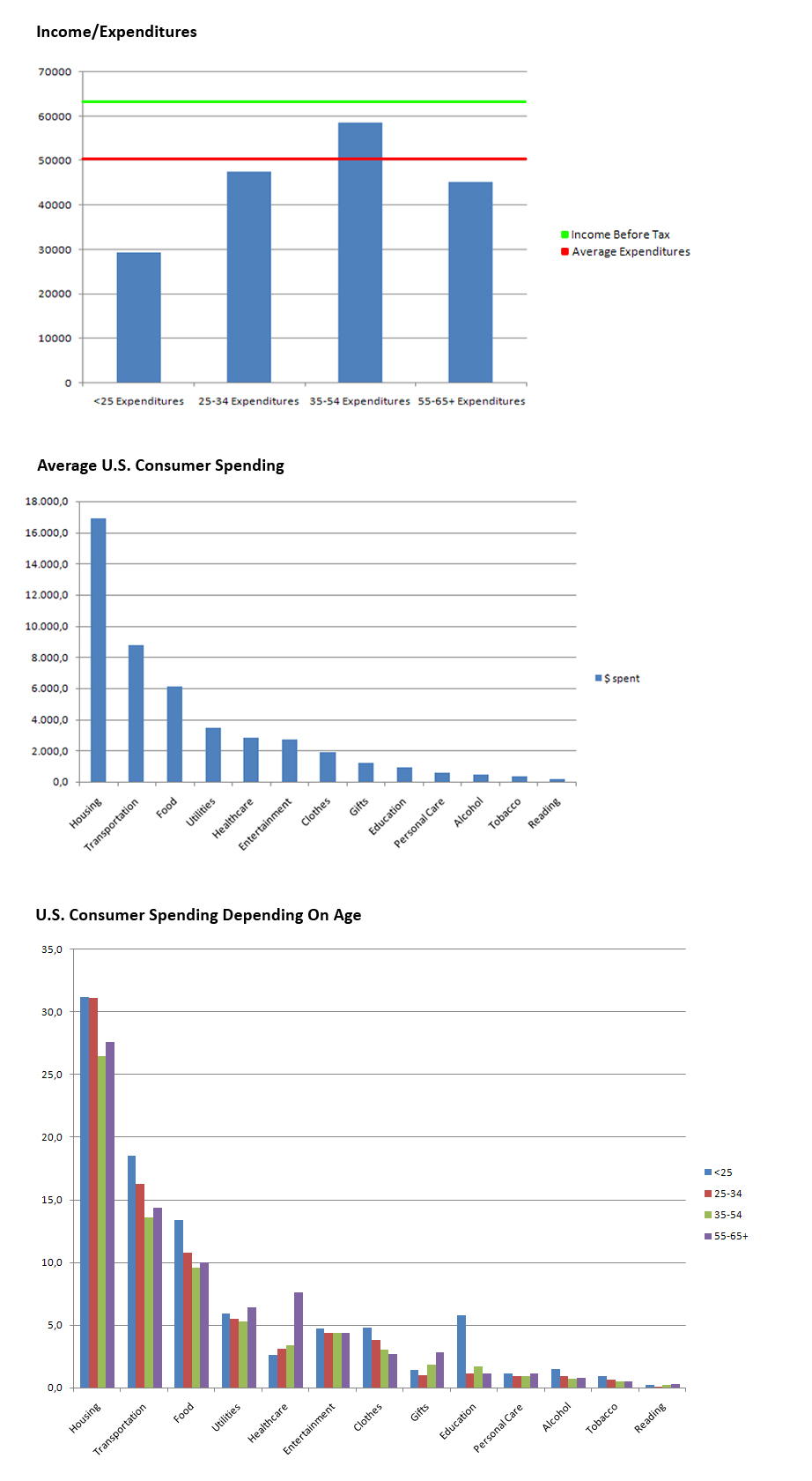
- Devided the graph into 3 smaller graphs with increased readability.
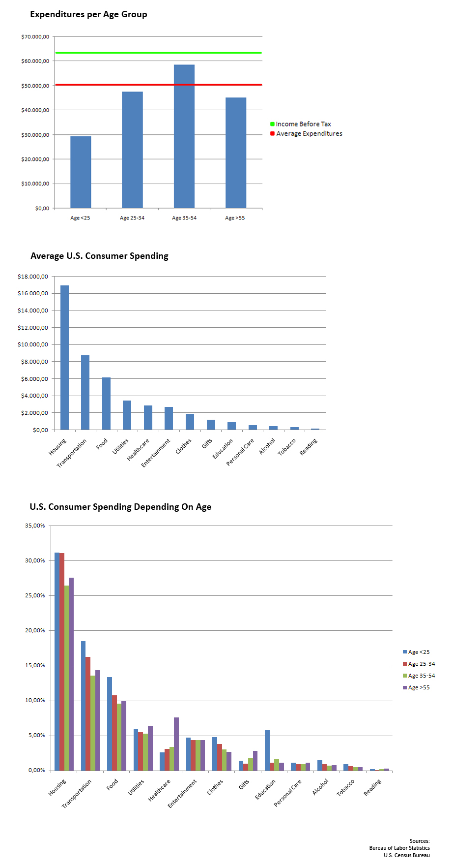
- The first graph shows the average expenditures seperated by age group. The overall Expenditures are displayed by the red line, the total income before tax is displayed by the green line.
- The second graph shows the absolut expenditures seperated by categories.
- The third graph shows the same categories as the second graph, but instead of absolut expenditures, there are relative expenditures seperated within the categories by age group.
Reredesigned Graph
Changes
- Added captions to the axes
- Renamed some captions/headings
- Renamed the x2 section to 2x section
- Added the source of the information
- Decided not to delete the lines in the first graph to save the information provided by the original graph
- Graph 1 and 3 could not be merged, because the first graph shows the absolute expenditures, the third one shows relative expenditures. The two graphs can not be compared, because the first graph shows the total expenditures of the age group and the third one shows how much of their total expenditures they spend on what categorie.


