Teaching:TUW - UE InfoVis WS 2009/10 - Gruppe 12 - Aufgabe 3
Assignment
Description of the second exercise (German)
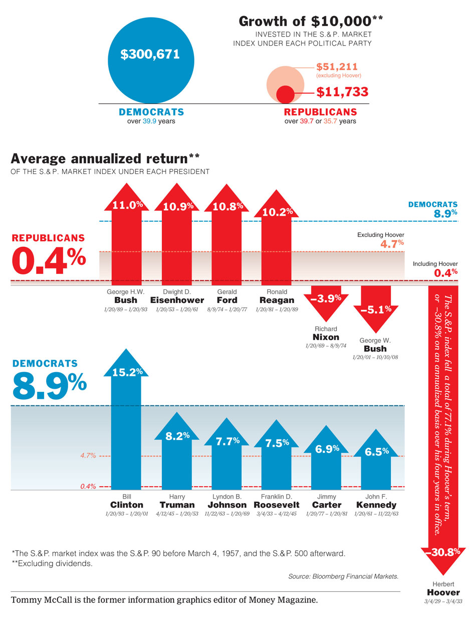
The Original Charts
Critique of the Given Charts
Visual Design
- Distracting asterisks after titles
- The text formatting isn't consistent througout the document (with and without serifs, capital letters for subtitles, slanted text etc.)
- The needless use of a bubble chart for data which could be communicated more efficiently with a bar chart
- The unnecessary use of arrows instead of simple bars, which don't offer any additional information
- The vertical scale isn't equal on both bar charts in favor for the democrats. The bar charts are therefore not comparable.
- Percentage values, president names and election periods aren't aligned in a line causing difficulties regarding fast horizontal scanning
- The use of vertically aligned text for the bar representing Hoover's return value making it difficult to read
- The data ink ratio is very low due to unnecessary gradients, lines and redundant information
Content
- The subtitles are just continuations of the titles instead of offering an additional (or alternate) explanation
- The bars could be aligned in a time series for an additional quality of information (e.g. depressions, regressions, etc.)
- The exact dates of the election period of each president are irrelevant information
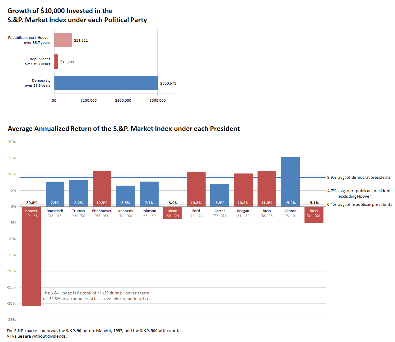
The Revised Charts
Description of the Undertaken Improvements
Visual Design
- The titles have been capitalized following the rules for any title
- Special considerations have been made regarding the consistency of text formatting to enable fast processing of information
- Text formatting varies according to the degree of importance (e.g. bold percentage values, light gray text color for dates, etc.)
- Light gray guides and a ruler have been plotted to ease the comparison of the bars over a greater distance
- The bubble chart has been replaced with a more sophisticated bar chart to increase comparability and to avoid visual clutter
- Bars have been used instead of arrows to increase the data ink ratio and to avoid visual clutter
- Percentage values, president names and election periods have been aligned in a line to faciliate fast horizontal scanning
- The vertical text has been placed horizontally beneath the respective bar to increase it's readability
Content
- The "subtitles" have been aggregated into the titles
- The bars have been aligned in a time series for an additional quality of information, inherently undermining the problem regarding the unequal vertical scales
- The display of the election period dates of each president have been reduced to years to remove irrelevant information

