Teaching:TUW - UE InfoVis WS 2009/10 - Gruppe 12 - Aufgabe 3
Aufgabenstellung
Zu verbessernde Grafik
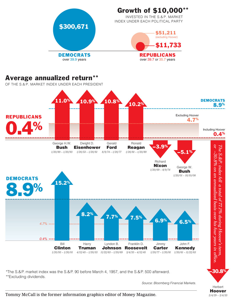
Critique
- Disturbing * in titles: write annotation in title
- Arrows for bars unnecessary: they dont offer any additional information
- Descriptions should be horizontal
- days and month of election period of each president is unnecessary information
- formatting of text should be consistent (serifs, Cappital letters in Subtitles, etc)
- bubbles not well chosen: false representation of data because
- diagrams could be combined for easier comparison and sortet by election periods of the presidents for an additional quality of information
- vertical scale is not identical on both diagrams (false representation of bars | not compareable) -> political issue?
- Data int ration too low: because of additional gradients, lines and stuff
