Teaching:TUW - UE InfoVis WS 2009/10 - Gruppe 08 - Aufgabe 3
Aufgabenstellung
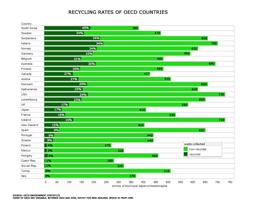
Zu verbessernde Grafik
Point B : Critics on the given graph
1. Type of graphic:
In this example, we have an not-so-convenient choice of the graphic type. First of all, the spiral adjustment of data objects is rather confusing then highlighting, and makes comparison of data difficult for the viewer. Also, even when the authors tryed not to distort the oject size in an unproportional way, one needs time to get a sensibility for the quantific estimation of the given data circles, compared with scaled bars or quadratic elements.
2. Colour:
As written in the data-ink-ratio rule, a graph should contain just as much color as needed, and not more. Different colors or intensities can be used to highlight special parts, but they shouldnt be used as a periodic design style. The reader is automatically seeking differences between the distinct colored elements and needs more time to conceive the information.
3. Grouping of data:
We have two main informations in our graph: tonnes of municipal waste per capita and the recycling ratio. Even when the recycling rate has top priority, a reader may ask himself, why the graph elements cant be grouped by both - total waste and recycling rate.
4. Priority of data:
As written in point 3, its not always clear that the size of an object depends on the recycling ratio. This effect is caused by the amount of total waste, which is placed in a very large and widespread way around the data objects. This is also confusing for the reader.
5. Use of text and numbers:
Some country names are small and difficult readable, because there was a need to scale it into the circle. Also, the percentage symbol of the recycling ratio appears only at the first element. The reader needs time to realize, all of these numbers are percentages.
