Teaching:TUW - UE InfoVis WS 2009/10 - Gruppe 02 - Aufgabe 3: Difference between revisions
Jump to navigation
Jump to search
No edit summary |
No edit summary |
||
| Line 2: | Line 2: | ||
[http://ieg.ifs.tuwien.ac.at/~gschwand/teaching/infovis_ue_ws09/infovis_ue_aufgabe3.html Beschreibung der Aufgabe 3] | [http://ieg.ifs.tuwien.ac.at/~gschwand/teaching/infovis_ue_ws09/infovis_ue_aufgabe3.html Beschreibung der Aufgabe 3] | ||
=== Zu verbessernde Grafik === | === Zu verbessernde Grafik === | ||
------------------------------- | ------------------------------- | ||
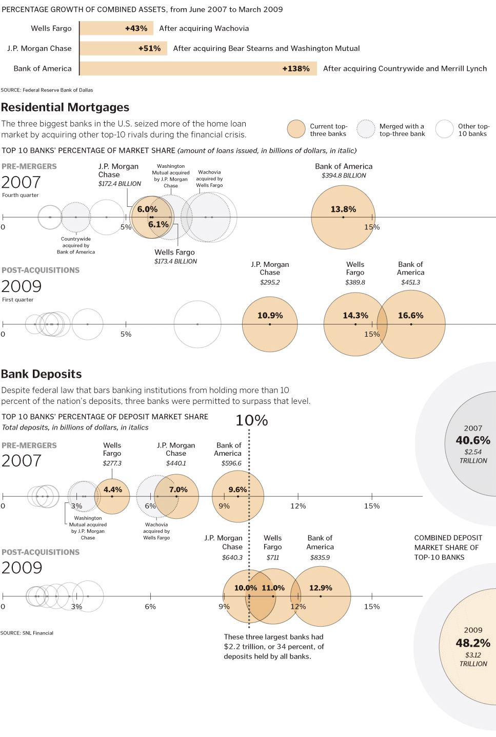
[[Image:big.gif]] | [[Image:big.gif | 400px]] | ||
=== Critics === | === Critics === | ||
------------------------------- | |||
==== Percentage Growth ==== | ==== Percentage Growth ==== | ||
* Gives a good overview | * Gives a good overview | ||
* Topic should be presented larger and stronger | * Topic should be presented larger and stronger | ||
* The use of different colors for the individual banks could achieve linking with the other graphics | * The use of different colors for the individual banks could achieve linking with the other graphics | ||
==== Residential Mortgages ==== | ==== Residential Mortgages ==== | ||
* Reading this graphic is very difficult | * Reading this graphic is very difficult | ||
* Layering of the circles is confusing - banks are not related just because they have about the same percentage -> use bar charts instead | * Layering of the circles is confusing - banks are not related just because they have about the same percentage -> use bar charts instead | ||
| Line 24: | Line 18: | ||
* Use colors which banks have been merged, same colors like in the "percentage growth" creates the linking effect | * Use colors which banks have been merged, same colors like in the "percentage growth" creates the linking effect | ||
* The x-axes is too low-detailed -> use more details: 0, 5%, 10%, 15%, 20% | * The x-axes is too low-detailed -> use more details: 0, 5%, 10%, 15%, 20% | ||
==== Bank Deposits ==== | ==== Bank Deposits ==== | ||
* Sense of the graphic is hard to get | * Sense of the graphic is hard to get | ||
* Circles on the right side don't have any relation to the rest of the graphic | * Circles on the right side don't have any relation to the rest of the graphic | ||
* The use of a bar or pie chart for the amount of money that is partitioned over the 3 banks would help understanding the graphic | * The use of a bar or pie chart for the amount of money that is partitioned over the 3 banks would help understanding the graphic | ||
[[User:UE-InfoVis0910 0928170|UE-InfoVis0910 0928170]] 14:39, 30 November 2009 (CET) | [[User:UE-InfoVis0910 0928170|UE-InfoVis0910 0928170]] 14:39, 30 November 2009 (CET) | ||
Revision as of 15:42, 30 November 2009
Aufgabenstellung
Zu verbessernde Grafik
Critics
Percentage Growth
- Gives a good overview
- Topic should be presented larger and stronger
- The use of different colors for the individual banks could achieve linking with the other graphics
Residential Mortgages
- Reading this graphic is very difficult
- Layering of the circles is confusing - banks are not related just because they have about the same percentage -> use bar charts instead
- Comments are confusing and need too much space
- Use colors which banks have been merged, same colors like in the "percentage growth" creates the linking effect
- The x-axes is too low-detailed -> use more details: 0, 5%, 10%, 15%, 20%
Bank Deposits
- Sense of the graphic is hard to get
- Circles on the right side don't have any relation to the rest of the graphic
- The use of a bar or pie chart for the amount of money that is partitioned over the 3 banks would help understanding the graphic
UE-InfoVis0910 0928170 14:39, 30 November 2009 (CET)
