Teaching:TUW - UE InfoVis WS 2008/09 - Gruppe 09 - Aufgabe 3
Aufgabenstellung[edit]
Zu beurteilende Grafik[edit]
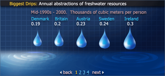
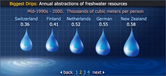
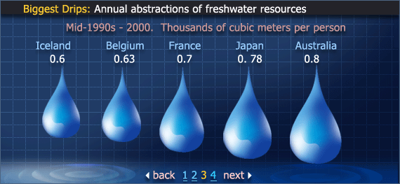
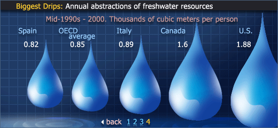
Biggest Drips: Annual abstraction of treshwater resources
Critics on the Graphics[edit]
- Headline
- The headline is badly formatted. It isnt well positioned and the text doesnt really explain what the graphics are all about. A short and precise title would help the viewer to get a first idea of what the graphics show.
- "Biggest Drips" is completely unnecessary since it is no essential information and should be dropped from the graphics therefore [Few, 2004a].
- For a short description of the graphics, "Annual abstractions of freshwater resources" is not a good choice either. The meaning of the graphics could be expressed in a more simple way/expression.
- Sub-headline
- The Sub-headline contains two different units: date and unit information. To avoid confusing the viewer, those should be merged or rearrangend.
- "Mid-90's" is no exact year and may be a sign of bad research of data.
- "Thousands of cubic meters per person" is a quite long description. It could be abbreviated (1,000m³) or the unit of data could be changed to cubic meters (m³). Changing the unit would make it even easier to comprehend the data. For Denmark the viewer has to calcuate 0.19 * 1000 to get the actual water consumption. Changing the unit and writing 190 instead of 0.19 therefore makes a lot of sense.
- Ink
- The graphics contain way too much ink in general. The graphics for example need four(!) pages to fulfill an easy task: comparing one attribute of 20 countries.
- The data-ink ration is very bad - there is much ink but little data. One should always try to reduce non-data ink to a minimum and enhance data-ink. [Few, 2004a]
- The background is filled with too much (and same) ink. For example, gridlines, shades and little waves in the water. Those should all be dropped since they distract the viewer. [Few, 2004b]
- Raindrops show proportions but overload the graphics. This is espacially true for image number four where the drip for the U.S. doesnt fit into the borders.
- Colors
- Unimportant data is much more emphasized (e.g. by colors) than important data. The difference between background and data should always be very distinct [Few, 2004a]. Therefore it is a bad idea to draw the background of the graphics in the same color tone as the data itself (blue).
- Colors are not used well in general. Important data (numbers) are in white which is the least "powerful" color. [Few, 2004a]
- There are too many different colors used. This is not useful because it distracts the viewer. [Few, 2004b]
- Font-Size
- Graphics just use one fontsize/-style for all text. Important parts of the data could be emphasized to help the viewer understand what the graphics want to tell. [Few, 2004a]
- The scaling of numbers seems not well chosen. The page numbers at the bottom of the graphics for example, have the same font-size as the water consumption data.
- Page numbers
- The numbers of the pages as well as the "back" and "next" buttons are probably too big (font-size is the same as the important data).
- Pages
- The table is divided into 4 different pages which leads to bad readability and comparability. The data should be merged into one table by placing the different pages adjacent. Grouping connected data - according to [Few, 2004b] - is an essential part when organizing/enhancing data-ink.
- Abbreviations
- As pointed out in [Tufte, 1999], words should always be spelt out or at least described if an abbreviation is used. The terms OECD or U.S., even if they are quite common, should be described.
- Highlighting
- OECD average is not highlighted although is not a country (as other data).
Optimized Graphics[edit]
Improvements[edit]
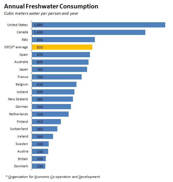
- All unneccessary non-data ink was removed. The viewer is no longer distracted by flashy background colors or useless "splash" effects.
- The water drops were replaced by a simple bar chart. To give a connection to the graphs topic (water) the bars are colored blue.
- The bars are horizontically arranged in order to allow easier comparison of the data. According to [Few, 2004a] they are the first choice when displaying ranking relationships.
- The water consumption data is displayed as a bar and as a number. While the bars gives a good "first glance"-idea of the topic, the numbers allow specific comparison between the different countries. The numbers are also right-aligned for better viewing.
- The only column which is not a country (OECD average) is enhanced by using a different color.
- For a better understanding the title of the graph was changed to a simplier one. This, combined with the new sub-headline, gives a better description of the graphs topic.
- As described in the "Critics on the Graphics" we changed the measured unit from 'thousands of cubic meters' to simply 'cubic meters'.
- The abbreviation for OECD is now described at the bottom.
- Colors were only used when they helped grasping the data more easily.
References[edit]
- [Few, 2004a]:Stephen Few, Show Me the Numbers: Designing Tables and Graphs to Enlighten, Analytics Press, 2004, Chapter 7 - General Design for Communication.
- [Few, 2004b]:Stephen Few, Elegance Through Simplicity, intelligent enterprise, Oct 16, 2004.
- [Tufte, 1999]:Edward R. Tufte, The Visual Display of Quantitative Information, Stanford, January 26, 1999.
