Teaching:TUW - UE InfoVis WS 2008/09 - Gruppe 09 - Aufgabe 3: Difference between revisions
Jump to navigation
Jump to search
No edit summary |
No edit summary |
||
| Line 15: | Line 15: | ||
:"Biggest Drips" is completely unnecessary since it is no essential information. | :"Biggest Drips" is completely unnecessary since it is no essential information. | ||
:"Annual abstractions of freshwater resources" is not a good choice for a short description of the graphics. | :"Annual abstractions of freshwater resources" is not a good choice for a short description of the graphics. | ||
*Sub-headline | |||
:Sub-headline contains two different units. They could be merged. | :Sub-headline contains two different units. They could be merged. | ||
:"Mid-90's" is no exact year and looks like bad research of data. | :"Mid-90's" is no exact year and looks like bad research of data. | ||
Revision as of 20:01, 9 December 2008
Aufgabenstellung
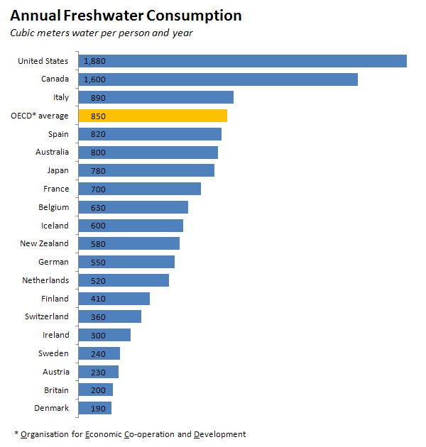
Zu beurteilende Grafik
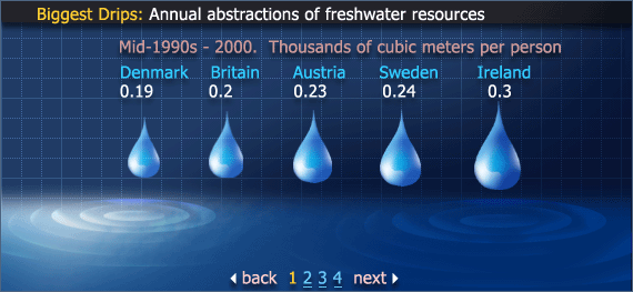
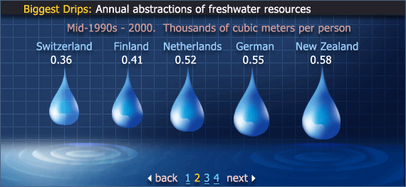
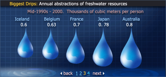
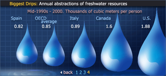
Biggest Drips: Annual abstraction of treshwater resources
Critics on the Graphics
- Headline
- (Bad) formatted headline leads to slow comprehension.
- "Biggest Drips" is completely unnecessary since it is no essential information.
- "Annual abstractions of freshwater resources" is not a good choice for a short description of the graphics.
- Sub-headline
- Sub-headline contains two different units. They could be merged.
- "Mid-90's" is no exact year and looks like bad research of data.
- "Thousands of cubic meters per person" is a quite long description. Could be abbreviated (1,000m³) or the unit of data could be changed to cubic meters (m³).
- Ink
- The data-ink ration is very bad - there is much ink but little data.
- The graphics contain too much ink in general.
- Unimportant things are much more emphasized (p.e. colors) than important data.
- The background is filled with (too much and same) ink, for example gridlines, shades, little waves in the water. Could all be omitted.
- Colors are not used well in general. Important data (numbers) are in white which is the least "powerful" color.
- There are too many different colors used, this is not useful because it distracts the viewer.
- Raindrops show proportions but overload the graphics, especially image number four.
- Font-Size
- Graphics just use one font-size/-style for all text.
- Scale of number
- The scale of numbers seems not well chosen. The page numbers at the bottom habe the same font-size.
- Page numbers
- The numbers of the pages as well as the "back" and "next" buttons are much too big (font-size is the same as the important data).
- Pages
- The table is divided into 4 different pages which leads to bad readability and comparability. Data should be merged into one table.
- Highlighting
- OECD average is not highlighted although is not a country (as other data).
Optimized Graphics
Improvements
- New Design
- More details
References
- [Few, 2004a]:Stephen Few, Show Me the Numbers: Designing Tables and Graphs to Enlighten, Analytics Press, 2004, Chapter 7 - General Design for Communication.
- [Few, 2004b]:Stephen Few, Elegance Through Simplicity, intelligent enterprise, Oct 16, 2004.
- [Tufte, 1999]:Edward R. Tufte, The Visual Display of Quantitative Information, Stanford, January 26, 1999.
