Teaching:TUW - UE InfoVis WS 2008/09 - Gruppe 08 - Aufgabe 1 - Chart: Difference between revisions
mNo edit summary |
m (Wiki-Link ausgebessert) |
||
| Line 54: | Line 54: | ||
* [Wiki 2008] Chart, Wikipedia. Retrieved at: November 02, 2008. [http://en.wikipedia.org/wiki/Chart | * [Wiki 2008] Chart, Wikipedia. Retrieved at: November 02, 2008. [http://en.wikipedia.org/wiki/Chart http://en.wikipedia.org/wiki/Chart] | ||
http://en.wikipedia.org/wiki/Chart] | |||
---- | ---- | ||
Revision as of 11:21, 6 November 2008
Definitions
Overview
The term chart can stand for several different things. A chart might be a diagram, maps that hold additional information depending on their usage or music charts that represent the popularity of different tracks. Charts are used to provide people a fast and better understanding of large amount of data. Therefore they hold only a limited amount of text for example a title to give a quick idea what the chart is about. Examples could be to show the population of a country over the last years. Using for example a line chart, an increase or a decrease of the population is easier to see then if he would have only plane numbers.


Types of Charts
Depending on the available data and the information somebody is willing to provide different kinds of charts exist since different information can be visualized better in one form than another. Some of the most common are listed below and explained in more detail.
Bar Chart
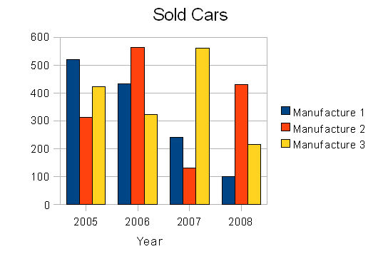
Bar Charts are composed out of several rectangles usually with equal width while the hight expresses the value. The bars can be horizontal or vertical oriented. Usually they are used to compare two ore more different values. A bar charts can be used for example when the data can be counted.
Histogram
Same as the bar chart the histogram uses bars where the value is encoded in the hight of the bars. Different to a bar chart, on a histogram the bars are ordered only horizontal moreover the bars touch each other while on the bar chart there is a space between the different categories. A histogram is used to visualize continuous data while the bar chart visualizes discrete data.
Line Chart
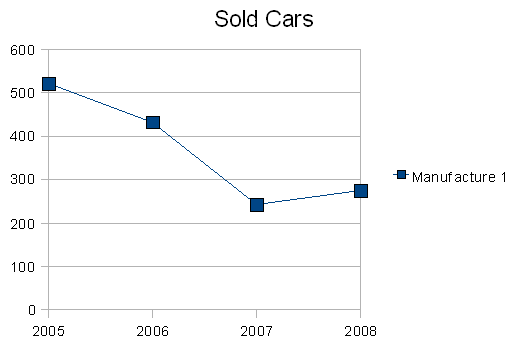
A Line Chart holds several related values. This values are connected with each other from left to right to show a tendency of the given data. As an example of usage could be the speed of a given body over some time.
Pie Chart
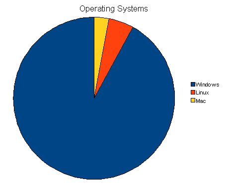
A Pie chart is drawn in form of a circle. The different data values are encoded as segments. The relative values are used to define the arc length of the segments. A pie chart can be used if it should visualize the value of one segment compared to the rest of the chart. Comparing different segments which each other might be difficult for humans. Also displaying increase or decrease of values other charts can be a better choice.
Gantt Chart
A Gantt chart is used for scheduling an amount of tasks. The horizontal axis is used to represent the time. The vertical axis holds the different tasks. Inside the plane horizontal bars are used to display the tasks where the length of the bar determines the time needed to fulfill the task. It is not possible to display which tasks depend on each other. This can be done with the so called PERT chart.
Candlestick Chart
not done yet
Some other types of charts are: Timeline chart, Organizational chart, Tree chart, Flow chart, Bubble chart, Radar chart.
References
- [Wiki 2008] Chart, Wikipedia. Retrieved at: November 02, 2008. http://en.wikipedia.org/wiki/Chart