Teaching:TUW - UE InfoVis WS 2008/09 - Gruppe 07 - Aufgabe 2
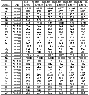
Original Table
Critics
- There is no title and subtitle defined for the table.
- The border around the table is not needed since there is plenty of space around it.
- The percent sign is missing for every percentage value.
- Numbers are not consistent, because they have a different amount of digits after the decimal point and other numbers are expressed in an exponential form.
- Numbers should be aligned to the right, because this makes them easier to read. Text not holding numbers such as the columns "Analyte" and "Units" should be aligned to the left.
- Rows and columns are to close togehter which makes reading the data very hard.
- Grid makes the data harder to read when scaning throug the colums and rows because it breaks up the data.
- Tk-50-HTK is a master category for all the other categories but it is not shown as a master category.
- microg is not a very suitable unit. µg would be better.
Resources
- [Stephen Few, 2004] Stephen Few, Show Me the Numbers: Designing Tables and Graphs to Enlighten, Analytics Press, 2004, Chapter 8 - Table Design
