Teaching:TUW - UE InfoVis WS 2008/09 - Gruppe 07 - Aufgabe 1 - Pie Chart: Difference between revisions
No edit summary |
No edit summary |
||
| Line 17: | Line 17: | ||
To construct a pie chart the following steps are necessary: | To construct a pie chart the following steps are necessary: | ||
* Determine the proportions of the categories to be represented. | * Determine the proportions of the categories to be represented. | ||
* Find the total value for the entire category being studied and calculate | * Find the total value for the entire category being studied and calculate the percentage for each segment or part. | ||
the percentage for each segment or part. | * Calculate the degrees of the categories. Convert the percentage values for each segment into degrees relative to the 360 degrees in the circle. (For example, 12% X 360 degrees = 43 degrees) | ||
* Calculate the degrees of the categories. Convert the percentage values for each segment into degrees relative to the | |||
360 degrees in the circle. (For example, 12% X 360 degrees = 43 degrees) | |||
* Construct the chart. Draw a circle and divide it into appropriately sized segments. | * Construct the chart. Draw a circle and divide it into appropriately sized segments. | ||
* Add labels and a title. Label each segment or add a legend to identify the segments. Then | * Add labels and a title. Label each segment or add a legend to identify the segments. Then clearly title the chart. | ||
clearly title the chart. | |||
---- | ---- | ||
| Line 29: | Line 26: | ||
=== Variants of the Pie Chart === | === Variants of the Pie Chart === | ||
* Exploded Pie Chart | * Exploded Pie Chart: A segment of the pie chart is seperated from the rest, to highlight it. | ||
* Perspective (3D) pie chart | * Perspective (3D) pie chart: Mainly for aesthetic reasons the pie chart is displayed in 3D. In general the use of this form of pie charts is discouraged because it does not enhance readability. | ||
* Polar area diagram | * Polar area diagram: The polar area diagram is similar to a usual pie chart, except that the sectors are each of an equal angle and differ rather in how far each sector extends from the centre of the circle, enabling multiple comparisons on one diagram. | ||
[Wikipedia, 2008] | [Wikipedia, 2008] | ||
---- | ---- | ||
| Line 52: | Line 50: | ||
A student's life. | A student's life. | ||
Hours per week. | Hours per week. | ||
* '''Sleeping''' '''40''' | * '''Sleeping''' '''40%''' | ||
* '''Partying''' '''15''' | * '''Partying''' '''15%''' | ||
* '''Eating''' '''10''' | * '''Eating''' '''10%''' | ||
* '''Slacking''' '''20''' | * '''Slacking''' '''20%''' | ||
* '''Working''' '''30''' | * '''Working''' '''30%''' | ||
* '''Studying''' '''20''' | * '''Studying''' '''20%''' | ||
---- | ---- | ||
Revision as of 17:33, 20 November 2008
Pie Charts
Definition
How to use it
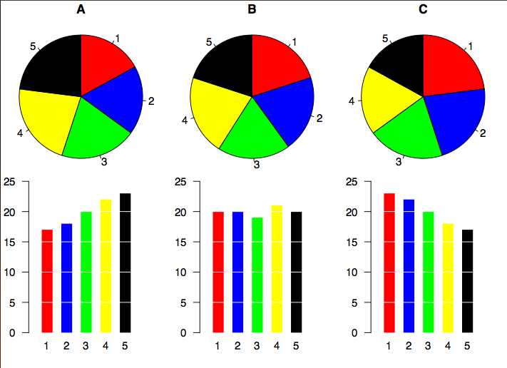
The popularity of the pie chart results from its simplicity. The circle provides a visual concept of the whole. They are best used for displaying statistical information when there are no more than six components. Otherwise, the resulting picture can be too complex to understand. Also, pie charts are not useful when the values of each component are similar because it is difficult to see the differences between slice sizes.
A pie chart uses percentages to compare information. Percentages are used because they are the easiest way to represent a whole. The whole is equal to 100%. To present certain values in a pie chart it is necessary to determine how many degrees represent this share of data in comparison to the whole circle. This calculation is done by developing the equation:
percent ÷ 100 x 360 degrees = the number of degrees [Statistics Canada, 2008]
To construct a pie chart the following steps are necessary:
- Determine the proportions of the categories to be represented.
- Find the total value for the entire category being studied and calculate the percentage for each segment or part.
- Calculate the degrees of the categories. Convert the percentage values for each segment into degrees relative to the 360 degrees in the circle. (For example, 12% X 360 degrees = 43 degrees)
- Construct the chart. Draw a circle and divide it into appropriately sized segments.
- Add labels and a title. Label each segment or add a legend to identify the segments. Then clearly title the chart.
Variants of the Pie Chart
- Exploded Pie Chart: A segment of the pie chart is seperated from the rest, to highlight it.
- Perspective (3D) pie chart: Mainly for aesthetic reasons the pie chart is displayed in 3D. In general the use of this form of pie charts is discouraged because it does not enhance readability.
- Polar area diagram: The polar area diagram is similar to a usual pie chart, except that the sectors are each of an equal angle and differ rather in how far each sector extends from the centre of the circle, enabling multiple comparisons on one diagram.
[Wikipedia, 2008]
Criticism on the Pie Chart

Though being a common method of displaying data, pie charts are not the preferred method among statisticians and in scientific literature. While pie charts offer a good view on how one segment is related to the whole pie the comparison of segments amongst each other is difficult. Also a comparison by angle (as in pie charts) was shown to be percieved less accurate than comparison by length. Using bars instead of slices improves therfore improves the capability to compare the different segments of data.
Example
Data
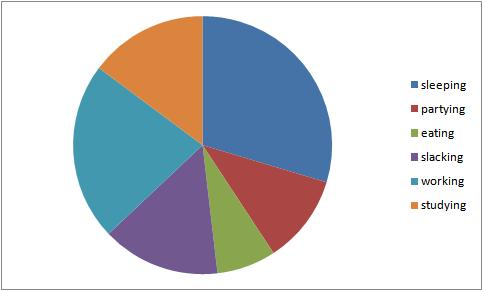
A student's life. Hours per week.
- Sleeping 40%
- Partying 15%
- Eating 10%
- Slacking 20%
- Working 30%
- Studying 20%
Other Forms of Charts
Among Pie Charts, used to display percentages, other forms of charts can be used for different purposes.
- Column Charts - Used to show comparisons between items of data. A column in the chart represents the value of one item of data.
- Bar Charts - Are very similar to column charts, except they run horizontally on the page instead of vertically like column charts.
- Line Charts - Used to show trends over time. Each line in the graph shows the changes in the value of one item of data.
References
- [Hull, 1998] Stephen Hull, BusinessObjects Glossary. Last Modified at: November 5, 1998. Retreived at: November 4, 2008 http://planning.ucsc.edu/IRPS/dwh/BOBGLOSS.HTM
- [Concordia University, 1999] Unknown, Pie Chart. Last Modified at: 1999. Retrieved at: November 4, 2008 http://web2.concordia.ca/Quality/tools/21piechart.pdf
- [French, 2008] Ted French. Chart. http://spreadsheets.about.com/od/c/g/chart_def.htm
- [Wikipedia, 2008] Wikipedia. Pie chart. Retrieved at: November 2008. http://en.wikipedia.org/wiki/Pie_chart
- [Statistics Canada, 2008] Statistics Canada. Pie charts. Retrieved at: November 19, 2008. http://www.statcan.ca/english/edu/power/ch9/piecharts/pie.htm
