Teaching:TUW - UE InfoVis WS 2008/09 - Gruppe 07 - Aufgabe 1 - Pie Chart: Difference between revisions
No edit summary |
No edit summary |
||
| Line 35: | Line 35: | ||
[[image:pie_chart_example.jpg|picture]] | [[image:pie_chart_example.jpg|picture]] | ||
==== Data ==== | ==== Data ==== | ||
A student's life | A student's life. | ||
Hours per week. | |||
* '''Sleeping''' '''40''' | * '''Sleeping''' '''40''' | ||
* '''Partying''' '''15''' | * '''Partying''' '''15''' | ||
Revision as of 18:57, 4 November 2008
Pie Charts
Definition
A pie chart is a circular chart divided into sectors, illustrating relative magnitudes or frequencies or percents. In a pie chart, the size of each sector is proportional to the quantity it represents. Together, the sectors create a full disk. It is named for its resemblance to a pie which has been sliced.
A type of chart divided into sections of a circle, drawn from a single Y-axis value and used to illustrate the relationship of parts to the whole, particularly useful for emphasizing one specific element.
QUOTATIONS, ANYONE?
How to use it
Determine proportions. Find the total value for the entire category being studied and calculate the percentage for each segment or part.
Calculate degress. Convert the percentage values for each segment into degrees relative to the 360 degrees in the circle. (For example, 12% X 360 degrees = 43 degrees)
Construct the chart. Draw a circle and divide it into appropriately sized segments. Add labels and a title. Label each segment or add a legend to identify the segments. Then clearly title the chart.
Forms of Charts
Among Pie Charts, used to display percentages, other forms of charts can be used for different purposes.
- Column Charts - Used to show comparisons between items of data. A column in the chart represents the value of one item of data.
- Bar Charts - Are very similar to column charts, except they run horizontally on the page instead of vertically like column charts.
- Line Charts - Used to show trends over time. Each line in the graph shows the changes in the value of one item of data.
Example
Data
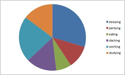
A student's life. Hours per week.
- Sleeping 40
- Partying 15
- Eating 10
- Slacking 20
- Working 30
- Studying 20
SUBPARAGRAPH1
PARAGRAPH2
- Entry1
- Entry2
PARAGRAPH3
[Phothographer]
REFERENCES / WEBLINKS
- [Hull, 1998] Stephen Hull, BusinessObjects Glossary. Last Modified at: November 5, 1998. Retreived at: November 4, 2008 http://planning.ucsc.edu/IRPS/dwh/BOBGLOSS.HTM
- [Concordia University, 1999] Unknown, Pie Chart. Last Modified at: 1999. Retrieved at: November 4, 2008 http://web2.concordia.ca/Quality/tools/21piechart.pdf
- [French, 2008] Ted French. Chart. http://spreadsheets.about.com/od/c/g/chart_def.htm
- [Anonymous, 2008] John Doe. Unknown Paper. Wikipedia, http://en.wikipedia.org/wiki/Reference
