Teaching:TUW - UE InfoVis WS 2008/09 - Gruppe 06 - Aufgabe 4: Difference between revisions
No edit summary |
No edit summary |
||
| Line 190: | Line 190: | ||
The first two cam be visualized with normal line charts, while for the last one, we opted for a stacked line chart. | The first two cam be visualized with normal line charts, while for the last one, we opted for a stacked line chart. | ||
Events -> LifeLines [Plaisant et al., 1998] | |||
==== Visual Mapping ==== | ==== Visual Mapping ==== | ||
The visual mapping is the same in all our visualisation variants, and rather simple: the time series is mapped to the horizontal axis [Few, 2004], while the vertical axis maps the values at the specific point in time. The scale of the vertical axis either measured in litres consumption per day, or as a percentage of the recommended daily dose. The recommended dose, which is at 100%, is specifically highlighted, to allow for easily spotting over-consumption. | The visual mapping is the same in all our visualisation variants, and rather simple: the time series is mapped to the horizontal axis [Few, 2004], while the vertical axis maps the values at the specific point in time. The scale of the vertical axis either measured in litres consumption per day, or as a percentage of the recommended daily dose. The recommended dose, which is at 100%, is specifically highlighted, to allow for easily spotting over-consumption. | ||
LifeLines [Plaisant et al., 1998] | |||
* Beschreibung der verwendeten Techniken / angewandten Prinzipien | * Beschreibung der verwendeten Techniken / angewandten Prinzipien | ||
| Line 223: | Line 229: | ||
Still, we provide the following interaction modes | Still, we provide the following interaction modes | ||
* Switching between different data to visualise: with the tabs on the top-right part of the tool, just above the time-line. This allows the user to select either the consumption of drinks, consumption of substances, or detailed consumption and sources for each of the substances caffeine, sugar and alcohol. | * Switching between different data to visualise: with the tabs on the top-right part of the tool, just above the time-line. This allows the user to select either the consumption of drinks, consumption of substances, or detailed consumption and sources for each of the substances caffeine, sugar and alcohol. | ||
* Zooming into a specific period of life: this can be initiated by clicking on a specific location of the time-line, and by using the (+) and (-) icons. Zooming uses the "context and zoom" technique to always view the selected area in context with the data of the other stages of life of the patient. | ** These tabs are connected with each other: If the user zooms in a tab and then changes to another tab, the same timespan will be focussed. | ||
* Zooming into a specific period of life: this can be initiated by clicking on a specific location of the time-line, and by using the (+) and (-) icons. Zooming uses the "context and zoom" technique to always view the selected area in context with the data of the other stages of life of the patient [Leung and Apperley, 1994]. | |||
** click on LifeLine element to move focus on that time span | |||
* Details on demand | |||
* Switching future scenarios | |||
=== Discussion === | === Discussion === | ||
| Line 248: | Line 253: | ||
* [Leung and Apperley, 1994] Y.K. Leung and M.D. Apperley. A Review and Taxonomy of Distortion-Oriented Presentation Techniques. ''ACM Transactions on Computer-Human Interaction (TOCHI)'', 1(2):126-160, June 1994. | * [Leung and Apperley, 1994] Y.K. Leung and M.D. Apperley. A Review and Taxonomy of Distortion-Oriented Presentation Techniques. ''ACM Transactions on Computer-Human Interaction (TOCHI)'', 1(2):126-160, June 1994. | ||
* [Plaisant et al., 1998] Catherine Plaisant, Richard Mushlin, Aaron Snyder, Jia Li, Dan Heller, and Ben Shneiderman. LifeLines: Using Visualization to Enhance Navigation and Analysis of Patient Records. Technical Report HCIL-98-08, University of Maryland, 1998. | * [Plaisant et al., 1998] Catherine Plaisant, Richard Mushlin, Aaron Snyder, Jia Li, Dan Heller, and Ben Shneiderman. LifeLines: Using Visualization to Enhance Navigation and Analysis of Patient Records. Technical Report HCIL-98-08, University of Maryland, 1998. | ||
*[Pownser and Tufte, 1994] Seth M. Powsner and Edward R. Tufte. Graphical Summary of Patient Status. ''The Lancet'', 344(8919):386-389, August 1994. | * [Pownser and Tufte, 1994] Seth M. Powsner and Edward R. Tufte. Graphical Summary of Patient Status. ''The Lancet'', 344(8919):386-389, August 1994. | ||
Revision as of 00:26, 8 January 2009
Aufgabenstellung
Gegebene Daten
Homer Simpson's Trinkverhalten in Abhängigkeit von seinen Lebensumständen
...Visualisierung von Homer's Lebensabschnitten bzw. Ereignissen mit Einfluss auf sein
Trinkverhalten (zB.: Kindheit, Pubertät, Arbeitslosigkeit, Beziehungen, Hochzeit, Geburt
der Kinder, Liebeskummer, Alltag, etc.) von seiner Geburt bis Jetzt + mögliche
Zukunftsszenarien (mind. 3).
- Die Menge folgender Getränke soll für die jeweiligen Lebensumstände ablesbar sein
(ml oder Liter - je nachdem - pro Tag, Monat, Jahr (z.B.: Fokus+Kontext Methoden):
 a) Wasser

 b) Milch

 c) Fruchtsaft

 d) Cola

 e) Kaffee (Würfelzucker?)

 f) Bier
(vereinfacht angenommen, Homer trinkt ausschließlich diese Getränke)
- Die folgenden Werte sollen abhängig von den konsumierten Getränken ablesbar sein:
 1) g oder kg konsumierter Zucker (aus Getränken) + empfohlene Maximaldosis pro Tag, Monat, Jahr
   (empfohlene Maximaldosis/Tag: 50g; enthaltener Zucker: 10g/100 ml Cola; 10g/100 ml Fruchtsaft; 3g/Würfelzucker).

 2) mg konsumiertes Coffein + empfohlene Maximaldosis pro Tag, Monat, Jahr
   (empfohlene Maximaldosis/Tag: 600mg; enthaltenes Coffein: 10 mg/100 ml Cola; 80 mg/100 ml Kaffee).

 3) g konsumierter Alkohol + empfohlene Maximaldosis pro Tag, Monat, Jahr
   (empfohlene Maximaldosis/Tag: 20g; enthaltener Alkohol: 3,6 g/100ml Bier)
- Die Daten sollen zur medizinischen/psychologischen Analyse visualisiert werden.
- Die bisher erlernten Design-Prinzipien sollen umgesetzt werden (z.B.: Optimierung der Data-ink ratio).
- Die Mockups sollten zumindest 1) Homer's Leben im Überblick 2) und eine Detailansicht wiedergeben.
- Alle nicht angeführten Daten können frei erfunden werden.
Links
General description and background
Field of application
The visualization will be used by experts for medical and psychological analysis. The visualization shall provide information of a single patient, and give details about their consumption of several different drinks (water, milk, juice, coke, coffee, and beer), and the thus resulting consumption of sugar, caffeine and alcohol. It shall be possible to visualize both a time-line overview of these consumptions, as well as detailed views for specific periods in time. Additionally, certain periods of life, such as childhood or puberty, and specific events and happenings such as unemployment, wedding(s), or birth of the children, shall be indicated.
Analysis of the data set
The application displays abstract, multi-dimensional, time-oriented information:
- Drinks: Consumption of six different drinks (water, milk, juice, coke, coffee, and beer) and sugar cubes by day.
- These dimensions have a continuous data type.
- Ingredients: The amount of dangerous substances (sugar, caffeine, and alcohol) contained in the drinks and in the sugar cubes.
- These dimensions have a continuous data type.
- These variables are derived from the drinks and sugar cubes.
- Events: Certain periods of life and specific events (e.g., childhood, unemployment).
- This dimension is of a nominal data type; they can be distinguished, but they cannot be ordered, as they might be overlapping.
The following table gives a detailed overview on each datum:
| Dimension | Data type | Unit |
|---|---|---|
| water | continuous | ml |
| milk | continuous | ml |
| juice | continuous | ml |
| coke | continuous | ml |
| coffee | continuous | ml |
| beer | continuous | ml |
| sugar cube | discrete | pieces |
| sugar | continuous | g |
| caffeine | continuous | g |
| alcohol | continuous | g |
| events | nominal |
Temporal Dimension
We can characterize the temporal dimension as follows [Aigner, 2006, pp. 13-17]:
- The application's time domain is branching, because it allows the description of alternative scenarios.
- The time scale is discrete and days are the smallest granularity used.
- Drinks and ingredients are totally ordered, whereas events are partially ordered, because they might be overlapping.
- The temporal primitives used for drinks and ingredients are instants, whereas intervals are used for events.
- The application uses the Gregorian calendar and different temporal granularities like months and year will be made available to the users.
The ingredients of the drinks, and their recommended maximum dose per day, are as follows:
| Sugar | Caffeine | Alcohol | |
|---|---|---|---|
| Water | |||
| Milk | |||
| Juice (100ml) | 10g | ||
| Coffee (100ml) | 80mg | ||
| Lump sugar (per piece) | 3g | ||
| Coke (100ml) | 10g | 10mg | |
| Beer (100ml) | 3.6g | ||
| Daily dose | 50g | 600mg | 20g |
For the events and periods in life, the data would look like:
| Start | End | Type | remarks |
|---|---|---|---|
| 13.4.1965 | 12.4.1972 | Childhood | |
| 7.7.1977 | 7.7.1977 | Wedding | |
| 25.7.1980 | 25.7.1980 | Birth | Bart |
| 1.8.1981 | 31.10.1982 | Unemployment | |
| 12.10.1982 | 12.10.1982 | Birth | Lisa |
An exemplary data set for the consumption would look as follows:
| Date | Water | Milk | Juice | Coffee | Lump sugar | Coke | Beer |
|---|---|---|---|---|---|---|---|
| 7.7. 1977 | 0.25 | 0.5 | 0 | 0.75 | 5 | 1 | 5.5 |
| 25.7. 1980 | 0 | 0 | 0.25 | 1.25 | 12 | 0 | 0 |
| 1.1. 1993 | 1.0 | 0 | 0.25 | 0.25 | 2 | 0.33 | 1.5 |
Analysis of the target group
The intended target group of the visualization are physicians, psychologists and nutritionist. Thanks to their education they can interpret of the data and thus do primary need hints what different values imply but require guidance to navigate through the data and conceive it.
On the other hand it cannot be assumed that the users have technical knowledge of interactive systems or are willing to acquire it, therefore the visualization must be intuitive and as far as possible self descriptive.
Furthermore possible limitations by the target hardware must be taken into account. This could also limit the possibilities of interaction (e.g. screen-size, no keyboard or no mouse but a touch-pad).
Goals of the visualization
The visualisation shall allow medical doctors to get a fast overview on excess consumption of certain drinks and the thus resulting consumption of substances, potentially to be able to link it with certain symptoms and diseases Homer might suffer from.
For psychologists, it might be more relevant to link the consumption to events, to find patterns in what circumstances Homer tends to have an excess consumption of the certain drinks. It might be especially interesting to spot excess consumption that cannot be linked with a certain event, for example too much beer consumption that isn't in relation to a celebration or a known phase of depression, like unemployment.
Generally, we assume the doctors to use these tools mainly during a physical examination, or maybe a ward round; we thus expect the doctors having a limited amount of time available for inspecting the data, thus they should be able to get a fast overview and fast zooming into specific time periods. Therefore, we want to provide for a simple navigation, and rather focus on displaying data in the context of the whole life span, rather than giving (too) detailed data or even numbers for a specific date.
Concept
Visualization
Type of Visualization
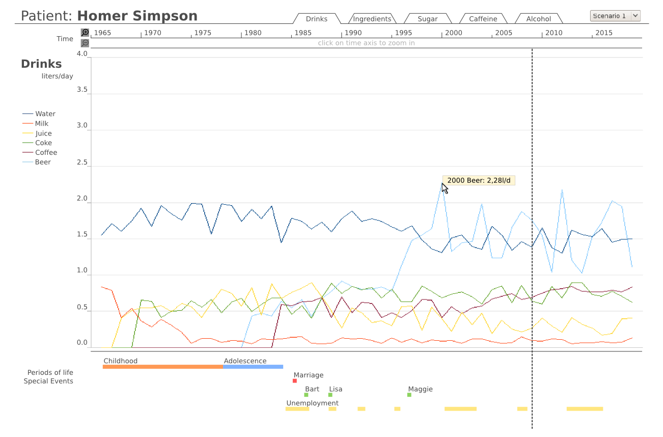
The data sets is composed of multiple instances of several measures taken periodically, i.e. a time series, which is best visualised as a line chart [Few, 2004]. We have several different aspects to visualize
- Consumption of drinks
- Consumption of substances/ingredients
- Individual consumption of caffeine, sugar and alcohol, indicating the source of the substance
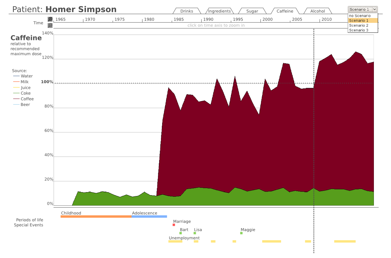
The first two cam be visualized with normal line charts, while for the last one, we opted for a stacked line chart.
Events -> LifeLines [Plaisant et al., 1998]
Visual Mapping
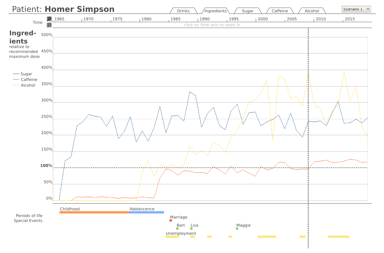
The visual mapping is the same in all our visualisation variants, and rather simple: the time series is mapped to the horizontal axis [Few, 2004], while the vertical axis maps the values at the specific point in time. The scale of the vertical axis either measured in litres consumption per day, or as a percentage of the recommended daily dose. The recommended dose, which is at 100%, is specifically highlighted, to allow for easily spotting over-consumption.
LifeLines [Plaisant et al., 1998]
- Beschreibung der verwendeten Techniken / angewandten Prinzipien
- inkl. Quellenangaben (siehe z.B. VO Skriptum/Foliensatz)
Mockup(s)
The imaginary data-set and the charts were produced using Open Office Calc, while the final mockups were created with a drawing-program.

Figure 1: Overview and standard visualisation, showing the consumption of drinks during the whole life of the patient.

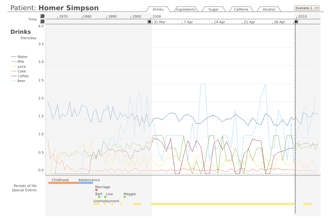
Figure 2: Detailed view of a specific period of time, using the context and zoom technique.

Figure 3: Overview, showing the consumption of substances.

Figure 4: Overview, showing the sources of caffeine consumed.
Interaction
As the application is meant for medical doctors and psychologists, we kept the interface simple, to avoid situations where the users might get lost in a specific view / selection and not finding their way back.
Still, we provide the following interaction modes
- Switching between different data to visualise: with the tabs on the top-right part of the tool, just above the time-line. This allows the user to select either the consumption of drinks, consumption of substances, or detailed consumption and sources for each of the substances caffeine, sugar and alcohol.
- These tabs are connected with each other: If the user zooms in a tab and then changes to another tab, the same timespan will be focussed.
- Zooming into a specific period of life: this can be initiated by clicking on a specific location of the time-line, and by using the (+) and (-) icons. Zooming uses the "context and zoom" technique to always view the selected area in context with the data of the other stages of life of the patient [Leung and Apperley, 1994].
- click on LifeLine element to move focus on that time span
- Details on demand
- Switching future scenarios
Discussion
- Wie werden die BenutzerInnen in ihren Aufgaben unterstützt?
- Welche Besonderheiten gibt es?
- Was sind die Vor- und Nachteile der Technik?
Future Work
- Erweiterungs- bzw. Verbesserungsmöglichkeiten
References
- [Aigner, 2006] Wolfgang Aigner. Visualization of Time and Time-Oriented Information: Challenges and Conceptual Design. Ph.D. thesis, Vienna University of Technology, 2006.
- [Few, 2004] Stephen Few. Show Me the Numbers - Designing Tables and Graphs to Enlighten. Analytics Press, Oakland, CA, 2004.
- [Kosara and Miksch, 2002] Robert Kosara and Silvia Miksch. Visualization Methods for Data Analysis and Planning in Medical Applications. International Journal of Medical Informatics, 68(1-3):141-153, December 2002.
- [Leung and Apperley, 1994] Y.K. Leung and M.D. Apperley. A Review and Taxonomy of Distortion-Oriented Presentation Techniques. ACM Transactions on Computer-Human Interaction (TOCHI), 1(2):126-160, June 1994.
- [Plaisant et al., 1998] Catherine Plaisant, Richard Mushlin, Aaron Snyder, Jia Li, Dan Heller, and Ben Shneiderman. LifeLines: Using Visualization to Enhance Navigation and Analysis of Patient Records. Technical Report HCIL-98-08, University of Maryland, 1998.
- [Pownser and Tufte, 1994] Seth M. Powsner and Edward R. Tufte. Graphical Summary of Patient Status. The Lancet, 344(8919):386-389, August 1994.