Teaching:TUW - UE InfoVis WS 2008/09 - Gruppe 06 - Aufgabe 2
Aufgabenstellung
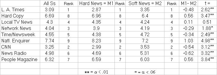
Zu beurteilende Tabelle
Critical Review
We reviewed the given table based on the table design guidelines by Few [2004] and found the following problems:
Delineating Columns and Rows
A grid is used to delineating columns and rows, which should be avoided.
Arranging Data
The table has multiple columns called "rank", which have the same data. We don't know, if this is by coincidence, or redundance.
The data rows are not sorted by any column.
Formatting Text
All columns containing numbers have centered. Some numbers (e.g., 4.3) only have one digit right of the decimal point. Consequently these numbers are narrower than the other numbers in the column and are not well aligned.
Some of the columns (rank) have a smaller font size. We compared the asterisk symbols and found out that three different font families are used.
The table contains footnotes.
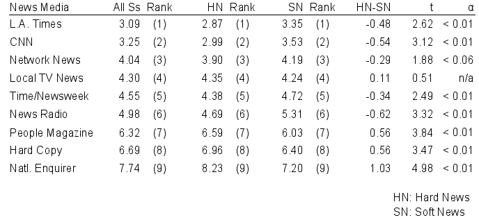
Improved Table
Improvements
Delineating Columns and Rows
We removed the grid and slightly increased line height. Rulers are used in the header.
Arranging Data
We created three column groups for "All Ss", "Hard News", and "Soft News". Each of these groups contain a column for the value and a column for the rank. Instead of "M1" and "M2" we used the variables "HN" and "SN".
We reordered the data rows by rank.
To avoid footnotes we created an additional column.
Formatting Text
We used only one font family and one font size We applied the same number format and precision for all values to improve alignment.
The resulting table can be browsed easily and looks good. Even if it's size would be downscaled by ~15%, the content would be comprehensible.
Links
References
- [Few, 2004] Stephen Few. Show Me the Numbers - Designing Tables and Graphs to Enlighten. Analytics Press, Oakland, CA, 2004.

