Teaching:TUW - UE InfoVis WS 2008/09 - Gruppe 05 - Aufgabe 2
Aufgabenstellung
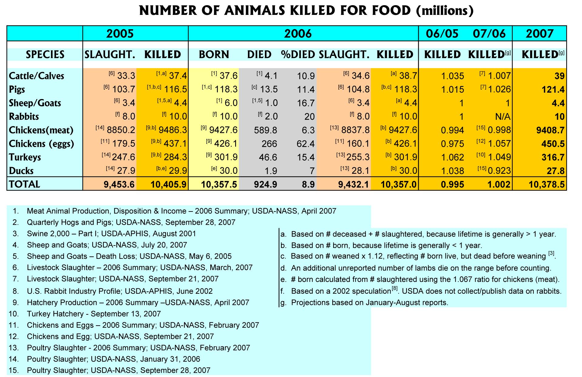
Zu beurteilende Tabelle
Critical comments
- Too many colors where white space would be sufficient.
- The comparison column 07/06 is placed between the two columns it refers to (2006 and 2007), but this is not true for the comparison column 06/05.
- In the columns 06/05 and 07/06 the numbers / decimal points are not aligned.
- A comma is placed to the left of every three digits in the Total row, but not in the table body.
- In the %died column, a % sign is missing after each number.
- In the column headers, years are sometimes formatted using four digits (e.g. 2005), and sometimes using two digits (e.g. 06/05).
- Columns 06/05 and 07/06 use a higher precision / more digits after the comma.
- Different fonts are used in the table body and the column / row headers.
- Some column headers are set to bold font and some are not.
- All numbers in the 2007 column are bold just like the numbers in the Total row, although the 2007 numbers do not summarize anything.
- Columns are separated from each other using colors, which makes it difficult to scan through the rows and compare numbers from one row to each other.
- The spanner header 2005 is not aligned to the center, while all other spanner headers are center-aligned.
- The outer grid is not necessary.
- More categories are available in the 2006 section than in the 2005 and 2007 section.
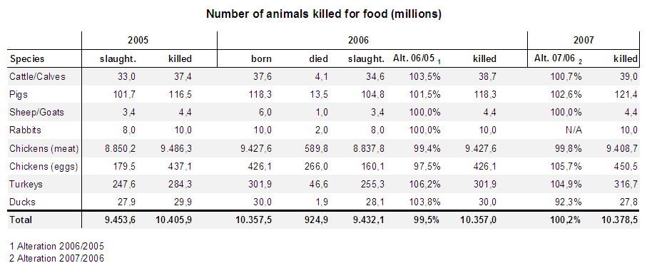
Adapted table
Adaptions
- The color-seperation was replaced by a whitespace(grey background on every second row). By using the whitespaces the colors don't distract and the information is easily readable
- The comparison columns were placed at the end of the table. The placement between the years leads to confusion
- The numbers / decimal points are aligned in all columns
- The usage of a comma/point is being applied to all numbers the same
- The %-Symbol has been added everywhere it is supposed to be
- The formatting in the headers and the table now has a standard.
- The usage of decimal places has been standardized
- One font has been chosen for the whole table diversifying in weight and size
- All column headers are now bold
- Only the numbers in the total column are now bold. This way there is no confusion about the usage of this formating
- The seperation through a whitespace is a great way to seperate columns.
- The spanner-headers are all aligned the same way
- The outer grid has been removed
- Due to the fact, that there is not enough information in the years 2005 and 2007, the main order in the table is now the "killed" column. From this column there is the information from all given years

