Teaching:TUW - UE InfoVis WS 2008/09 - Gruppe 05 - Aufgabe 2
Aufgabenstellung
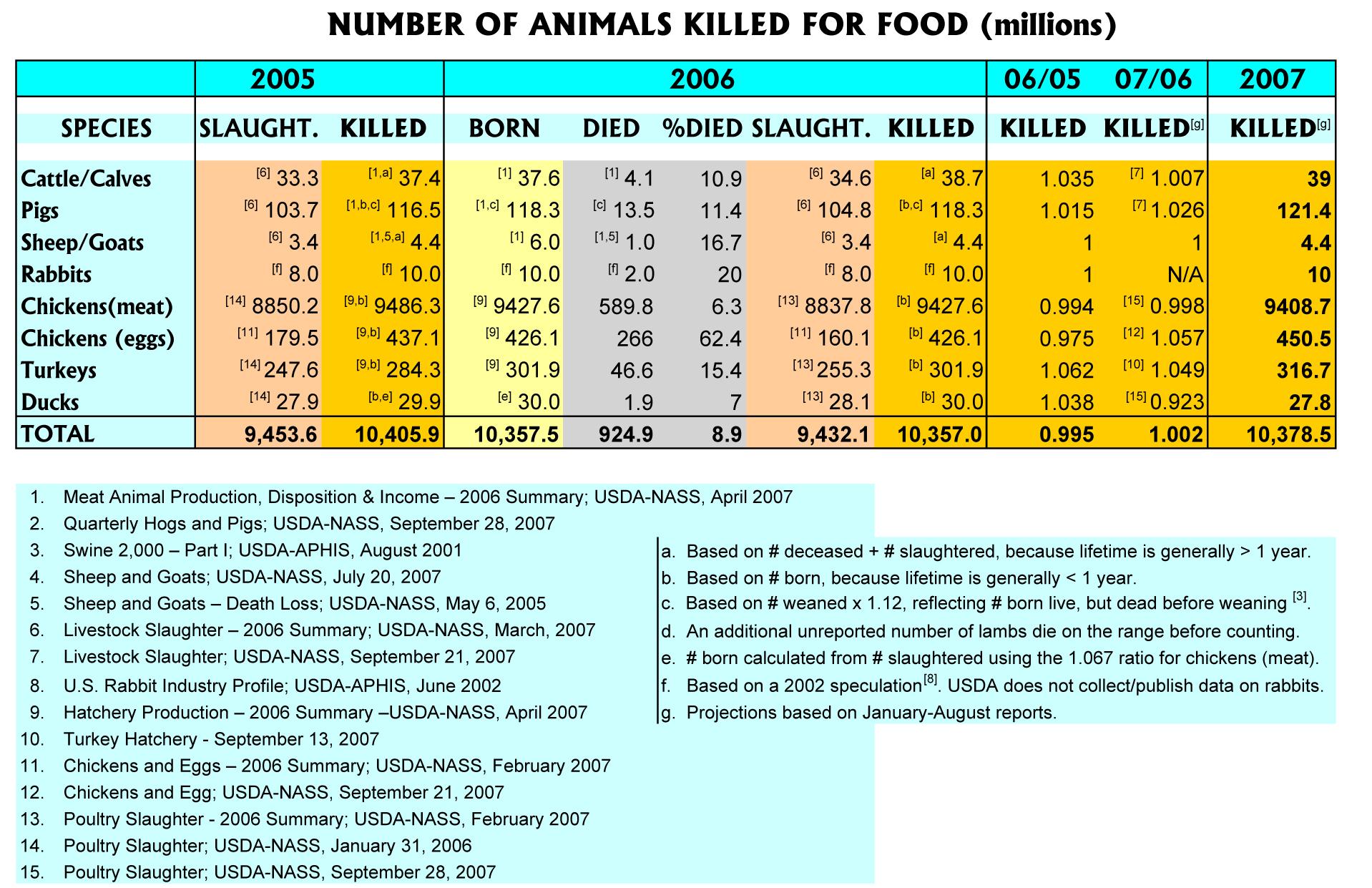
Zu beurteilende Tabelle
Critical comments
- Too many colors where white space would be sufficient
- The comparison column 07/06 is placed between the two columns it refers to (2006 and 2007), but this is not true for the comparison column 06/05
- In the columns 06/05 and 07/06 the numbers / decimal points are not aligned
- A comma is placed to the left of every three digits in the Total row, but not in the table body
- In the %died column, a % sign is missing after each number
- In the column headers, years are sometimes formatted using four digits (e.g. 2005), and sometimes using two digits (e.g. 06/05)
- Columns 06/05 and 07/06 use a higher precision / more digits after the comma
- Different fonts are used in the table body and the column / row headers
- Some column headers are set to bold font and some are not
- All numbers in the 2007 column are bold just like the numbers in the Total row, although the 2007 numbers do not summarize anything
- Columns are separated from each other using colors, which makes it difficult to scan through the rows and compare numbers from one row to each other
- The spanner header 2005 is not aligned to the center, while all other spanner headers are center-aligned
- The outer grid is not necessary
- More categories are available in the 2006 section than in the 2005 and 2007 section
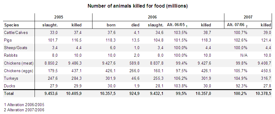
Adapted table
Adaptions
- The color-seperation was replaced by a whitespace(grey background on every second row). By using the whitespaces the colors don't distract and the information is easily readable
- The comparison columns were placed at the end of the table. The placement between the years leads to confusion
- The numbers / decimal points are aligned in all columns

