Teaching:TUW - UE InfoVis WS 2008/09 - Gruppe 02 - Aufgabe 3
Aufgabenstellung
Zu beurteilende Grafik

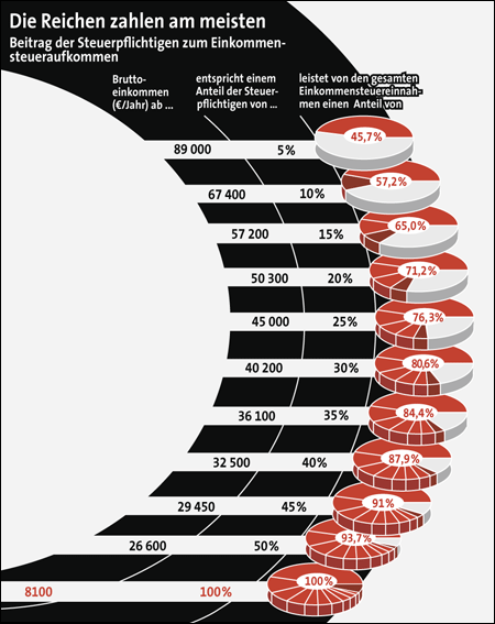
Beitrag der Steuerpflichtigen zum Einkommensteueraufkommen
Critics on the table
- little data-ink ratio
There is too many unnecessary ink used for the graphic, because the important text and values need less place against the borders around them, but not enough to stand out clearly. The greater the ratio of the ink that you use to communicate the data to the total amount of ink in the table or graph (i.e., the closer its value is to one), the better you’ve highlighted the data [Few 2004b].
- visual clutter
- The misalignment of the spending graphic makes the scanning down and across difficult, because we are more sensitve to the vertical and horizontal alignment than we might imagine [Few, 2004a]. If we want to stand out some data, it would be helpful, but in this scenario it isn't.
- The unstructured ordering of the pie charts makes it difficult to separatly scan the major content. Firstly there are too much little pie charts which stand nearly in front of each other and enclosure data "too much".
- Secondly the alignmet is different from line to line. But when using indentation, it should be far enough to make the intention clear[Few 2004b].
- The relation between white space and data space is 1/3.
Correction of the table
Which changes have been made and why is the changed one better than the original table?
References
- [Few, 2004a]:Stephen Few, Show Me the Numbers: Designing Tables and Graphs to Enlighten, Analytics Press, 2004, Chapter 7 - General Design for Communication.
- [Few, 2004b]: Stephen Few, Elegance Through Simplicity, intelligent enterprise, Oct 16, 2004.