Teaching:TUW - UE InfoVis WS 2008/09 - Gruppe 02 - Aufgabe 3: Difference between revisions
No edit summary |
No edit summary |
||
| Line 18: | Line 18: | ||
**The unstructured ordering of the pie charts makes it difficult to separatly scan the major content. Firstly there are too much little pie charts which stand nearly in front of each other and enclosure data "too much". | **The unstructured ordering of the pie charts makes it difficult to separatly scan the major content. Firstly there are too much little pie charts which stand nearly in front of each other and enclosure data "too much". | ||
**Secondly the alignmet of the pie charts is different from line to line. But when using indentation, it should be far enough to make the intention clear[Few 2004b]. | **Secondly the alignmet of the pie charts is different from line to line. But when using indentation, it should be far enough to make the intention clear[Few 2004b]. | ||
**Darker and brighter color makes the contrasting information stand out from the norm. So the red data and pie charts stand out in the graphic, but they aren't as important as they look. The last "100%- and lowest-income-row" doesn't underline the title of the graphic "The richest pay the most". This information would show the first row, but this one isn't red-coloured. | |||
Revision as of 13:25, 4 December 2008
Aufgabenstellung
Zu beurteilende Grafik

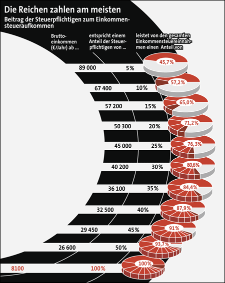
Beitrag der Steuerpflichtigen zum Einkommensteueraufkommen
Critics on the table
- little data-ink ratio
There is too many unnecessary ink used for the graphic, because the important text and values need less place against the borders around them, but not enough to stand out clearly. The greater the ratio of the ink that you use to communicate the data to the total amount of ink in the table or graph (i.e., the closer its value is to one), the better you’ve highlighted the data [Few 2004b].
- visual clutter
- The misalignment of the spending graphic makes the scanning down and across difficult, because we are more sensitve to the vertical and horizontal alignment than we might imagine [Few, 2004a]. If we want to stand out some data, it would be helpful, but in this scenario it isn't.
- The objects positioned on the right are also less seen than the objects positioned on the top, left or in the center and this graphic spent to the right. So the region which could include the easy seen data is unnecessarily white[Few 2004b].
- The unstructured ordering of the pie charts makes it difficult to separatly scan the major content. Firstly there are too much little pie charts which stand nearly in front of each other and enclosure data "too much".
- Secondly the alignmet of the pie charts is different from line to line. But when using indentation, it should be far enough to make the intention clear[Few 2004b].
- Darker and brighter color makes the contrasting information stand out from the norm. So the red data and pie charts stand out in the graphic, but they aren't as important as they look. The last "100%- and lowest-income-row" doesn't underline the title of the graphic "The richest pay the most". This information would show the first row, but this one isn't red-coloured.
- Organisation of the data
The way the diagram presents the data doesn't fit the message in the header at all. It's not crucial to know that 50 Percentage of taxpayers whose gross income is more than 26600 € are paying 93.7 Percentage of the collective income tax. To deliver the message correctly it's better to segment the data into meaningful subsets [Few 2004b]. Thus you group the gross income data into groups with upper and lower limits and recalculate the collective tax proportion for these boundaries. Accordingly you have separated the different income groups and can point out the specific tax proportion. Now it's clearly visible that the biggest fraction of taxpayers whose income is between 8,100€ and 29,450€ (55 percentage) are in fact paying only 9 percentage and the smallest and richest fraction are paying 45.7 percentage of the collective income tax.
Correction of the table
Which changes have been made and why is the changed one better than the original table?
References
- [Few, 2004a]:Stephen Few, Show Me the Numbers: Designing Tables and Graphs to Enlighten, Analytics Press, 2004, Chapter 7 - General Design for Communication.
- [Few, 2004b]: Stephen Few, Elegance Through Simplicity, intelligent enterprise, Oct 16, 2004.