Teaching:TUW - UE InfoVis WS 2008/09 - Gruppe 02 - Aufgabe 2
Aufgabenstellung
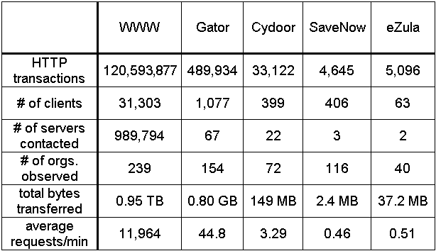
Zu beurteilende Tabelle
Critics on the table
- distracting grid
- The grid make the table difficult to read, because it distract the eyes. Less rulers and grid would increase the table's effectivness[FEW, 2004].
- missing labels = missing information
- The table's information isn't clear defined, because of the missing Title/Header.
- In addition there should be a title AND subheader because of the multiple variables. So the column should be titled with the name following by the units of :measurement[NSF, 2004].
- bad ordering of the data
- column Sequence
- Sets of categorial subdivision like the different products: "WWW", "Gator", "Cydoor", "SaveNow" and "eZula" should be sequenced from left to right and the categorial subdivision should be arranged down the rows of a single column to the left of the quantitative values associated with them[FEW, 2004]. So the information of the table would be shown better by placing the data of the columns in the rows an the data of the rows in the columns.
- data sequence
- The ordering of the data in the first row isn't logic, so I would prefer to place the products in an ascending or descending order of the first column values. It is also impossible to have a conventional order based on alphabetical sequence, which is useful for look-up purposes but isn't meaningful otherwise[FEW, 2004].
- centered alignment of the values and the text
- -make it difficult to read the table.
- Numbers that represent quantitative values should always be aligned to the right and text to the right[FEW, 2004]. All the numbers in the columns should line up with each other and with their headings[NSF, 2004], each using same number of decimal digits. So some values
- number precision
- Some numbers in the table should and could be reduced without the loss of meaningful information to line up with each other in the column.
- To make the reading of the table easily, it is also prefered to truncate the display of whole numbers by sets of three decimal digits, and declare it in the title or header[FEW, 2004] and not in the table body like in the "total bytes transferred"-row.
Correction on the table
grafic of new table
Which changes have been made and why is the changed one better than the original table?
References
- [FEW, 2004]:Stephen Few, Show Me the Numbers: Designing Tables and Graphs to Enlighten, Analytics Press, 2004, Chapter 8 - Table Design.
- [NSF, 2004]: Rosa Wallace, Designing Tables, NC State University LabWrite Resources, 2004.
http://www.ncsu.edu/labwrite/res/gh/gh-tables.html
