Teaching:TUW - UE InfoVis WS 2008/09 - Gruppe 01 - Aufgabe 3: Difference between revisions
Jump to navigation
Jump to search
No edit summary |
No edit summary |
||
| Line 24: | Line 24: | ||
** The 3-D Scatter plot which aims plotting the relationship between time and rising tides has an unclarity. It is not written on the axes what they refer to. Does the x-axis represent rising sea levels in centimeters ? and Does the y-axis refer to time in years ?. | ** The 3-D Scatter plot which aims plotting the relationship between time and rising tides has an unclarity. It is not written on the axes what they refer to. Does the x-axis represent rising sea levels in centimeters ? and Does the y-axis refer to time in years ?. | ||
** It is not easy to guess what the graph is about, because of the missing clear titles and introduction. How should be the graph interpreted by readers ? | ** It is not easy to guess what the graph is about, because of the missing clear titles and introduction. How should be the graph interpreted by readers ? | ||
** The sequence could have been clarified with some text | ** The sequence could have been clarified with some text, but in the following graph there is no sequence, therefore the current placements of the texts are not helping the readers to find an order in which data should be read. | ||
===Corrections on the table === | ===Corrections on the table === | ||
Revision as of 17:31, 9 December 2008
Aufgabenstellung
Zu beurteilende Grafik
Critics on the table
- Non-data ink is high :
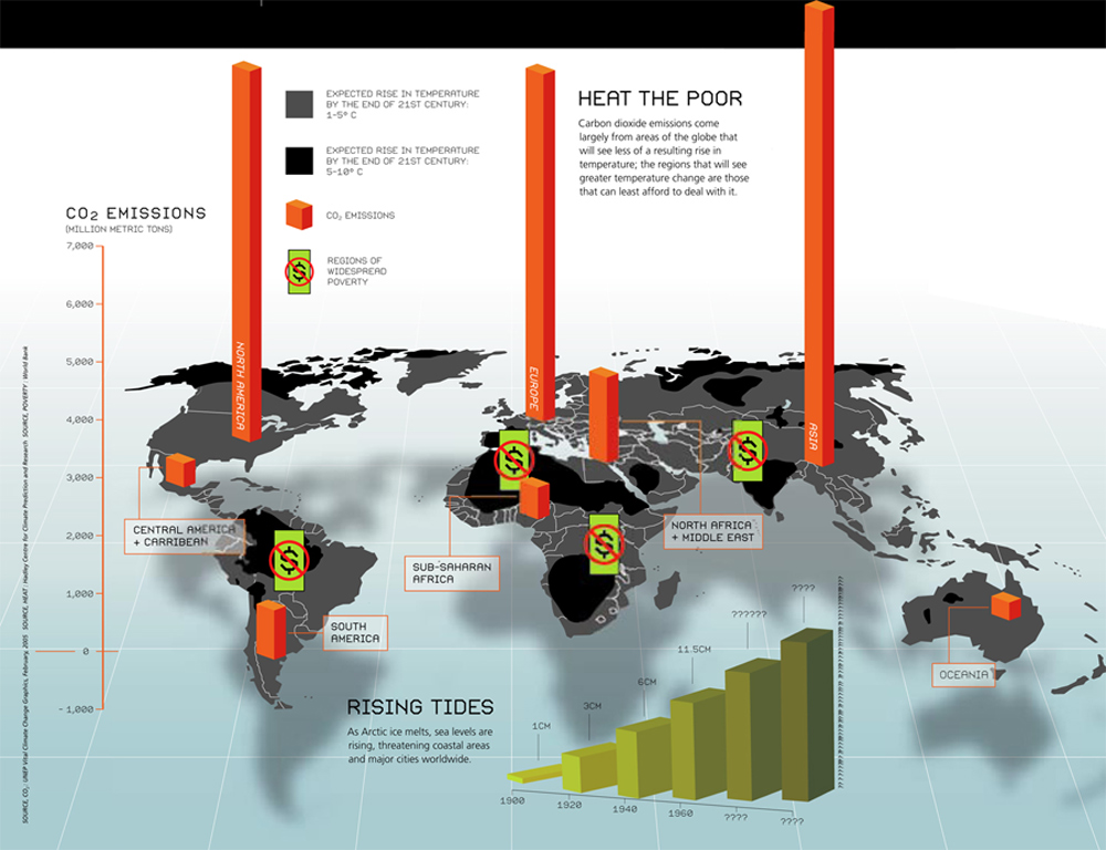
- Shadowing and the 3-D visualization of the World Map, 3d visualization of the CO2 emissions and rising tides, these objects increase the non-data ink, thus decreasing the data-ink ratio.
- 3-D CO2 Emission Bars block some the regions which is supposed to convey important information. (Especially the regions in black)
- The icon, which aims to emphasize regions of poverty, blocks important information and de-emphasizes the data-ink, although this icon doesn't convey a precise information.
- Consequently the real message or data is not supported in the Graph, which is against the task of visualizing quantitative information.
- The data is unorganized :
- The essential message of the graph is not clear, CO2 emissions of Regions ? Heat the Poor ? or the rising tides ?
- It is not clear which data has more priority.
- The data is not sequenced, thus confusing the readers. In other words there is no direction for order in which data should be read.
- Scales,Plots and Texts :
- The CO2 Emissions scale on the left side of the graph can't be taken as a reference, cause it is far away from the CO2 emission bars.
- The negative axis of CO2 Emissions scale refers to nothing, since CO2 emissions can't have a negative value.
- The 3-D Scatter plot which aims plotting the relationship between time and rising tides has an unclarity. It is not written on the axes what they refer to. Does the x-axis represent rising sea levels in centimeters ? and Does the y-axis refer to time in years ?.
- It is not easy to guess what the graph is about, because of the missing clear titles and introduction. How should be the graph interpreted by readers ?
- The sequence could have been clarified with some text, but in the following graph there is no sequence, therefore the current placements of the texts are not helping the readers to find an order in which data should be read.
