Teaching:TUW - UE InfoVis WS 2008/09 - Gruppe 01 - Aufgabe 3: Difference between revisions
Jump to navigation
Jump to search
(some critics are added..) |
mNo edit summary |
||
| Line 12: | Line 12: | ||
** 3-D CO2 Emission Bars block some the regions which is supposed to convey important information. (Especially the regions in black) | ** 3-D CO2 Emission Bars block some the regions which is supposed to convey important information. (Especially the regions in black) | ||
** The icon, which aims to emphasize regions of poverty, blocks important information and de-emphasizes the data-ink, although this icon doesn't convey a precise information. | ** The icon, which aims to emphasize regions of poverty, blocks important information and de-emphasizes the data-ink, although this icon doesn't convey a precise information. | ||
** Consequently the real message or data is not supported in the Graph, which is against the task of visualizing quantitive information. | |||
** | |||
Revision as of 15:51, 9 December 2008
Aufgabenstellung
Zu beurteilende Grafik
Critics on the table
- Non-data ink is high :
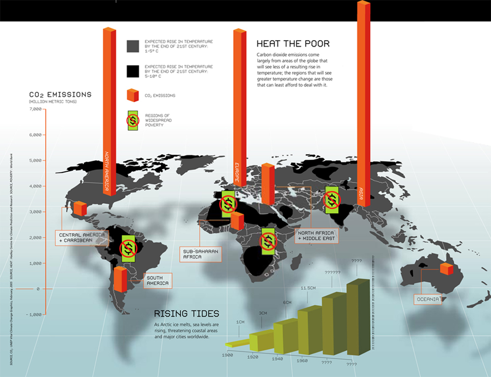
- Shadowing and the 3-D visualization of the World Map, 3d visualization of the CO2 emissions and rising tides, these objects increase the non-data ink, thus decreasing the data-ink ratio.
- 3-D CO2 Emission Bars block some the regions which is supposed to convey important information. (Especially the regions in black)
- The icon, which aims to emphasize regions of poverty, blocks important information and de-emphasizes the data-ink, although this icon doesn't convey a precise information.
- Consequently the real message or data is not supported in the Graph, which is against the task of visualizing quantitive information.
