Teaching:TUW - UE InfoVis WS 2008/09 - Gruppe 01 - Aufgabe 2
Aufgabenstellung
Exercise 2
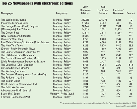
Table to evaluate
Critics on the table
- The titel doesn´t contain of which year(s) the Top 25 is and you don´t know which period of the year is used. Because the reference source is from March 2007 and it is not possible that the "whole" years 2006 and 2007 are compared.
- The table shows the Top 25, but from the the way the lines are ordered its not easy to get the rank for example the Top 7. Further it´s not easy to follow the horizontal line, because there are grids and rules missing.
- The mean of the colum "Increase/Decrease" is not clear, what shall it mean?
- In the colum "Percent" after every data the symbol % is missing and only in some cases a decimal place is published.
- The column "2006" and "2007" is not in chronological order.
- The subtitle electronic editions is used two times.
- A comma is placed to the left of every three digits of numbers and the data aligne centered. So the direct comparison with the other lines is not possible - you get an false impression of the size of the number.
- Because of the way numbers are written and read, aligning them to the left or
center makes them difficult to interpret.
- The column “-Frequency” is not important because there is only one exception.
- It is difficult to track across the rows with this spacing.
- The name of the district is just published in same cases.
Correction on the table

Which changes have been made? Why is the changed one better than the original table?
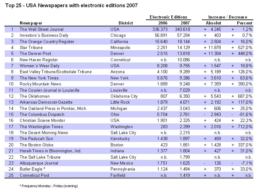
- Title should point on the year and the country in which the evaluation takes places. Our new title is: „Top 25 - USA Newspapers with electronic editions 2006/2007“. With this title you know exactly what’s the topic of the table, where the data comes from and in which time period it takes place.
- Percent Numbers should have a + or – in front and a % behind the number to make the it easier to read. Place a percentage sign (i.e., %) immediately to the right of every percentage value (e.g., 8.75%). Numbers should have the same size of decimal place. If they have the have have the same size it is easier to see which data is bigger and which is smaller. With a % sign afterwards you know with the first look at the row that, every line means a percental number.
- If a header is used for two columns there can be just one header instead of one for every column (i.e. subheader 2006/2007). It is easier to see the dependency of the two rows if the header is used for both of them.
- Because we don’t want to suggest that the columns are more important than the rows data, we’ve used a row fill color the highlight them.
- The Columns are not in chronological order. We have exchanged the rows 2007 and 2006 because the reading direction is from the left to the right.
- Numbers have to be right-aligned with a komma for a thousands digit and a point for a decimal place. Further they should have the same number of decimal place. With the points and kommas it is easier to read the numbers and with the same size of the decimal place and the right-align it’s a lot easier to see which data is bigger then an other one.
References
- [Few, 2004]:Stephen Few, Show Me the Numbers: Designing Tables and Graphs to Enlighten, Analytics Press, 2004, Chapter 8 - Table Design.
- [Wallace, 2004]: Rosa Wallace, Designing Tables, NC State University LabWrite Resources, 2004. http://www.ncsu.edu/labwrite/res/gh/gh-tables.html
