Teaching:TUW - UE InfoVis WS 2008/09 - Gruppe 01 - Aufgabe 2
Aufgabenstellung
EXERCISE 2
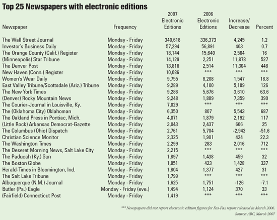
Table to evaluate
Critics on the table
- The table shows the Top 25, but because of the way the lines are ordered its not easy to get the rank for exampe the Top 7 (From the order the Rank of the Newspapers are not clear). Also it´s not easy to follow the horizontal line, because there is a lack of grids and rules.
- The titel doesn´t contain of which year the Top 25 is.
- The mean of the colum "Increase / Decrease" is not clear, what shall it mean=
- In the colum "Percent" after every data the symbol % is missing.
- The column "2006" and "2007" should be in chronological order.
- Title is bold, but subtitle is not ….. Subtitel besser hervorheben
- Numbers: there is a comma (A comma is placed to the left of every three digits), but the data is center aligned.So the direct comparison with the other lines is not possible - you get an false impression of the number-
- The Row “frequency” is not from importance because there is only one exception, would be better as text info with *, so the table body is clear from unimportant data / contains only important data (number).
- Because of the way numbers are written and read, aligning them to the left or
center makes them difficult to interpret.
- It is difficult to track across the rows with this spacing => besser : white space between the rows equal to the height of the rows (siehe Fig. 8.3) In the next example, I’ve exceeded the practical limits of vertical white space, with white space that equals 150% the height of the data. Figure8.4In this case you certainly don’t have any difficulty tracking across the rows, but too few rows now fit on the page
Correction on the table
grafic of new table
Which changes have been made? Why is the changed one better than the original table?
- Titel sollte sich aufs Jahr beziehen – Top 25 (2007); weiters bezieht es sich auf USA oder ? => Top 25 USA Newspaper … 2007
- bei Prozent + oder -
Nicht nur Prozent sondern auch % (Symbolkraft,visuelle Typen) Place a percentage sign (i.e., %) immediately to the right of every percentage value (e.g., 8.75%).
- Negative Zahlen in Klammer ? (+- oder rote, grüne Schrift)
- gemeinsamer Header (Unterpunkte 2006/2007)
- grau, weiß horizontale Aufmerksamkeit auf Zeile und nicht auf Spalte!!!
Because we don’t want to suggest that the names of the months or the totals are more important than the other data, I’ve used a subtle fill color.
- Störend dass zuerst 2007 dann 2006 – um drehen zuerst 2006 und dann 2007 (chronologische Reihenfolge) – Lesefluss von links nach rechts
chronological order of dates and times.
- Zahlen rechtsbündig, mit , für Tausenderstellen bzw. gleiche Anzahl an Nachkommastellen
- Highlights setzen? Mit Zellenhintergrundfarbe oder mit Schriftfarbe
References
- [Few, 2004]:Stephen Few, Show Me the Numbers: Designing Tables and Graphs to Enlighten, Analytics Press, 2004, Chapter 8 - Table Design.
- [Wallace, 2004]: Rosa Wallace, Designing Tables, NC State University LabWrite Resources, 2004. http://www.ncsu.edu/labwrite/res/gh/gh-tables.html
