Teaching:TUW - UE InfoVis WS 2008/09 - Gruppe 01 - Aufgabe 2: Difference between revisions
Jump to navigation
Jump to search
No edit summary |
No edit summary |
||
| Line 11: | Line 11: | ||
===Critics on the table=== | ===Critics on the table=== | ||
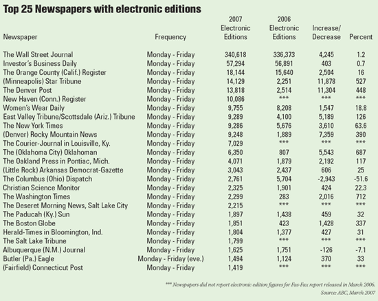
* The titel doesn´t contain of which year(s) the Top 25 is and you don´t know which period of the year is used. Because the reference source is from March 2007 and it is not possible that the "whole" years 2006 and 2007 are compared. | * The titel doesn´t contain of which year(s) the Top 25 is and you don´t know which period of the year is used. Because the reference source is from March 2007 and it is not possible that the "whole" years 2006 and 2007 are compared. | ||
* The table shows the Top 25, but from the the way the lines are ordered its not easy to get the rank for example the Top 7. Further it´s not easy to follow the horizontal line, because there are grids and rules | * The table shows the Top 25, but from the the way the lines are ordered its not easy to get the rank for example the Top 7. Further it´s not easy to follow the horizontal line, because there are no grids and rules . | ||
* The mean of the colum "Increase/Decrease" is not clear, what shall it mean? | * The mean of the colum "Increase/Decrease" is not clear, what shall it mean? | ||
* In the colum "Percent" after every data the symbol % is missing and only in some cases a decimal place is published. | * In the colum "Percent" after every data the symbol % is missing and only in some cases a decimal place is published. | ||
* The column "2006" and "2007" is not in chronological order. | * The column "2006" and "2007" is not in chronological order. | ||
* The subtitle electronic editions is used two times. | * The subtitle electronic editions is used two times. | ||
* A comma is placed to the left of every three digits of numbers | * A comma is placed to the left of every three digits of numbers, but because of the way numbers are written(aligned to the center) makes them difficult to interpret. So the direct comparison with the other lines is not possible - you can get a false impression of the size of the number. | ||
* The column “Frequency” is not important because there is only one exception. | * The column “Frequency” is not important because there is only one exception. | ||
* It is difficult to track across the rows with this spacing. | * It is difficult to track across the rows with this spacing. | ||
* The name of the district is just published in | * The name of the district is just published in some cases. It is placed with parenthesis in the title. | ||
===Correction on the table === | ===Correction on the table === | ||
| Line 29: | Line 28: | ||
===Changes on the table=== | ===Changes on the table=== | ||
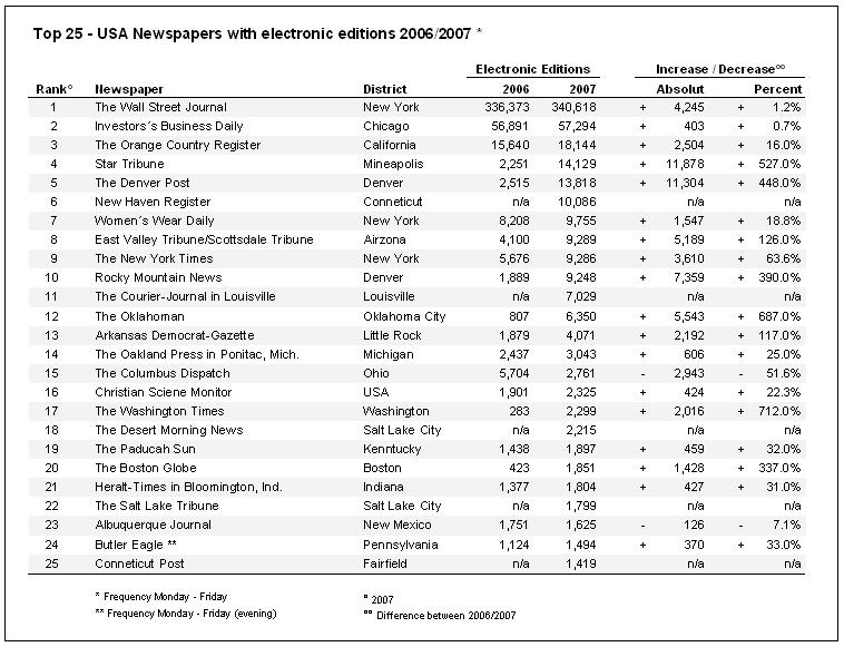
* Title should point on the year and the country in which the evaluation takes places. Our new title is: „Top 25 - USA Newspapers with electronic editions 2006/2007“. With this title you know exactly what’s the topic of the table, where the data comes from and in which time period it takes place. | * Title should point on the year and the country in which the evaluation takes places. Our new title is: „Top 25 - USA Newspapers with electronic editions 2006/2007“. With this title you know exactly what’s the topic of the table, where the data comes from and in which time period it takes place. | ||
* Percent Numbers should have a + or – in front and a % behind the number to make the it easier to read. Place a percentage sign (i.e., %) immediately to the right of every percentage value (e.g., 8.75%). Numbers should have the same size of decimal place. If they have | * Percent Numbers should have a + or – in front and a % behind the number to make the it easier to read. Place a percentage sign (i.e., %) immediately to the right of every percentage value (e.g., 8.75%). Numbers should have the same size of decimal place. If they have they have the same size it is easier to see which data is bigger and which is smaller. With a % sign afterwards you know with the first look at the row that every line means a percental number. | ||
* If a header is used for two columns there can be just one header instead of one for every column (i.e. subheader 2006/2007). It is easier to see the dependency of the two rows if the header is used for both of them. | * If a header is used for two columns there can be just one header instead of one for every column (i.e. subheader 2006/2007). It is easier to see the dependency of the two rows if the header is used for both of them. | ||
* Because we don’t want to suggest that the columns are more important than the rows data, we’ve used a row fill color the highlight them. | * Because we don’t want to suggest that the columns are more important than the rows data, we’ve used a row fill color the highlight them. | ||
* The Columns are not in chronological order. We have exchanged the rows 2007 and 2006 because the reading direction is from the left to the right. | * The Columns are not in chronological order. We have exchanged the rows 2007 and 2006 because the reading direction is from the left to the right. | ||
* Numbers have to be right-aligned with a | * Numbers have to be right-aligned with a comma for a thousands digit and a point for a decimal place. Further they should have the same number of decimal place. With the points and commas it is easier to read the numbers and with the same size of the decimal place and the right-alignment it’s a lot easier to see which data is bigger then an other one. | ||
* In some cases the name of the origin of the newspaper is in the title. Sometimes left, right or in the name. We changed this | * In some cases the name of the origin of the newspaper is in the title. Sometimes left, right or in the name. We changed this by making a new row with the district of every newspaper. Now you can read this information if you are interested in or just leave it out. | ||
* The value Frequency is for every row except of one the same. We have deleted this row and made a legend under the table, which descripes the behavior. With this step we saved much place with information that is not that important. | * The value Frequency is for every row except of one the same. We have deleted this row and made a legend under the table, which descripes the behavior. With this step we saved much place with information that is not that important. | ||
Revision as of 22:49, 21 November 2008
Aufgabenstellung
Exercise 2
Table to evaluate
Critics on the table
- The titel doesn´t contain of which year(s) the Top 25 is and you don´t know which period of the year is used. Because the reference source is from March 2007 and it is not possible that the "whole" years 2006 and 2007 are compared.
- The table shows the Top 25, but from the the way the lines are ordered its not easy to get the rank for example the Top 7. Further it´s not easy to follow the horizontal line, because there are no grids and rules .
- The mean of the colum "Increase/Decrease" is not clear, what shall it mean?
- In the colum "Percent" after every data the symbol % is missing and only in some cases a decimal place is published.
- The column "2006" and "2007" is not in chronological order.
- The subtitle electronic editions is used two times.
- A comma is placed to the left of every three digits of numbers, but because of the way numbers are written(aligned to the center) makes them difficult to interpret. So the direct comparison with the other lines is not possible - you can get a false impression of the size of the number.
- The column “Frequency” is not important because there is only one exception.
- It is difficult to track across the rows with this spacing.
- The name of the district is just published in some cases. It is placed with parenthesis in the title.
Correction on the table
Changes on the table
- Title should point on the year and the country in which the evaluation takes places. Our new title is: „Top 25 - USA Newspapers with electronic editions 2006/2007“. With this title you know exactly what’s the topic of the table, where the data comes from and in which time period it takes place.
- Percent Numbers should have a + or – in front and a % behind the number to make the it easier to read. Place a percentage sign (i.e., %) immediately to the right of every percentage value (e.g., 8.75%). Numbers should have the same size of decimal place. If they have they have the same size it is easier to see which data is bigger and which is smaller. With a % sign afterwards you know with the first look at the row that every line means a percental number.
- If a header is used for two columns there can be just one header instead of one for every column (i.e. subheader 2006/2007). It is easier to see the dependency of the two rows if the header is used for both of them.
- Because we don’t want to suggest that the columns are more important than the rows data, we’ve used a row fill color the highlight them.
- The Columns are not in chronological order. We have exchanged the rows 2007 and 2006 because the reading direction is from the left to the right.
- Numbers have to be right-aligned with a comma for a thousands digit and a point for a decimal place. Further they should have the same number of decimal place. With the points and commas it is easier to read the numbers and with the same size of the decimal place and the right-alignment it’s a lot easier to see which data is bigger then an other one.
- In some cases the name of the origin of the newspaper is in the title. Sometimes left, right or in the name. We changed this by making a new row with the district of every newspaper. Now you can read this information if you are interested in or just leave it out.
- The value Frequency is for every row except of one the same. We have deleted this row and made a legend under the table, which descripes the behavior. With this step we saved much place with information that is not that important.

