Teaching:TUW - UE InfoVis WS 2007/08 - Gruppe 07 - Aufgabe 3
Assignment description
Assigned Graphic
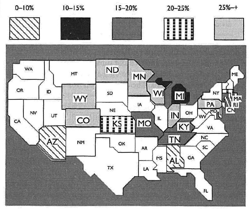
 Established Percentage of Homes that Exceed EPA's Recommended Level for Radon
Used terminology
In this section, we will try to explain several terms used through the rest of the article.
- Data-ink - Data-Ink is a ratio that specifies how much of the visual presentation in a graphic really describes some concrete data. The equation looks something like this: data-ink / all-ink = data-ink-ration. The value of a data-ink ratio always lies between 1 and 0, the bigger the number, the better. The goal is not to eliminate all visual elements that doesn't have anything to do with the data directly but to minimize unnecessary visual data. The target is to move the data into the foreground and to make it stand out.
Critique
One of the first things that the observer sees by looking at the graphic is that about a half of all US states cannot be matched according to the legend. The blank-filled (white) states doesn't have an explanation so you can't really tell if these states haven't been considered in this statistic or if it's simply a bug in the graphic. The next thing is the gray-shaded fill of each state. Using some color would make the states more differentiable. Of course, there are some cases where no color can be used as common daily print media for instance. Nevertheless, the variety of fill styles (solid monochromatic fills and patterns) in this graphic is not be easily interpreted by the observer.