Teaching:TUW - UE InfoVis WS 2007/08 - Gruppe 07 - Aufgabe 3: Difference between revisions
No edit summary |
No edit summary |
||
| Line 15: | Line 15: | ||
{{Quotation|Graphics must not quote data out of context.|[Mizuno et al., 1999]}} | {{Quotation|Graphics must not quote data out of context.|[Mizuno et al., 1999]}} | ||
===Colors=== | ===Colors And Fill Styles=== | ||
At first view, it's difficult to detect differences in the shading of | At first view, it's difficult to detect differences in the shading of two used gray values (0-10% and 25%+). Using colors or gray values that visualy seem to be different from each other would make the states more distinguishable in this graphic - concerning the fact that different statements (percentages of homes) should be related to the states. | ||
We assume (inspired by the different font size) that states with higher percentages are those that are more important to us. The use of bigger font sizes in this graphic is not the ideal solution. A better way would be to use brighter colors (more saturated or lighter) for those states we want to stand out. | |||
For other graphical representations it's often better to use similar color values. But in this case, for the purpose of pointing out the main statement of the representation - "some countries have higher percentages than others, hence there is more radiation and more risk" - it's very useful to use distinct color or gray values to emphasize exactly this fact. | |||
Of course, sometimes it is not possible to use colors for such graphics because of economic issues, as common daily print media for instance.<br><br> | |||
Additionally, the variety of fill styles (solid monochromatic fills and patterns) in this graphic couldn't be easily interpreted by the observer. First thing is the mixture of patterns and solid color fills. The second thing is the ordering of these fills. The class with the lowest percentage (0 - 10%) has a striped fill pattern. The next class (10 - 15%) has a solid color fill that is almost black. The following class (15 - 20%) has a slightly lighter fill color than the previous one. The next one (20 - 25%) uses a pattern again whereas the following is filled with a solid color again. It would be much wiser to stick to one fill style (solid color or pattern). | |||
=== Data Ink === | === Data Ink === | ||
Revision as of 00:35, 14 December 2007
Assignment description
Assigned Graphic
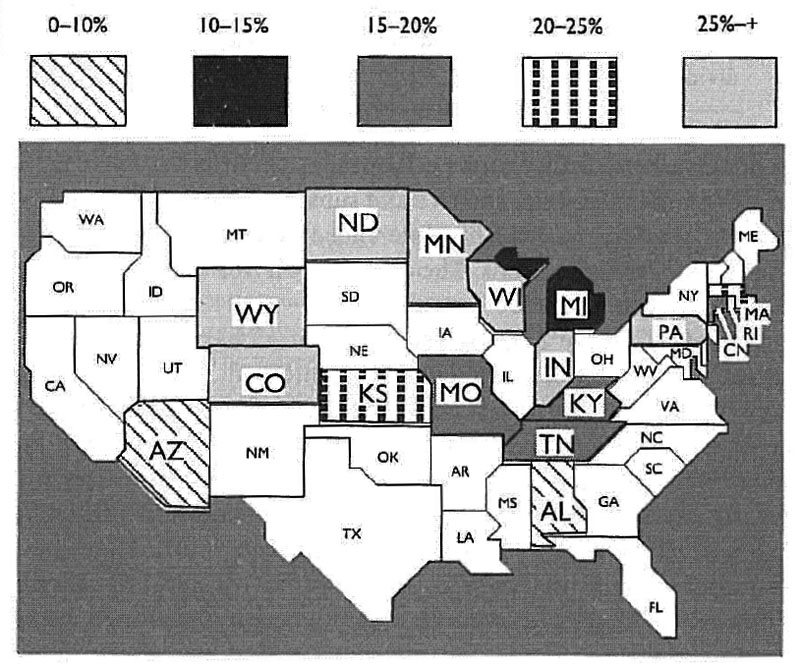
 Established Percentage of Homes that Exceed EPA's Recommended Level for Radon
Terminology
- Data-ink - Data-Ink is a ratio that specifies how much of the visual presentation in a graphic really describes some concrete data. The equation looks something like this: data-ink / all-ink = data-ink-ration. The value of a data-ink ratio always lies between 1 and 0, the bigger the number, the better. The goal is not to eliminate all visual elements that doesn't have anything to do with the data directly but to minimize unnecessary visual data. The target is to move the data into the foreground and to make it stand out. The amount of redundant data that is not being used should be minimized - here is an appropriate citation:
Critics
At First Glance
One of the first things that the observer sees by taking a look at the graphic is, that nearly a half of all the US states cannot be matched according to the legend. For the blank (white filled) states there is no further explanation in the legend. So, it's not clear if the states haven't been considered in this graphical representation of statistical data or if it's simply the result of a bad copy or print.
Colors And Fill Styles
At first view, it's difficult to detect differences in the shading of two used gray values (0-10% and 25%+). Using colors or gray values that visualy seem to be different from each other would make the states more distinguishable in this graphic - concerning the fact that different statements (percentages of homes) should be related to the states.
We assume (inspired by the different font size) that states with higher percentages are those that are more important to us. The use of bigger font sizes in this graphic is not the ideal solution. A better way would be to use brighter colors (more saturated or lighter) for those states we want to stand out.
For other graphical representations it's often better to use similar color values. But in this case, for the purpose of pointing out the main statement of the representation - "some countries have higher percentages than others, hence there is more radiation and more risk" - it's very useful to use distinct color or gray values to emphasize exactly this fact.
Of course, sometimes it is not possible to use colors for such graphics because of economic issues, as common daily print media for instance.
Additionally, the variety of fill styles (solid monochromatic fills and patterns) in this graphic couldn't be easily interpreted by the observer. First thing is the mixture of patterns and solid color fills. The second thing is the ordering of these fills. The class with the lowest percentage (0 - 10%) has a striped fill pattern. The next class (10 - 15%) has a solid color fill that is almost black. The following class (15 - 20%) has a slightly lighter fill color than the previous one. The next one (20 - 25%) uses a pattern again whereas the following is filled with a solid color again. It would be much wiser to stick to one fill style (solid color or pattern).
Data Ink
First thing we criticize on this graphic is the use of relatively thick lines that make are supposed to make the differentiation between the US states visible. Thinner lines would make this graphic much brighter and easier to read. The use of larger characters for states names according to the class they belong to is a valid way to point out some data, but it creates an unorganized look in a couple of cases on this graphic. For instance, the area covered by Michigan, Indiana, Kentucky and Tennessee looks unorganized due to the geographical location of these (and surrounding) states. The use of a simple color / fill pattern differentiation would be more accurate here. A problematic part of this graphic is the northern part of the east coast. There are many smaller states and the placement of labels is very problematic here.
Another issue to be discussed is the grouping of the data. This graphic is relatively simple because of the fact that it only tries to point out one single main idea. This main idea is a certain percentage for each US state. A standard way to achieve some basic grouping would be to use proximity which in our case cannot be applied because the alignment of the states is defined by their geographical placement. So the solution for this problem is the separation by using different hues as fill colors for the states.
The missing accuracy in this graphic (the border between North and South Dakota; Wisconsin, Iowa and Illinois; Kansas and Oklahoma and some others) steals the observer's attention unnecessarily. Such defects should be avoided.
The use of state abbreviation instead of full names as labels is the right choice here because there would be hardly any place place for long names.
This graphic misses the about the date when the presented information has been gathered although this information could be crucial for some people. The information about the source of this information are missing as well.
Improvements
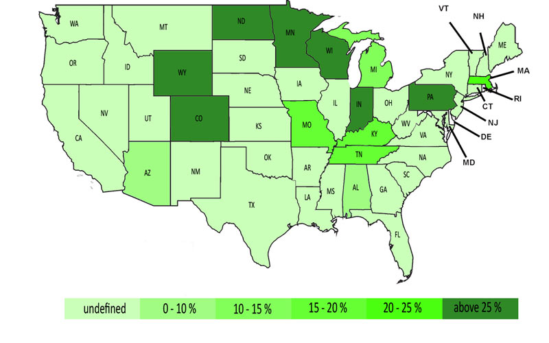
First thing we considered to be changed in the original graphic were the fill colors / patterns. These weren't consistent because they've mixed solid color fills with fill patterns. We decided only to use solid colors for classifications. We also casted the idea of using different hues aside and concentrated on how to visualize that all these classes have something in common. Lastly, we achieved this by modifying the lightness of the green color.
In addition, we decided to make all the state labels use the same font size to point up the homogeneity of the data. The classes stand out only because of their fill colors.
The thickness of the borders between the states is thin enough not to stand out but also thick enough to be visible. The legend at the bottom of the graphic is ordered by the percentage (an therefore also by the color intensity). This makes the graphic easier to read.
We have tried to follow the data-ink model and to eliminate all unnecessary visual elements from the original graphic and make it much clearer and more legible.
Links
References:
- [Few, 2004a] Elegance Through Simplicity. Retrieved at: December 09, 2007. http://www.intelligententerprise.com/showArticle.jhtml
- [Mizuno et al., 1999] Tufte Design Principle, Retrieved at: December 09, 2007. http://ldt.stanford.edu/ldt1999/Students/mizuno/Portfolio/Work/reports/tufte/ed229c-tufte-outline.html
- [Few, 2004] Show Me the Numbers: Designing Tables and Graphs to Enlighten, Analytics Press, 2004, Chapter 7 - General Design for Communication.
