Teaching:TUW - UE InfoVis WS 2007/08 - Gruppe 06 - Aufgabe 1 - Thematic Map: Difference between revisions
No edit summary |
No edit summary |
||
| Line 44: | Line 44: | ||
==== Choropleth ==== | ==== Choropleth ==== | ||
A choropleth map displays statistical data, which is colored or patterned accordingly to their distribution. It provides an easy way to demonstrate how data is shared across a geographic area, e.g. population density. <br/> | Choropleth maps are the most common thematic maps. A choropleth map displays statistical data, which is colored or patterned accordingly to their distribution. It provides an easy way to demonstrate how data is shared across a geographic area, e.g. population density. Typically they are used after elections to show the spreading of the votes.<br/> | ||
[[Image:g156.gif|Choropleth example]] | [[Image:g156.gif|Choropleth example]] | ||
==== Proportional Symbol ==== | ==== Proportional Symbol ==== | ||
Proportional Symbols maps represent data associated with point locations. Interpretations of statistics represented by these maps are simple to understand. The Proportional Symbols vary in size from place to place on a map in proportion to the quantities they represents. | |||
[[Image:map100km.png|Proportional example]] | [[Image:map100km.png|Proportional example]] | ||
==== Isarithmic ==== | ==== Isarithmic ==== | ||
[[Image: | An Isarithmic map uses contour lines to join points where a function has a same particular value and thus show valleys and hills, and the steepness of slopes. Contour lines are curved or straight lines on a map describing the intersection of a real or hypothetical surface with one or more horizontal planes. | ||
[[Image:Isopleth_map.jpg|Isarithmic example]] | |||
==== Dot ==== | ==== Dot ==== | ||
These maps use dots to show the presence of a feature or occurrence and display a spatial pattern. A dot is not necessarily required to represent a single unit and may indicate any number of entities. | |||
[[Image:tower_maps_large.gif|Dot example]] | [[Image:tower_maps_large.gif|Dot example]] | ||
==== Dasymetric ==== | ==== Dasymetric ==== | ||
''Dasymetric maps'' utilize areal symbols to spatially classify volumetric data. However, although boundaries are displayed on dasymetric maps, these geographic units may span multiple theme values. | |||
[[Image:zoom2_lowres.jpg|Dasymetric example]] | [[Image:zoom2_lowres.jpg|Dasymetric example]] | ||
=== References === | === References === | ||
Revision as of 20:59, 9 November 2007
Defintion
Thematic Maps give information about spatial pattern of one ore more specific data themes for standard geographic areas.
For example:
- Physical phenomena like climate
- Human characteristics
- Population density
- Health issues like cholera
General maps show you where you can find something on this world but a thematic map tells you the story about.
History & Development
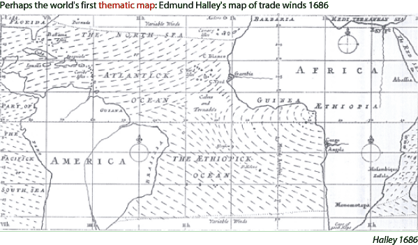
The first map was created by Edmond Halley (1686). This map includes the information of the direction of trade winds in the Atlantic Ocean.
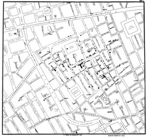
The most famous example of an early thematic map was created by John Snow in 1855 and specifies the cholera progression in a specific area.
Use of Thematic Maps
Important aims of Thematic Maps:
- Thematic Maps provide specific information about particular locations
- They include general information of spatial patterns
- They open the possibility to compare patterns on one or two different maps
Further it is important for the cartographers to be careful to portray the data on the map so that it will be easy for the audience to use and understand. But they have even to notice the spatial accuracy, the aesthetics, human visual perception, the presentation format and the audience. The audience is very important because a political scientist will have other interest than a biologist scientist.
Even the marks and symbols a cartographer uses to represent data are relevant. Next step for displaying data is to collect data sets. Therefore you have to differ between univariate, bivariate and multivariate mapping.
Univariate mapping means to deal with one subject like cancer rates or the rainfall of a year. In comparison the bivariate mapping deals with two subjects like the population density in relation to the textile manufacturing. Multivariate mapping means only to deal with more than two subjects.
Methods
The most important methods for designing a thematic map are:
- Choropleth
- Proportional Symbol
- Isarithmic
- Dot
- Dasymetric
Choropleth
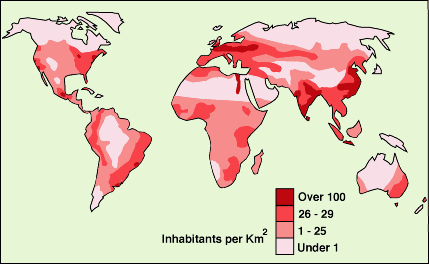
Choropleth maps are the most common thematic maps. A choropleth map displays statistical data, which is colored or patterned accordingly to their distribution. It provides an easy way to demonstrate how data is shared across a geographic area, e.g. population density. Typically they are used after elections to show the spreading of the votes.
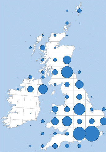
Proportional Symbol
Proportional Symbols maps represent data associated with point locations. Interpretations of statistics represented by these maps are simple to understand. The Proportional Symbols vary in size from place to place on a map in proportion to the quantities they represents.
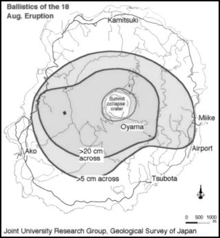
Isarithmic
An Isarithmic map uses contour lines to join points where a function has a same particular value and thus show valleys and hills, and the steepness of slopes. Contour lines are curved or straight lines on a map describing the intersection of a real or hypothetical surface with one or more horizontal planes.
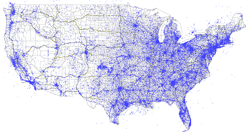
Dot
These maps use dots to show the presence of a feature or occurrence and display a spatial pattern. A dot is not necessarily required to represent a single unit and may indicate any number of entities.
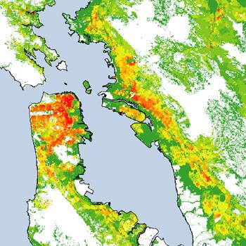
Dasymetric
Dasymetric maps utilize areal symbols to spatially classify volumetric data. However, although boundaries are displayed on dasymetric maps, these geographic units may span multiple theme values.
