Teaching:TUW - UE InfoVis WS 2007/08 - Gruppe 05 - Aufgabe 3: Difference between revisions
Jump to navigation
Jump to search
(R-code for the modified graph) |
No edit summary |
||
| Line 9: | Line 9: | ||
* The essential data values are hidden in the labels that are scattered in small print all over the graph. | * The essential data values are hidden in the labels that are scattered in small print all over the graph. | ||
* The graphical representation of the data is hard to impossible to grasp: one can suspect that the height of the circular stairs are supposed to be proportional to the percentage. However, there is no reason, why there should be 3D stairs, and even less why those stairs should be circual. | * The graphical representation of the data is hard to impossible to grasp: one can suspect that the height of the circular stairs are supposed to be proportional to the percentage. However, there is no reason, why there should be 3D stairs, and even less why those stairs should be circual. | ||
* The pictorial illustration of the different performance types hides the data-related parts of the graph and | * The pictorial illustration of the different performance types hides the data-related parts of the graph and is unnecessarily complex as a visual way to distinguish between performance types. | ||
* Overall, data-ink ration on this graph is very low: apart from all the ink-consuming 3D shading, the actual data can really just be gathered from the percentage given in the label texts. | * Overall, data-ink ration on this graph is very low: apart from all the ink-consuming 3D shading, the actual data can really just be gathered from the percentage given in the label texts. | ||
* Organization of the graph into two halves for east/west comparison is good, but to display the data values for each half as rounded stairs makes it extremely difficult to get an impression of the actual distributions. | * Organization of the graph into two halves for east/west comparison is good, but to display the data values for each half as rounded stairs makes it extremely difficult to get an impression of the actual distributions. | ||
* Another problem is that the percentage for "Kinder und Jugendthater" is given separately for "West" but is combined with "Schauspiel" for "Ost". | * Another problem is that the percentage for "Kinder und Jugendthater" is given separately for "West" but is combined with "Schauspiel" for "Ost". | ||
* The order of "Oper/Ballet" and "Operette/Musical" is reversed between "West" and "Ost". | |||
* The values are given sometimes with one digit after the comma for east, but with no digit after the comma for west data. | * The values are given sometimes with one digit after the comma for east, but with no digit after the comma for west data. | ||
* It is not clear what the actual source of the data is. The text to the left of the chart hints towards the "Bundesministerium für innerdeutsche Beziehungen" but what has the Promot GmbH got to do with it? What does the "75" in "Quellen" mean and what are the "eigene Berechnungen"? | * It is not clear what the actual source of the data is. The text to the left of the chart hints towards the "Bundesministerium für innerdeutsche Beziehungen" but what has the Promot GmbH got to do with it? What does the "75" in "Quellen" mean and what are the "eigene Berechnungen"? Also source information is distributed between the left and the bottom right of the chart. | ||
* The title is within the chart area while the labels for "West" and "Ost" are in the title area. | |||
== Revised diagram == | == Revised diagram == | ||
| Line 25: | Line 23: | ||
* The percentage of "Kinder und Jugendtheater" has been combined with "Schauspiel" for "West" too, so that the comparison is made more easy. | * The percentage of "Kinder und Jugendtheater" has been combined with "Schauspiel" for "West" too, so that the comparison is made more easy. | ||
* The percentages for "West" and "Ost" are displayed | * The percentages for "West" and "Ost" are displayed side by side for each category, making them directly comparable. | ||
* Since categories are directly labeled, no color or other coding is needed. "West"/"Ost" is color coded using different shades of grey which are distinguishable also by color blind persons. | |||
* The labeling of the categories was done using the text only, the icons were dropped | |||
* The labeling of the categories was done using the text only, the icons were | |||
* Values for east have been rounded to the next integer percentage value since values for west are only exact to whole percentage points too. | * Values for east have been rounded to the next integer percentage value since values for west are only exact to whole percentage points too. | ||
Latest revision as of 18:43, 15 January 2008
Poor Graphic[edit]
Review[edit]
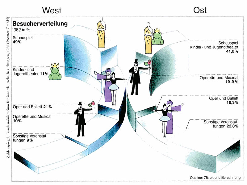
- The essential data values are hidden in the labels that are scattered in small print all over the graph.
- The graphical representation of the data is hard to impossible to grasp: one can suspect that the height of the circular stairs are supposed to be proportional to the percentage. However, there is no reason, why there should be 3D stairs, and even less why those stairs should be circual.
- The pictorial illustration of the different performance types hides the data-related parts of the graph and is unnecessarily complex as a visual way to distinguish between performance types.
- Overall, data-ink ration on this graph is very low: apart from all the ink-consuming 3D shading, the actual data can really just be gathered from the percentage given in the label texts.
- Organization of the graph into two halves for east/west comparison is good, but to display the data values for each half as rounded stairs makes it extremely difficult to get an impression of the actual distributions.
- Another problem is that the percentage for "Kinder und Jugendthater" is given separately for "West" but is combined with "Schauspiel" for "Ost".
- The order of "Oper/Ballet" and "Operette/Musical" is reversed between "West" and "Ost".
- The values are given sometimes with one digit after the comma for east, but with no digit after the comma for west data.
- It is not clear what the actual source of the data is. The text to the left of the chart hints towards the "Bundesministerium für innerdeutsche Beziehungen" but what has the Promot GmbH got to do with it? What does the "75" in "Quellen" mean and what are the "eigene Berechnungen"? Also source information is distributed between the left and the bottom right of the chart.
- The title is within the chart area while the labels for "West" and "Ost" are in the title area.
Revised diagram[edit]
Explanation of changes[edit]
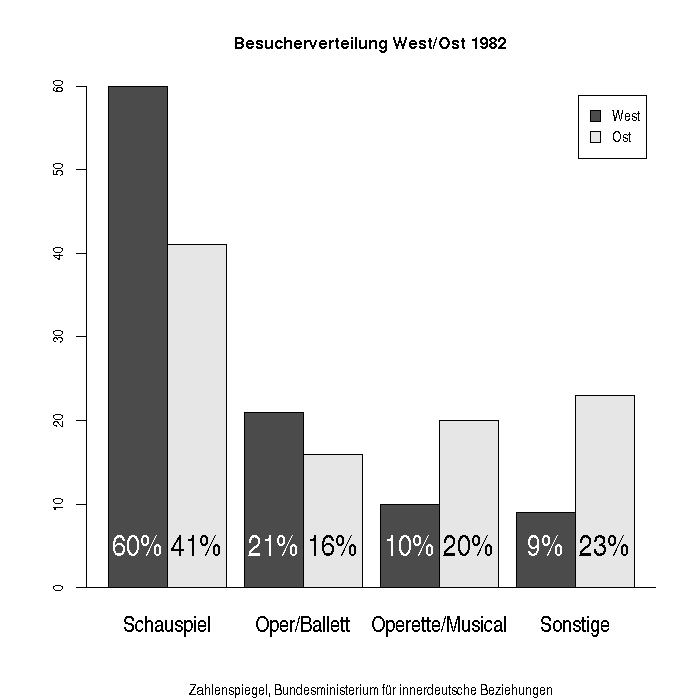
- The percentage of "Kinder und Jugendtheater" has been combined with "Schauspiel" for "West" too, so that the comparison is made more easy.
- The percentages for "West" and "Ost" are displayed side by side for each category, making them directly comparable.
- Since categories are directly labeled, no color or other coding is needed. "West"/"Ost" is color coded using different shades of grey which are distinguishable also by color blind persons.
- The labeling of the categories was done using the text only, the icons were dropped
- Values for east have been rounded to the next integer percentage value since values for west are only exact to whole percentage points too.
R-code to generate the graph[edit]
 makepng<-function() {
 png("West_ost04.png",bg="transparent",width=700,height=700)
 makegraph()
 dev.off()
 }
 makegraph<-function() {
   west= c(60,21,10,9)
   ost = c(41,16,20,23)
   l = c("Schauspiel","Oper/Ballett","Operette/Musical","Sonstige")
   m=matrix(c(west,ost),ncol=2)
   m=t(m)
   bs=barplot(m,beside=TRUE,names=l,legend.text=c("West","Ost"),cex.names=1.5,space=c(0,0.3))
   for(i in 1:4) {
     text(bs[1,i],5,paste(west[i],"%",sep=""),adj=0.5,cex=2,col="white")
     text(bs[2,i],5,paste(ost[i], "%",sep=""),adj=0.5,cex=2)
   }
   lines(c(-3,10),c(0,0))
   title(main = "Besucherverteilung West/Ost 1982", sub="Zahlenspiegel, Bundesministerium für innerdeutsche Beziehungen")
 }

