Teaching:TUW - UE InfoVis WS 2007/08 - Gruppe 03 - Aufgabe 2
Aufgabenstellung
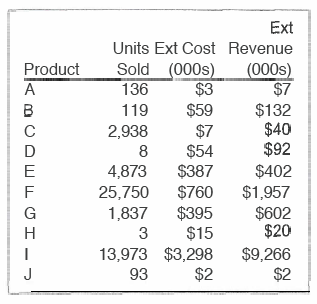
Zu beurteilende Tabelle
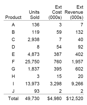
Resolution
Criticism
It is hard to read the cells of one line. So there should be more white space between the rows, horizontal rules or fill shades to assist horizontal scanning.
In this case there is no text close to the table, so the border which surround the table is no necessary. It is good, that there is only one rule, which is between the header and the body, and no grid or other rules. Because of the quality of the image is very bad, I can't see if the rule between the header and the body has more than one color. It should have only one color.
It is good, that the amounts are displayed in thousands and that the commas break the numbers up into smaller chunks.
The align is right of all headers and text entries. Because of the fact, that in the first column all text entries consists of the same number of characters, it would be easier to read, if the text align of this column would be center.
There is no need to include the currency sign with each value.
A column summery would be nice.
The header entries are hard to read. There should be more white space between them or a line break.

