Teaching:TUW - UE InfoVis WS 2007/08 - Gruppe 02 - Aufgabe 3: Difference between revisions
Jump to navigation
Jump to search
(Exercise 03) |
No edit summary |
||
| Line 13: | Line 13: | ||
*'''Layer/Structure''' | *'''Layer/Structure''' | ||
:[+] Concerning the layers (data, supporting components, background) of the graphic, one can see that the data layer surely does emphasize from the background in both tables. | :[+] Concerning the layers (data, supporting components, background) of the graphic, one can see that the data layer surely does emphasize from the background in both tables. | ||
:[+] | :[+] Both the tick marks and the corresponding labels, acting as supporting components of the graphic, are good. They are thin but not too small to read. | ||
:[-] It is not a good idea to use those barrels to indicate definite information. They are indeed representative for the objective of the graphic and it would be a nice designing idea. But the observer will finally not be able to have a clue what the graphic communicates. It is not clear whether the height or the actual volume of such a barrel delivers the necessary information. Even if it would be clear both the height and the volume cannot be read off correctly. | |||
:[-] The year dates of the "U.S. Beer Sales" must not be placed within the graphic itself but down on the x-axis. | |||
:[-] It is not a good idea to use those barrels to indicate definite information. They are indeed representative for the objective of the graphic | |||
*'''Data-Ink ratio''' | *'''Data-Ink ratio''' | ||
:[ | :[-] As already mentioned before, barrels are representative for the objective of the graphic. But in general it is not necessary to use the objective of a graphic as an design those barrels to indicate the actual amount of beer - in this case. To In this case, making the barrels bigger as the amount of sold beer grows is intuitive and good. | ||
''Um zu verstehen, dass es sich um Bier handelt, dafür reicht die Überschrift. Die Fässer als volumetrische Objekte sind schwer zu interpretieren und sind überflüssiges Beiwerk, da sie mit dem eigentlichen Zweck der Grafik - Vergleich der Daten - nichts zu tun haben.'' | ''Um zu verstehen, dass es sich um Bier handelt, dafür reicht die Überschrift. Die Fässer als volumetrische Objekte sind schwer zu interpretieren und sind überflüssiges Beiwerk, da sie mit dem eigentlichen Zweck der Grafik - Vergleich der Daten - nichts zu tun haben.'' | ||
| Line 37: | Line 26: | ||
''Die beiden Skalen (Y-Achsen) bilden einen unterschiedlichen Wertebereich und Wertemaßstab ab. Es fehlt der Nullwert an der Basis bzw. ein Hinweis, dass die Skala nicht bei Null beginnt.'' | ''Die beiden Skalen (Y-Achsen) bilden einen unterschiedlichen Wertebereich und Wertemaßstab ab. Es fehlt der Nullwert an der Basis bzw. ein Hinweis, dass die Skala nicht bei Null beginnt.'' | ||
:[-] Nevertheless this method produces a wrong impression at a glance. There were 160 millions of barrels sold in the year 1978 and almost 120 millions back in the year 1970. These are 25 percent of difference but if | :[-] Nevertheless this method produces a wrong impression at a glance. There were 160 millions of barrels sold in the year 1978 and almost 120 millions back in the year 1970. These are 25 percent of difference but if one takes a look at the two barrels he/she can see that the 1978-barrel is actually much bigger than the one that indicates 1970. | ||
*'''Visual clutter''' | *'''Visual clutter''' | ||
:[-] One can see that the table showing "Schlitz's Share" uses bars that share the same texture. This produces visual clutter and makes it difficult to distinguish between the different bars. | :[-] One can see that the table showing "Schlitz's Share" uses bars that share the same texture. There is no white space in between. This produces visual clutter and makes it difficult for the observer to distinguish between the different bars. | ||
:[-] The texture consists of a label that must not be part of the table. | |||
:[-] The first and the last bars are unnecessarily sloped. | :[-] The first and the last bars are unnecessarily sloped. | ||
== Correction of Table == | == Correction of Table == | ||
[[Image:good- | [[Image:good-graph_beer_2.jpg]] | ||
*'''Improvements''' | *'''Improvements''' | ||
: | :[+] First we decided that both tables had to be combined into one, to cleary show the viewer that those two tables are semantically linked together, which does no fully come out in the original graphic. | ||
: | :[+] To assist the viewer when comparing the two data-rows we equaled both scales, so that also the size of each bar and not only the label on the axis can be compared. Because for a quick overview it is easier to compare just the size of one bar, than the correspondnig values. | ||
: | :[+] We start our scales with 0 so the sizes of the bars are now in the correct relation to each other, in contrast to the original graphic where for example 160 million barrels is about five times bigger than 120 million barrels, which could communicate a wrong view of the underlying data. | ||
: | :[+] To further improve the readability of the graph we decided to use simple bars instead of the original used barrels. Most viewers are more familiar with such visualization objects, and it simply is easier to find out the actual value of an bar compared to the barrel-visualization in the original graphic. | ||
: | :[+] We use gridlines in the background of the graph to support the user when trying to find out the value of an bar far off the ordinate. We decided to use drawn through gridlines instead of possibly addind an second scale at the most right end of the graph, because adding a second axis would also mean to add 9 more numerical values to the graph that don't offer new information but use ink (data-ink ration) and also might unnecessary overfill the graph. | ||
== Links == | == Links == | ||
* [[Teaching:TUW_-_UE_InfoVis_WS_2007/08|InfoVis:Wiki UE Homepage]] | * [[Teaching:TUW_-_UE_InfoVis_WS_2007/08|InfoVis:Wiki UE Homepage]] | ||
Revision as of 16:09, 3 January 2008
Poor Graphic
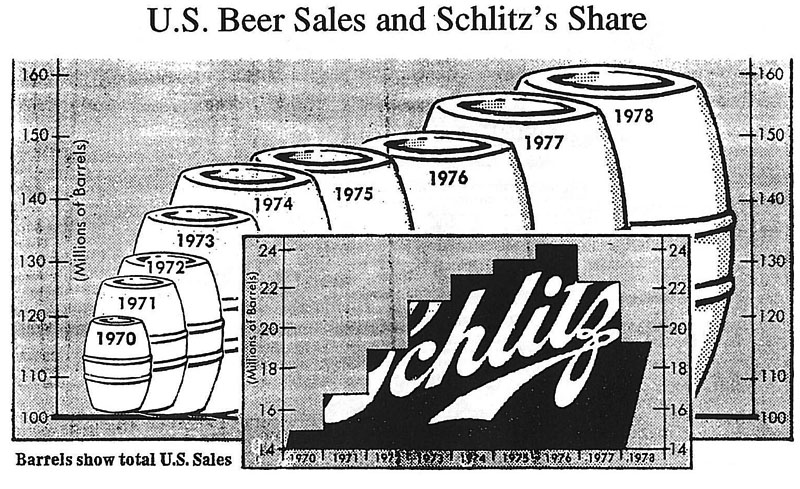
 U.S. Beer Sales and Schlitz´s Share
Critique
- Overall impression and number of tables
- [-] As one can see, the overall graphic of "U.S. Beer Sales and Schlitz's Share" consists of two separated tables. One table describes the "U.S. Beer Sales" and remains in the back while the other one describes the "Schlitz's Share" and comes to stay in the front. This makes the overall graphic difficult to understand. In the first place it is not obvious what it should communicate.
- [-] Furthermore the two tables are using different styles. The "U.S. Beer Sales" are described by the use of barrels but the "Schlitz's Share" is indicated by bars even though both tables share the same object (millions of barrels).
- [-] The contrast between the two tables isn't really good. The barrels are white and the bars are black. Both tables have outstanding appearances. As mentioned above, it is not clear what's the meaning of the overall graphic.
- Layer/Structure
- [+] Concerning the layers (data, supporting components, background) of the graphic, one can see that the data layer surely does emphasize from the background in both tables.
- [+] Both the tick marks and the corresponding labels, acting as supporting components of the graphic, are good. They are thin but not too small to read.
- [-] It is not a good idea to use those barrels to indicate definite information. They are indeed representative for the objective of the graphic and it would be a nice designing idea. But the observer will finally not be able to have a clue what the graphic communicates. It is not clear whether the height or the actual volume of such a barrel delivers the necessary information. Even if it would be clear both the height and the volume cannot be read off correctly.
- [-] The year dates of the "U.S. Beer Sales" must not be placed within the graphic itself but down on the x-axis.
- Data-Ink ratio
- [-] As already mentioned before, barrels are representative for the objective of the graphic. But in general it is not necessary to use the objective of a graphic as an design those barrels to indicate the actual amount of beer - in this case. To In this case, making the barrels bigger as the amount of sold beer grows is intuitive and good.
Um zu verstehen, dass es sich um Bier handelt, dafür reicht die Überschrift. Die Fässer als volumetrische Objekte sind schwer zu interpretieren und sind überflüssiges Beiwerk, da sie mit dem eigentlichen Zweck der Grafik - Vergleich der Daten - nichts zu tun haben.
Die Fässer stehen zudem nicht nebeneinander, sondern verdecken einander teilweise.
Die beiden Skalen (Y-Achsen) bilden einen unterschiedlichen Wertebereich und Wertemaßstab ab. Es fehlt der Nullwert an der Basis bzw. ein Hinweis, dass die Skala nicht bei Null beginnt.
- [-] Nevertheless this method produces a wrong impression at a glance. There were 160 millions of barrels sold in the year 1978 and almost 120 millions back in the year 1970. These are 25 percent of difference but if one takes a look at the two barrels he/she can see that the 1978-barrel is actually much bigger than the one that indicates 1970.
- Visual clutter
- [-] One can see that the table showing "Schlitz's Share" uses bars that share the same texture. There is no white space in between. This produces visual clutter and makes it difficult for the observer to distinguish between the different bars.
- [-] The texture consists of a label that must not be part of the table.
- [-] The first and the last bars are unnecessarily sloped.
Correction of Table
- Improvements
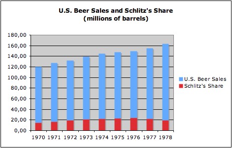
- [+] First we decided that both tables had to be combined into one, to cleary show the viewer that those two tables are semantically linked together, which does no fully come out in the original graphic.
- [+] To assist the viewer when comparing the two data-rows we equaled both scales, so that also the size of each bar and not only the label on the axis can be compared. Because for a quick overview it is easier to compare just the size of one bar, than the correspondnig values.
- [+] We start our scales with 0 so the sizes of the bars are now in the correct relation to each other, in contrast to the original graphic where for example 160 million barrels is about five times bigger than 120 million barrels, which could communicate a wrong view of the underlying data.
- [+] To further improve the readability of the graph we decided to use simple bars instead of the original used barrels. Most viewers are more familiar with such visualization objects, and it simply is easier to find out the actual value of an bar compared to the barrel-visualization in the original graphic.
- [+] We use gridlines in the background of the graph to support the user when trying to find out the value of an bar far off the ordinate. We decided to use drawn through gridlines instead of possibly addind an second scale at the most right end of the graph, because adding a second axis would also mean to add 9 more numerical values to the graph that don't offer new information but use ink (data-ink ration) and also might unnecessary overfill the graph.
