Teaching:TUW - UE InfoVis WS 2007/08 - Gruppe 02 - Aufgabe 3: Difference between revisions
mNo edit summary |
mNo edit summary |
||
| Line 28: | Line 28: | ||
[[Image:good-graph_beer_1.jpg]] | [[Image:good-graph_beer_1.jpg]] | ||
'''Improvements''' | |||
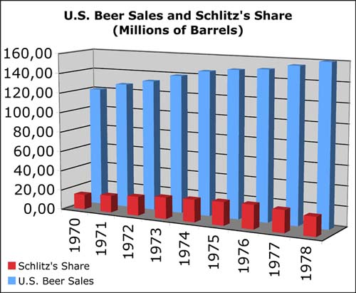
: First we decided, that both graphs hat to be combined into one, to cleary show the viewer, that those two graphs are semantically linked together, which does no fully come out in the original visualization. | |||
To assist the viewer when comparing the two data-rows we equaled both scales, so that also the size of each bar and not only the label on the axis can be compared, because for a quick overview it is easier to compare just the size of an bar, than the correspondnig values. | |||
We start our scales with 0 so the sizes of the bars are now in the correct relation to each other, in contrast to the original graphic where for example 160 million barrels is about five times bigger than 120 million barrels, which could communicate a wrong view of the underlying data. | |||
To improve the readability of the graph we decided to use simple bars instead of the original used barrels, because most viewers are more familiar with such visualization objects, and it simply is easier to find out the actual value of an bar compared to the barrel-visualization in the original graphic. | |||
== Links == | == Links == | ||
Revision as of 23:16, 10 December 2007
Poor Graphic
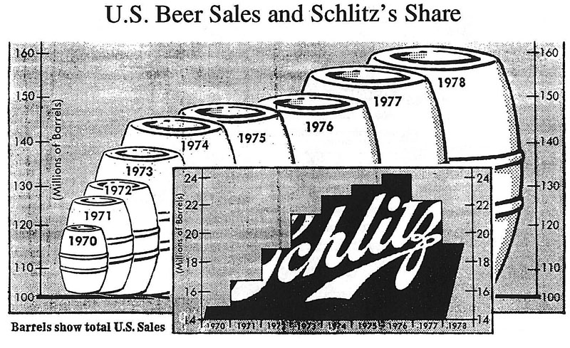
 U.S. Beer Sales and Schlitz´s Share
Critique
- Overall impression and number of tables
- [-] As one can see, the overall graphic of "U.S. Beer Sales and Schlitz's Share" consists of two separated tables. One table describes the "U.S. Beer Sales" and remains in the back while the other one describes the "Schlitz's Share" and comes to stay in the front. This makes the overall graphic difficult to understand. In the first place it is not obvious what it should communicate.
- [-] Furthermore the two tables are using different styles. The "U.S. Beer Sales" are described by the use of barrels but the "Schlitz's Share" is indicated by bars even though both tables share the same object (millions of barrels).
- [-] The contrast between the two tables isn't really good. The barrels are white and the bars are black. Both tables have outstanding appearances. As mentioned above, it is not clear what's the meaning of the overall graphic.
- Layer/Structure
- [+] Concerning the layers (data, supporting components, background) of the graphic, one can see that the data layer surely does emphasize from the background in both tables.
- [+] The grid lines, acting as supporting components of the graphic, are good. They are thin and their labels are not too small to read.
- [-] Of course, the background layer could be much brighter to make the data layer clearer.
- [-] It is not a good idea to use those barrels to indicate definite information. They are indeed representative for the objective of the graphic but for the observer it is very difficult to see the actual height of one barrel.
- Data-Ink ratio
- [+] As already mentioned before, barrels are representative for the objective of the graphic. In this case making the barrels bigger is intuitive and good.
- [-] Nevertheless this method produces a wrong impression at a glance. There were 160 millions of barrels sold in the year 1978 and almost 120 millions back in the year 1970. These are 25 percent of difference but if you take a look at the two barrels you can see that the 1978-barrel is actually much bigger than the one that indicates 1970.
- Visual clutter
- [-] One can see that the table showing "Schlitz's Share" uses bars that share the same texture. This produces visual clutter and makes it difficult to distinguish between the different bars.
- [-] The first and the last bars are unnecessarily sloped.
Correction of Table
Improvements
- First we decided, that both graphs hat to be combined into one, to cleary show the viewer, that those two graphs are semantically linked together, which does no fully come out in the original visualization.
To assist the viewer when comparing the two data-rows we equaled both scales, so that also the size of each bar and not only the label on the axis can be compared, because for a quick overview it is easier to compare just the size of an bar, than the correspondnig values. We start our scales with 0 so the sizes of the bars are now in the correct relation to each other, in contrast to the original graphic where for example 160 million barrels is about five times bigger than 120 million barrels, which could communicate a wrong view of the underlying data. To improve the readability of the graph we decided to use simple bars instead of the original used barrels, because most viewers are more familiar with such visualization objects, and it simply is easier to find out the actual value of an bar compared to the barrel-visualization in the original graphic.
