Teaching:TUW - UE InfoVis WS 2007/08 - Gruppe 01 - Aufgabe 3: Difference between revisions
Jump to navigation
Jump to search
No edit summary |
No edit summary |
||
| Line 27: | Line 27: | ||
[[Image:Aussenhandel_redesign.png]] | [[Image:Aussenhandel_redesign.png]] | ||
If it is feasible to change the type of chart, I would recommend to use a line chart, as it is easier to compare the values with this type of representation and the legend can be eliminated by labeling each line. | |||
[[Image:Aussenhandel_redesign2.png]] | |||
== Links == | == Links == | ||
Revision as of 13:48, 29 November 2007
Poor Graphic
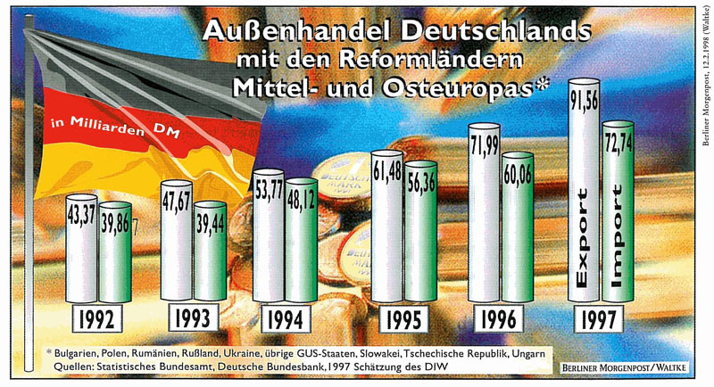
 Außenhandel Deutschlands mit den Reformländern Mittel- und Osteuropas
Review
Highlighting
- Data should be highlighted to give them a voice that comes through loudly and clearly, without distraction. Here, the background is massively distracting from the data.
- I'd say the data-ink ratio is only 0.1, as the data covers about 30% of the graphic and is much lighter than the background. The data must be highlighted (e.g. by increasing the color intensity), therefore the background must be de-emphasized, if not removed at all. The data must stand out.
- The supporting component in Milliarden DM must be emphasized too, because its essential for the understanding of the numbers.
- The actual countries are summarized with Reformländer Mittel- und Osteuropas which is good, because it reduces data-ink that isn't needed at first. Still, the summary is pretty long.
- The borders and 3D effect of the bars add no value, but boost visual noise.
Organization
- The visualization should be organized to lead readers through the contents in a manner that promotes optimal understanding. The organization in this graph is chaotic. What do the numbers mean?
What does the left, what does the right bar mean? Information that answers these questions scattered in an unorganized way.
- The bars are grouped nicely by year using proximity and by trading type using similarity of background colors. However, the colors could be more distinguishing. Furthermore, I believe (but have no scientific material to prove this) that the graph would be easier to interpret, if the Import and Export bars would be swapped, so that the smaller bars are on the left side. This would better emphasize the rising character of the trade in general in addition to the fact that exports are always higher than imports.
- Most of the elements are prioritized and sequenced correctly: The title on the top center, the bars centered, the years beyond the bars, the volume in the bars, and the actual countries on the bottom. In contrast, the in Milliarden DM is quite important and must be presented in a more prominent way (but not too prominent - possibly as an under-title). The labels Import and Export must also be easier to comprehend, e.g. by placing a legend on the top left side of the graph. Vertical orientation of text should generally be avoided.
- The years are properly sequenced from left to right.
- The accuracy of the numbers seems to high and should be reduced to remove unnecessary details and support clarity.
Required Text
- Everything is here, though it's not always properly communicated, as mentioned above.
Redesign
If it is feasible to change the type of chart, I would recommend to use a line chart, as it is easier to compare the values with this type of representation and the legend can be eliminated by labeling each line.

