Teaching:TUW - UE InfoVis WS 2006/07 - Gruppe 03 - Aufgabe 2
Poor Graphic

Arguments why it is a poor Graphic
Principles of Graphical Integrity
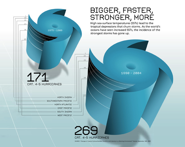
- Lie Factor: The right graphic seems do be much larger then the left. It should be only 1,5 times larger then the other one based on the data. The size of the effect in data is ca.57% and the effect in the graphic about 55%, which results a high Lie Factor of nearly 1.The Lie Factor should have a value between 0.95 and 1.05. [Friendly, 2005], so my impression of the two graphs seems to be an optical illusion. Conclusion: Don't use graphform which tend to give the viewers wrong impressions of size differences.
- the numbers are not readable and the lines between the numbers are very irritating and confusing.
- As well is the colour gradient. The gradient goes in the smaler "3D Hurricane" from blue to black and in the bigger one reverse.
- a pseudo 3-dimensional graphic is used to show 1-dimensional data
Data-Ink Ratio
This graph has a low Data-Ink Ratio. To maximise the data-ink ratio we have to reduce the non-data ink and enhance the data ink.
How much of the ink could be removed without loss of information?
- A large share of ink is used to show the pseudo 3-dimensional graphic and their shadows.
- The white lines forming squares (left) do not contain additional information.
- the background color has no additional information.
- It's not necessary to write "CAT. 4-5 Hurricanes" twice.
- in this case you could remove the numbers for the region, because they are unreadable.
Missing ink
- The ink doesn't change as the data changes.
Data Density
The Data Density of this graphic is very low. We should maximise it and the size of the data matrix, within reason.
- The graphic is very big and should be shrunk way down.
- The "3D Hurricanes" take a lot of space. Its better to replace them with smaler representations of the data, e.g. bars.
- divide the regions in seperate
Chartjunk
- The white grid and the shadow in the background is used to imitate a 3d-effect. The 3d-effect is not needed in this graphic and so the grid should be junked.
- In the text a reason for increased hurricans is mentioned, but in the shown data is no evidence for that, because there is no related data.
- The text "bigger, faster, stronger, more" is not necessary. The graphic shows (or should show) that there are more Hurricanes than in the last years.
Design
- The graphic isn't very comparative. The smaler "3D Hurricane" appears to be just farther behind in time and position.
- Graphical elegance is often found in simplicity of design and complexity of data, but in this graphic the graphical design is more complex than the visualised data.
- Although the data is about hurricans it doesn't suggets to use the shape of a hurrican in the graphic. It's better to use a horizontal graphic about 50% wider than tall.
- The type is not very clear or modest.
- The word "category" is not spelt out.
- The data is wrong, the sum of the hurricans(171) as shown in the left graphic does not equal the summed up hurricans from the regions(160) shown in the same graphic.
Improved Graphic
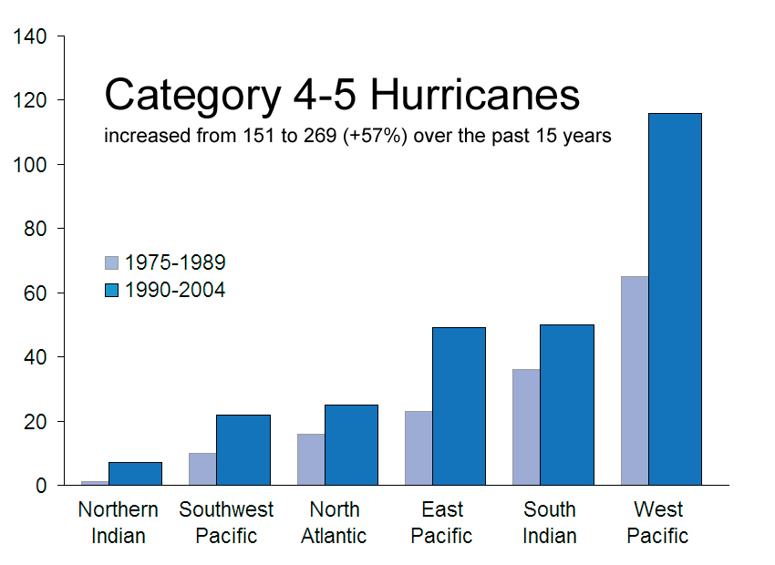
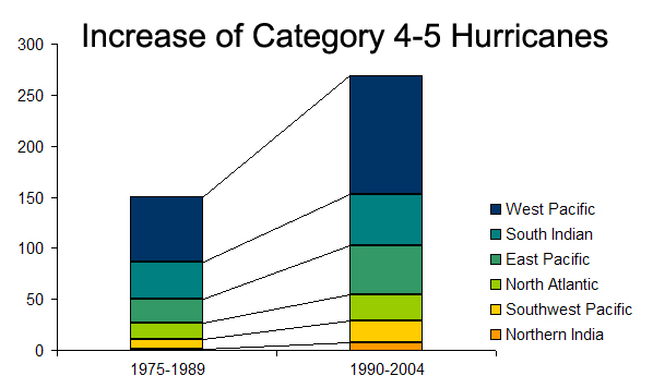
We made two improved graphics, the difference between them is that the first focuses on the comparability of the values in the different world regions and the second on the comparability of the entire number of hurricanes.
First improved graphic: Focus on the different world regions

Second improved graphic: Focus on the whole numbers of hurricanes

Description of Improvements
- Use of a 2-dimensional graph instead of a pseudo-3d graph
- Dividing the regions into seperate values.
- Use of different colors in the comparision between the entire number of hurricanes.
References
[Friendly, 2005] Michael Friendly, The Lie Factor, Department of Mathematics and Statistics, Toronto, Last updated: February 23, 2002, Retrieved at: Nov 17, 2006, http://www.math.yorku.ca/SCS/Gallery/lie-factor.html
[Few, 2004] Stephen Few, Elegance Through Simplicity, intelligent enterprise, Oct. 16, 2004, http://www.intelligententerprise.com/showArticle.jhtml;jsessionid=N2ATDQWY5VYKSQSNDBGCKHSCJUMEKJVN?articleID=49400920
[Tufte, 1999] Edward R. Tufte: The Visual Display of Quantitative Information, Stanford University, Jan. 26, 1999, http://ldt.stanford.edu/ldt1999/Students/mizuno/Portfolio/Work/reports/tufte/ed229c-tufte-outline.html