Teaching:TUW - UE InfoVis WS 2006/07 - Gruppe 03 - Aufgabe 1 - Data Density: Difference between revisions
| Line 15: | Line 15: | ||
== Example == | == Example == | ||
To better undrestand this term, we show | To better undrestand this term, we show two graphs and compute their data density. Consider the result of a survey in which the gender, height and weight were recordet for 92 students. The charts are 5.6cm by 7.4cm, an area of 41.4cm2. [Hunt and Mashhoudy, 2002] | ||
[[Image:Data1.10.gif]] | [[Image:Data1.10.gif]] | ||
Revision as of 13:59, 29 October 2006
Definition
[Brath, 1997]
[Barth, 1997]
Charts and Graphs
While the human eye has the ability to detect large amounts of information within a small area, statistical graphs often fail to take advantage of this ability. To messure the information content of a graph he definses the data density. [Hunt and Mashhoudy, 2002] Therefor you need numerical values which relate the number of maximal at the same time presentable information elements to a display panel. [Edlinger, 2006]
Data density is also used to compute the cognitive complexity. [Edlinger, 2006] To do this you additonaly need the number of dimensions. [Dal Sasso Freitas, 2002]
In The Visual Display of Graphical Information of Edward Tufte, a milestone in the theory of graph design, principles of graph design are discussed. One of them is: Try to maximise the data density. [Hunt and Mashhoudy, 2002] and the size of the data matrix, within reason. As the volume of data increases, data measures must shrink and the graphics can be shrunk way down. [Tufte, 1999]
Usually there is a minimum amount, which schuld always be less than the data density. If the data density falls below this value 0 is used as a result, otherwise 1. [Edlinger, 2006]
Example
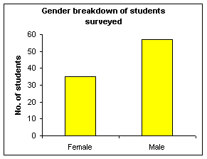
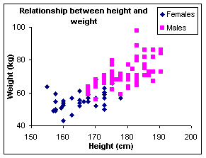
To better undrestand this term, we show two graphs and compute their data density. Consider the result of a survey in which the gender, height and weight were recordet for 92 students. The charts are 5.6cm by 7.4cm, an area of 41.4cm2. [Hunt and Mashhoudy, 2002]
Above you see a bar graph showing the breakdown into males and females. According the definition you've 2 (female and male) areas with 2 kind of information (gender and number of students), what makes 4 data points. By deviding this over the size of its area, you get the data tensity of this graph. [Barth, 1997]
number of data points = 4
data density = 4 / 41.4 = 0.1 (to 1 dp) [Hunt and Mashhoudy, 2002]
The computation of the second example works similiar to the first one. The second graph shows a labelled XY-chart, which additonaly shows the relationship between height and weight of the students. As a result you've 3 kind of information on 92 areas, what results 276 data points. [Barth, 1997]
number of data points = 92 x 3 = 276
data density = 276 / 41.4 = 6.7 (to 1 dp) [Hunt and Mashhoudy, 2002]
References
[Barth, 1997] R. Barth. Metrics for effective information visualization. In Proceedings of the 1997 IEEE Symposium on Information Visualization (InfoVis '97), pages 0–108, DC, USA, October 1997. IEEE Computer Society Washington
[Hunt and Mashhoudy, 2002] Neville Hunt and Housh Mashhoudy, Discovering Important Statistical Concepts Using SpreadSheets. Created at: January 29, 2002. Retrieved at: October 28, 2006. http://home.ched.coventry.ac.uk/Volume/vol0/philosop.htm.
[Edlinger, 2006] Karl Edlinger, Informationsvisualisierung im Wissensmanagement – Eine Analyse unterschiedlicher Visualisierungstechniken auf ihre Eignung für das Wissensmanagement, Master's thesis, Fachhochschul-Studiengang Informationsberufe, Eisenstadt, 2006, 31-32.
[Dal Sasso Freitas et al., 2002] Carla M. Dal Sasso Freitas, Paulo R. G. Luzzardi, Ricardo A. Cava, Marco A. A. Winckler, Marcelo S. Pimenta, Luciana P. Nedel. Evaluating Usability of Information Visualization Techniques. In Proceedings of 5th Symposium on Human Factors in Computer Systems (IHC), pages 10-11, Fortaleza, CE, 2002. Fortaleza:SBC
[Tufte, 1999] Edward R. Tufte, The Visual Display of Quantitative Information. Created at: January 26, 1999. Retrieved at: October 29, 2006. http://ldt.stanford.edu/ldt1999/Students/mizuno/Portfolio/Work/reports/tufte/ed229c-tufte-outline.html
[Smith, 2005] Waynes Smith, Graphics and Web Design Based on Edward Tufte's Principles. Created at: January 17, 2005. Retrieved at: October 29, 2006. http://www.washington.edu/computing/training/560/zz-tufte.html

