Teaching:TUW - UE InfoVis WS 2006/07 - Gruppe 02 - Aufgabe 3 - Technique
Tile Maps
Summary
Images
Figure 1: a tilemap showing different levels of ocone-concentration in different shades of grey [Mintz et al., 1997].
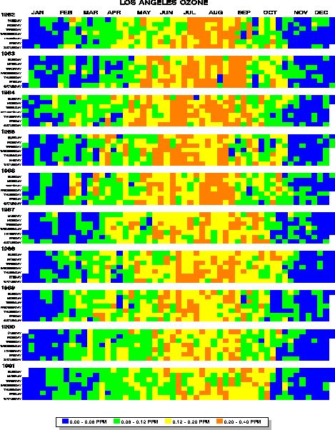
Figure2: ocone-concentration over several years, color-coded [Friendly, 2006].
Description
A tile map is a representation of a discrete - respectively quantized (discretion by quantization)- two-dimensional dataset, where each dataset-entry is represented by a colored square (tile). Usually the first dimension is an instance of time (like one day, hour, etc), and with each entry representing the same amount of time. The second dimension then represents some arbitray data, like the amount of rain for that day, the average temperature for a certain amount of time, or the concentration of ocone for a certain day (like in figure 2).
The special thing now is the arrangement of the time-axis: it is not a straight line, but rather a zigzag-line thus forming a block of a bigger time-entity from many smaller entities. For better understanding see figure 1: there is one tile for each day. The days are grouped into vertical lines of one week each, and the weeks are aligned along the horizontal axis forming months and consequently a whole year. As in figure 2 several of these bigger entities can again be arranged along a vertical axis thus providing a quick overview over a long period of time which makes it possible to easily detect certain trends in the dataset.
The values for each time-entity can be coded by color or shades of grey. In following the function to give a quick overview there should not be used to many levels of colors. Furthermore the assignment of values to colors might not be linear: eg in figure 2 there are four levels of ozone-concentration, but the last level covering 50% of the concentration-spectrum.
Notes
Maybe there could be used (almost) continuous values for the second dimension, by mapping the whole dataset on a big-enough color-space. That might also appeal to the time-dimension by increasing time-resolution, but possibly this would result in a loss of simplicity and overview, which is the biggest strength of the tile maps.

