|
|
| (30 intermediate revisions by 4 users not shown) |
| Line 1: |
Line 1: |
| == Tile Maps ==
| |
|
| |
|
| ===Summary===
| |
| ===Images===
| |
|
| |
|
| [[Image:Tilemaps_bw.jpg | Tilemap (greyscale)]]
| |
|
| |
|
| Figure 1: a tilemap showing different levels of ocone-concentration in different shades of grey [Mintz et al., 1997].
| | =Project TileMap= |
|
| |
|
| [[Image:Tilemaps_color.jpg | Tilemap (color)]] | | ==Authors== |
| | [[Teaching:TUW - UE InfoVis WS 2006/07 - Gruppe 02|Gruppe 02 (Diesenreiter, Weixelbaumer, Felkel, Maier)]] |
|
| |
|
| Figure2: ocone-concentration over several years, color-coded [Friendly, 2006].
| | ==Task Description== |
| | Our task was to implement an application for visualizing time-dependent data, using the so called tilemap technique. For detailed information on this fascinating technique, you should visit our [[Teaching:TUW_-_UE_InfoVis_WS_2006/07_-_Gruppe_02_-_Aufgabe_3_-_Technique|Tilemap]] description. We were allowed to make use of the powerful java toolkit prefuse, which provides many of the needed functionalities. |
|
| |
|
| ===Description=== | | ==Implementation Details== |
| | Our final prototype parses given input data (provided in .csv files), writes it into table structures and calculates useful information like the adequate week for each entry. Therefor additional columns get appended and are use for our labeling. The visual mapping was realized by dependence of the color of each tile on the given values. Finally we defined basic interaction like zooming and created a simple user interface to control scaling and bucket size of our visualization. Now the result is ready to be printed on screen. |
|
| |
|
| == Visual Mapping == | | ==Screenshot== |
| | [[Image:screen.jpg]] |
|
| |
|
| === Introduction === | | ==Used Toolkits== |
| The aim of the visual representation with tile maps is to abstract and simplify seasonal patterns. This makes it easier to recognize patterns or to compare them.
| | * Prefuse Information Visualization Toolkit |
|
| |
|
| === Visualisation / Abstraction === | | ==Links== |
| With this visualisation technique the measured data (in our case weather) is represented by "tiles" (squares) which are aranged in 2 dimesions. Both dimensions represent time. Compared to a 2-dimension coordnate system, we could say the x-axis is always one step bigger than the y-axis, which is used for displaying more details ( e.g. x-axis or from left to right: every step or tile representing a week; y-axis every step or tile representing one day ... like a 90 degree rotated calendar )
| | * [[Teaching:TUW_-_UE_InfoVis_WS_2006/07_-_Gruppe_02|Gruppe 2]] |
| | | * [[Teaching:TUW_-_UE_InfoVis_WS_2006/07_-_Gruppe_02_-_Aufgabe_3_-_Technique|Technique]] |
| The value of the measured data is illustrated by the color or color intensity of the tiles. For example a light shade indicating low values, darker shades indicating higher values. [Mintz et al., 1997]
| |
| | |
| == Interaction practices ==
| |
| | |
| === application building ===
| |
| | |
| 1. Load the data to be visualized into prefuse's data structures, either reading in data from a file, loading data from a database, or through a custom data source.
| |
| 2. Create a Visualization that maps the loaded data to a visual abstraction. Tables, Graphs, and/or Trees are added to the Visualization and given a unique data group name for later reference.
| |
| 3. Create a RendererFactory and register it with the Visualization. The factory is responsible for assigning Renderers to VisualItems.
| |
| 4. Construct a series of data processing Actions that operate on the visual abstraction. These operations can involve just about anything, but common examples include setting the location, color, size, and shape of visual items or animating these properties between different configurations. These Action instances can be grouped into ActionLists for performing various processing tasks. Actions that will be invoked directly are added to the Visualization and given a unique name by which they can be referenced.
| |
| 5. Initialize one or more interactive Displays for viewing and manipulating visual items. Specify interactive behaviors by adding Controls to the Displays. Search and filtering over data items can be added using dynamic query bindings.
| |
| | |
| === User Interface ===
| |
| | |
| === Techniques/Functions ===
| |
| | |
| * Table Data
| |
| * Navigation
| |
| * Text
| |
| * Zooming
| |
| * Alpha-Slider
| |
| * Highlighting | |
| * Dynamic Querying
| |
| * Selection
| |
| * Brushing
| |
| * Distortion Techniques
| |
| * layout, color, size, and shape encodings, distortion techniques, animation
| |
| * query language
| |
| * If you are regularly issuing queries (via Predicate filters) to data sets, it might help to index the data columns referenced by the Predicate. This can be done using the index() method of the Table class.
| |
| * rendering
| |
| * use simple shapes - performance
| |
| | |
| == References ==
| |
| [Friendly, 2006] Michael Friendly. Gallery of Data Visualization. York University: Statistical Consulting Service and Psychology Department. Accessed: 27.11.2006. [http://www.ecn.wfu.edu/SCS/Gallery/ Gallery of Data Visualization] | |
| | |
| [Mintz et al., 1997] Mintz, D., Fitz-Simons, T., and Wayland, M.. Tracking Air Quality Trends with SAS/GRAPH. In ''Proceedings of the 22nd Annual SAS User Group International Conference (SUGI97)'', pages 807–812, 1997. [http://ieg.ifs.tuwien.ac.at/~aigner/teaching/infovis_ue/papers/tilemaps-PAPER173.PDF PDF]
| |
| | |
| [Printezis and Garthwaite, 2002] Tony Printezis, Alex Garthwaite. Visualising The Train Garbage Collector. In ''Proceedings of the 3rd international symposium on Memory management'', Pages: 50 - 63, Berlin, June 20-21, 2002. Publisher: ACM Press. [http://portal.acm.org/citation.cfm?id=512436&coll=ACM&dl=ACM&CFID=7238592&CFTOKEN=49755970 Link on ACM-Portal]
| |
Project TileMap[edit]
Authors[edit]
Gruppe 02 (Diesenreiter, Weixelbaumer, Felkel, Maier)
Task Description[edit]
Our task was to implement an application for visualizing time-dependent data, using the so called tilemap technique. For detailed information on this fascinating technique, you should visit our Tilemap description. We were allowed to make use of the powerful java toolkit prefuse, which provides many of the needed functionalities.
Implementation Details[edit]
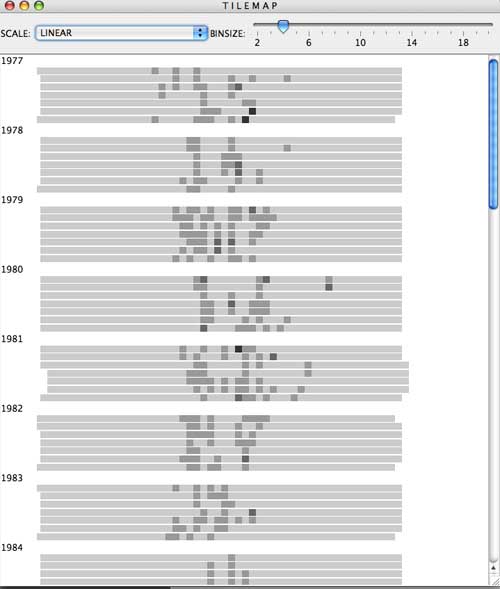
Our final prototype parses given input data (provided in .csv files), writes it into table structures and calculates useful information like the adequate week for each entry. Therefor additional columns get appended and are use for our labeling. The visual mapping was realized by dependence of the color of each tile on the given values. Finally we defined basic interaction like zooming and created a simple user interface to control scaling and bucket size of our visualization. Now the result is ready to be printed on screen.
Screenshot[edit]
Used Toolkits[edit]
- Prefuse Information Visualization Toolkit
