Teaching:TUW - UE InfoVis WS 2005/06 - Gruppe G7 - Aufgabe 2
Poor Graphic

Drawbacks
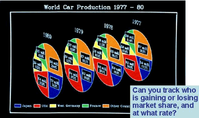
This image is far away from a good Visualization of the underlying Data. It has drawbacks according to some well known Design Principles, which we will explain in the following:
- data ink: Everything that communicates actual data is data ink and is needed. But our image contains some unnecessary data ink. The white Border around all the charts and the white lines around each single chart and between the pies of the charts are unnecessary data ink.
- chart chunk: Chartjunk is a term for unnecessary or confusing visual elements in charts and graphs. Our image uses 2D Pie charts. The problem is it seems that we look at the image not from the front but a little from the side. That distorts the message since neither the angles nor the areas are in proportion to the data.
- color: Lines, bars and charts should be colored in a way, that that no one color stands out more prominently than the others, thus supporting the equal importance of the three data sets. In our image the red and blue pies of the charts violate this principle because they stand out more promonently than the others.