Chart Junk
Definition(s)
- Chartjunk is a term for unnecessary or confusing visual elements in charts and graphs. Markings and visual elements can be called chartjunk if they are not part of the minimum set of visuals necessary to communicate the information understandably. Examples of unnecessary elements which might be called chartjunk include heavy or dark grid lines, ornamented chart axes and display frames, pictures or icons within data graphs, and ornamental shading.
Another kind of chartjunk skews the depiction and makes it difficult to understand the real data being displayed. Examples of this type include items depicted out of scale to one another and noisy backgrounds making comparison between elements difficult in a chart or graph. [wikipedia.org]
- "The interior decoration of graphics generates a lot of ink which does not tell the viewer anything new. The purpose of the decoration varies - to make the graphic appear more scientific, to enliven the display, to give the designer an opportunity to exercise artistic skill. Regardless of the cause, it is all non-data-ink or redundant data-ink, and it is often chartjunk." [Tufte, 1983]
Examples
3D Bar Chart
The Icon of the Microsoft® Office Excel "Diagramm-Assistent" shows exactly what it mostly produces namely Chart Junk.
Microsoft® Excel "Diagramm-Assistent"
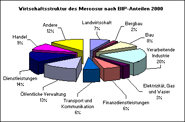
3D Pie Chart
[AHK]
Bibliography
[wikipedia.org] Wikipedia, the free encyclopedia, http://en.wikipedia.org/wiki/Chartjunk
[Tufte, 1983] Edward R. Tufte, The Visual Display of Quantitative Information, 1983. http://www.edwardtufte.com/tufte/
[AHK] AHK Die deutschen Auslandshandelskammern in Mercosur http://www.mercosur-info.com/al/handelsstatistiken.shtml
Back to G8
