Teaching:TUW - UE InfoVis WS 2009/10 - Gruppe 03 - Aufgabe 3
Aufgabenstellung
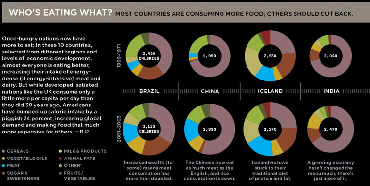
Zu verbessernde Grafik
improvements made
- we removed the black background and the background from the headline. although it makes sense in the design of the entire page, looked at it seperatly its not necessary.
- the basic design of the table was changed (from a circle diagram) to a line diagram with years as one dimension, calories as the other dimension, the different types of food as categories:
- percent -> values: in the circle the values are shown in percentage of the circle (the amount was shown in the size of the diagram). now we use the absolute numbers comparing them over the years in a
- line diagram which makes it much easier to see the in-/decrease of the values.
- this also brings a reduction of a diagram for each county.
- as the new diagrams only contain 2 values each on the horizontal axis, its possible to make them relative small and
- align all the diagrams in one line from the left to the right. because the values are shown on the vertical axes which were
- normed to a maximum value over all countries. this even allows to campare the values between the countries.
- additional decoration like the bar in the middle of the old graphic are not necessary to express the data and thus were omitted.
- the categories have no natural order, so we ordered them alphabetically, except the category 'other' which is the least meaningful compared to the others and so listed last.
- the text next to the diagrams was removed, because it refered to the article, not to the diagrams themselfes which is more confusing then helping.
- we added a reference to the source of the data used in the diagram.
