Teaching:TUW - UE InfoVis WS 2006/07 - Gruppe 03 - Aufgabe 2
Poor Graphic

Arguments why it is a poor graphic
- Principles of Graphical Integrity
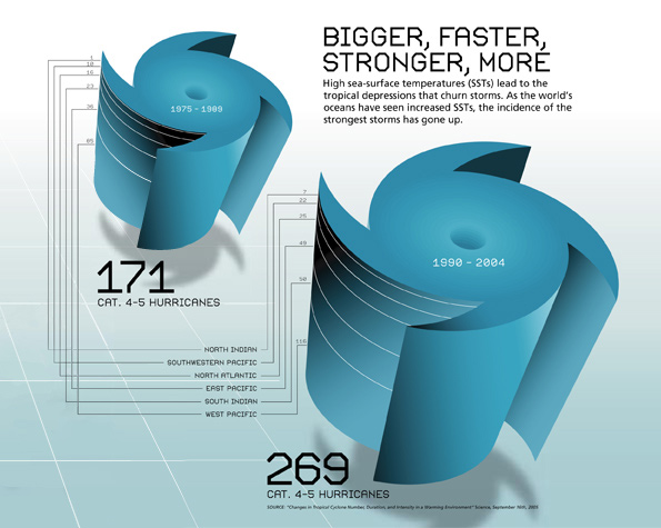
- lie factor:the right graphic seems do be much larger then the left. it should be only 1,5 times larger then the other one based on the data.
- the numbers are not readable and the lines between the numbers are not needed and very irritating.
- a pseudo 3-dimensional graphic is used to show 1-dimensional data
- data-ink ratio:very poor data-ink ratio.
- visual clutter:
- Data Density:
- Chartjunk:
- in the text a reason for increased hurricans is mentioned, but in the shown data is no evidence for that, because there is no reason related data.