Data-Ink Ratio
Definitions
The Data-Ink ratio is a concept introduced by Edward Tufte, the expert whose work has contributed significantly to designing effective data presentations. In his 1983 book, The Visual Display of Quantitative
Data, he stated the goal:
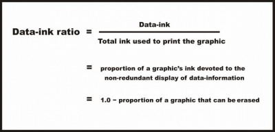
Tufte refers to data-ink as the non-erasable ink used for the presentation of data. If data-ink would be removed from the image, the graphic would lose the content. Non-Data-Ink is accordingly the ink that does
not transport the information but it is used for scales, labels and edges. The data-ink ratio is the proportion of Ink that is used to present actual data compared to the total amount of ink (or pixels) used in
the entire display. (Ratio of Data-Ink to non-Data-Ink).

Good graphics should include only data-Ink. Non-Data-Ink is everywhere where possible to be deleted. The reason for this is to avoid the attention of viewers of the data presentation to irrelevant elements.
The goal is to design a display with the highest possible data-ink ratio (that is, as close to the total of 1.0), without eliminating something that is necessary for effective communication.
Example
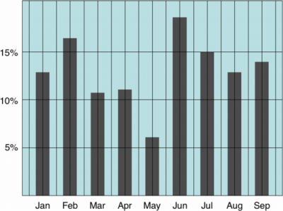
This is an example of a graph with a low Data-Ink Ratio.

The border around the graph, the background color and the grid lines are all unnecessary data ink.
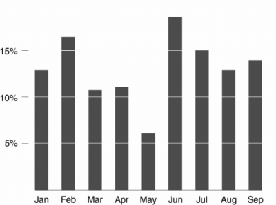
Now an example of a graph with a high Data-Ink Ratio

We have deleted the border around the graph, the background color and the grid lines and drowned the attention to horizontal scales that are data-ink. There is nothing else to distract and the key features of the data stand out clearly.
Critisicm on Tufte's principles
Inbar, et al, evaluated in 2007 the people's acceptance of the minimalist approach to visualize information. Therefore he asked 87 students to rate their preference for two different graphs displaying identical information - a standard bar-graph and a minimalist version. Both versions were taken from [Tufte, 1983]. [Inbar, 2007]
The results showed that the majority students did not like Tufte's minimalist design of bar-graphs - instead they seem to prefer "chartjunk". [Inbar, 2007]
Quellen
[Few, 2004] Stephen Few. Elegance Through Simplicity. Created at: October 16, 2004. Retrieved at: October 25, 2005. http://www.intelligententerprise.com/showArticle.jhtml?articleID=49400920.
[Few, Edge 2009] Stephen Few, . Perceptual Edge Sometimes We Must Raise Our Voices, Visual Business Intelligence Newsletter Created at: January/February 2009. http://www.perceptualedge.com/articles/visual_business_intelligence/sometimes_we_must_raise_our_voices.pdf.
[Tufte, 1983] Edward Tufte. The Visual Display of Quantitative Information. http://campusphere.de/datensicht/files/EdwardR.Tufte.%20Tufte
Pictures: http://www.tbray.org/ongoing/data-ink/di1
http://www.tbray.org/ongoing/data-ink/di5