Data-Ink Ratio
Definitions
The Data-Ink ratio is a concept introduced by Edward Tufte, the expert whose work has contributed significantly to designing effective data presentations. In his 1983 book, The Visual Display of Quantitative
Data, he stated the goal:
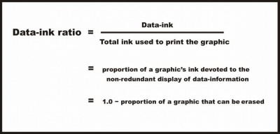
Tufte refers to data-ink as the non-erasable ink used for the presentation of data. If data-ink would be removed from the image, the graphic would lose the content. Non-Data-Ink is accordingly the ink that does
not transport the information but it is used for scales, labels and edges. The data-ink ratio is the proportion of Ink that is used to present actual data compared to the total amount of ink (or pixels) used in
the entire display. (Ratio of Data-Ink to non-Data-Ink).

Good graphics should include only data-Ink. Non-Data-Ink is everywhere where possible to be deleted. The reason for this is to avoid the attention of viewers of the data presentation to irrelevant elements.
The goal is to design a display with the highest possible data-ink ratio (that is, as close to the total of 1.0), without eliminating something that is necessary for effective communication.
Example
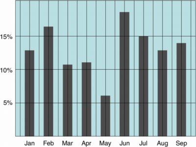
First an example of a graph with a low Data-Ink Ratio

How much of the ink on this chart could be removed without loss of information?
- The word "Year" is superflous
- Only the first year needs to include the digits 19
- Either the data labels or the vertical scale could be removed
- The y-axis label is duplicated in the title
- The bars need not be coloured
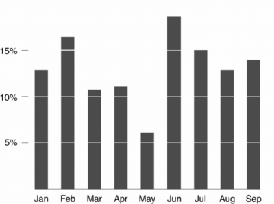
Now an example of a graph with a high Data-Ink Ratio

This graph shows the revenue of three equally important service lines as it moves through the four quarters, but also the comparative performance of the three service lines in any one quarter. The three prominently displayed lines, without anything else to distract from them in the plot area of the graph, makes the key features of the data stand out clearly from the text data that surrounds them.
Critisicm on Tufte's principles
Inbar, et al, evaluated in 2007 the people's acceptance of the minimalist approach to visualize information. Therefore he asked 87 students to rate their preference for two different graphs displaying identical information - a standard bar-graph and a minimalist version. Both versions were taken from [Tufte, 1983]. [Inbar, 2007]
The results showed that the majority students did not like Tufte's minimalist design of bar-graphs - instead they seem to prefer "chartjunk". [Inbar, 2007]
Bibliography
[Hunt, 1997] Neville Hunt. Data Ink. Created at: 1997. Retrieved at: October 25, 2005. http://home.ched.coventry.ac.uk/Volume/vol0/dataink.htm%7Cdate=November 2009Template:Dead link.
[Few, 2004] Stephen Few. Elegance Through Simplicity. Created at: October 16, 2004. Retrieved at: October 25, 2005. http://www.intelligententerprise.com/showArticle.jhtml?articleID=49400920.
[Tufte, 1983] Edward Tufte. The Visual Display of Quantitative Information. Graphics Press, Cheshire, 1983.
[Inbar, 2007] Ohbad Inbar, Noam Tractinsky, Joachim Meyer. Minimalism in information visualization: attitudes towards maximizing the data-ink ratio. In ACM International Conference Proceeding Series; Vol. 250. Proceedings of the 14th European conference on Cognitive ergonomics: invent! explore!, pages 185-188, London, United Kingdom, ACM, 2007