Teaching:TUW - UE InfoVis WS 2009/10 - Gruppe 11 - Aufgabe 3: Difference between revisions
Jump to navigation
Jump to search
No edit summary |
No edit summary |
||
| Line 5: | Line 5: | ||
[[Image:guardian.png]] | [[Image:guardian.png]] | ||
Positives | === Positives === | ||
* colours show the regions | * colours show the regions | ||
Critique on the existing graphic | === Critique on the existing graphic === | ||
* it is very difficult to interpret | * it is very difficult to interpret | ||
| Line 26: | Line 26: | ||
[[Image:Gruppe11Aufgabe3Tabelle.jpg]] | [[Image:Gruppe11Aufgabe3Tabelle.jpg]] | ||
Changes | === Changes === | ||
* sum up the several circles to big regions | * sum up the several circles to big regions | ||
Revision as of 22:32, 18 December 2009
Aufgabenstellung
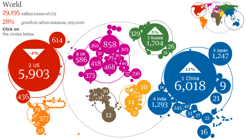
Zu verbessernde Grafik
Positives
- colours show the regions
Critique on the existing graphic
- it is very difficult to interpret
- there is a growth in carbon emissions of 28 % but this is not shown in the graphic
- most of the datas in the circles are not assignable to specific countries
- you can't click on the circles below
- the big dotted circle is expressionless
- you can see the growth in carbon emissions in per cent only at three of the five bigest CO2 producers
- the dimension of the circles is expressionless (sometimes bigger circles for low numbers and smaller circles for high numbers)
- the sum of the numbers from the circles is not the same as the given number of the million tonnes of CO2
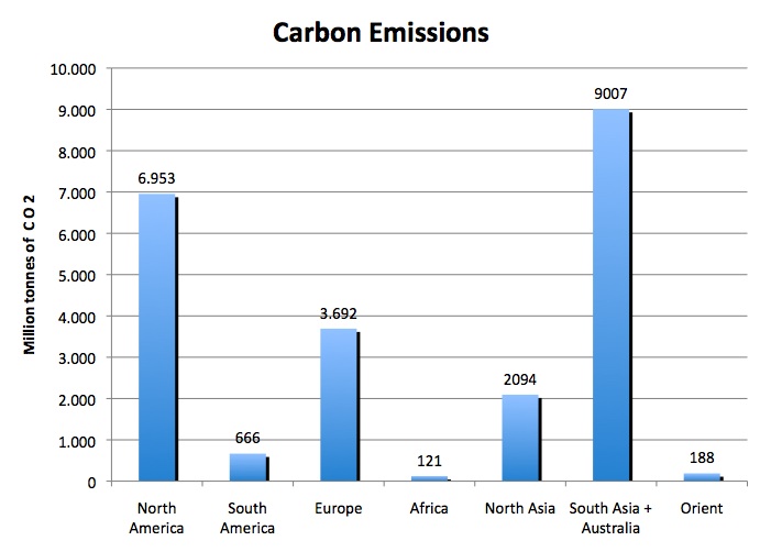
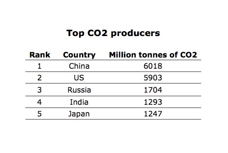
Verbesserte Grafik
Changes
- sum up the several circles to big regions
- remove the given number of the million tonnes of CO2, the growth in carbon emissions und "Click of the circles below"
- bar chart instead of the circles
- table with the five top CO2 producers
- no different colours


