Teaching:TUW - UE InfoVis WS 2009/10 - Gruppe 02 - Aufgabe 3: Difference between revisions
Jump to navigation
Jump to search
No edit summary |
No edit summary |
||
| Line 36: | Line 36: | ||
[[Image:Bank_Deposits.JPG | 500px]] | [[Image:Bank_Deposits.JPG | 500px]] | ||
== References == | |||
[Few,2004]: Stephen Few, Show Me the Numbers: Designing Tables and | [Few,2004]: Stephen Few, Show Me the Numbers: Designing Tables and Graphs to Enligthen, Analytics Press, 2004, Chapter 7 - Table Design | ||
== Links == | |||
* [[Teaching:TUW_-_UE_InfoVis_WS_2009/10|InfoVis:Wiki UE Homepage]] | |||
* [http://ieg.ifs.tuwien.ac.at/~gschwand/teaching/infovis_ue_ws09/ UE InfoVis] | |||
*[[Teaching:TUW - UE InfoVis WS 2009/10 - Gruppe 02|Gruppe 02]] | |||
Revision as of 23:29, 9 December 2009
Aufgabenstellung
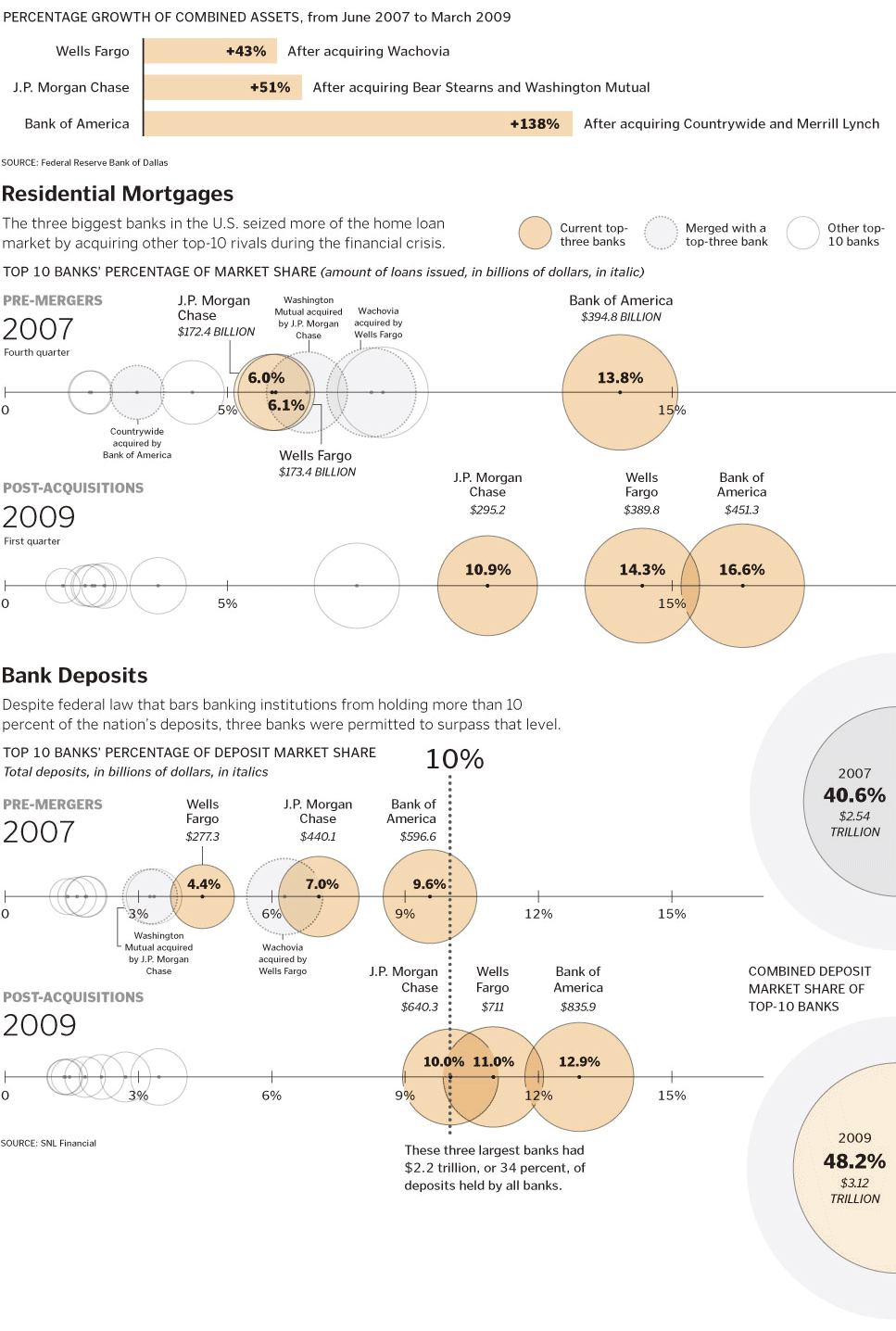
Zu verbessernde Grafik
Critics & Good Points
General
- Good use of low-saturated colors
- Information is presented in a nice-to-look-at way
- Wrong visualisation type -> you can't extract the actual information out of this pictures
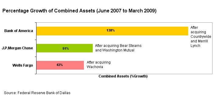
Percentage Growth
- Gives a good overview
- Topic should be presented larger and stronger
- The use of different colors for the individual banks could achieve linking with the other graphics
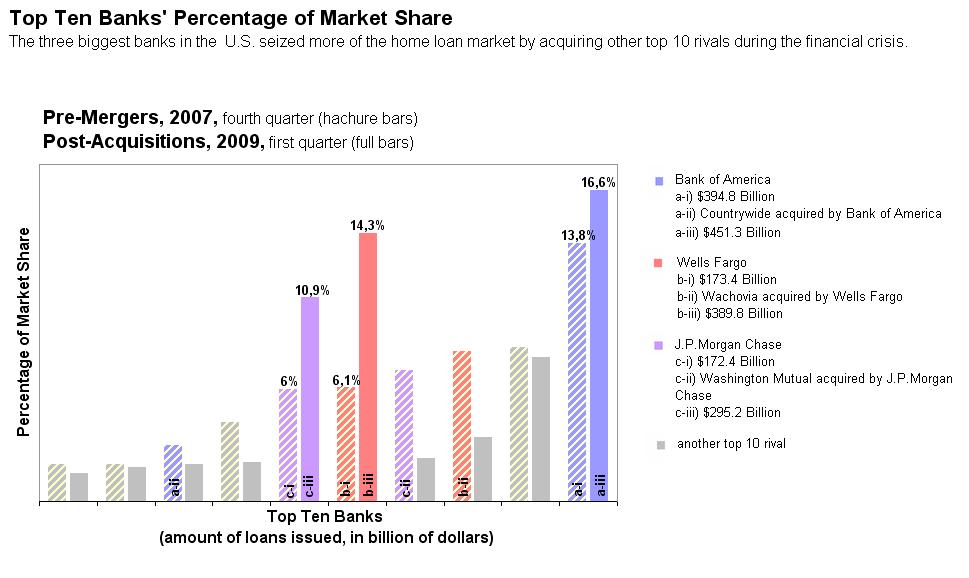
Residential Mortgages
- Reading this graphic is very difficult
- Layering of the circles is confusing - banks are not related just because they have about the same percentage -> use bar/line charts instead
- Comments are confusing and need too much space, put the comments near the chart
- Use colors which banks have been merged, same colors like in the "percentage growth" creates the linking effect
- 2007 and 2009 don't seem very related to each other, maybe this should be combined in one single chart with different color/saturation
- Use hachure effect for 2007 bars, as they are not the current value of the banks
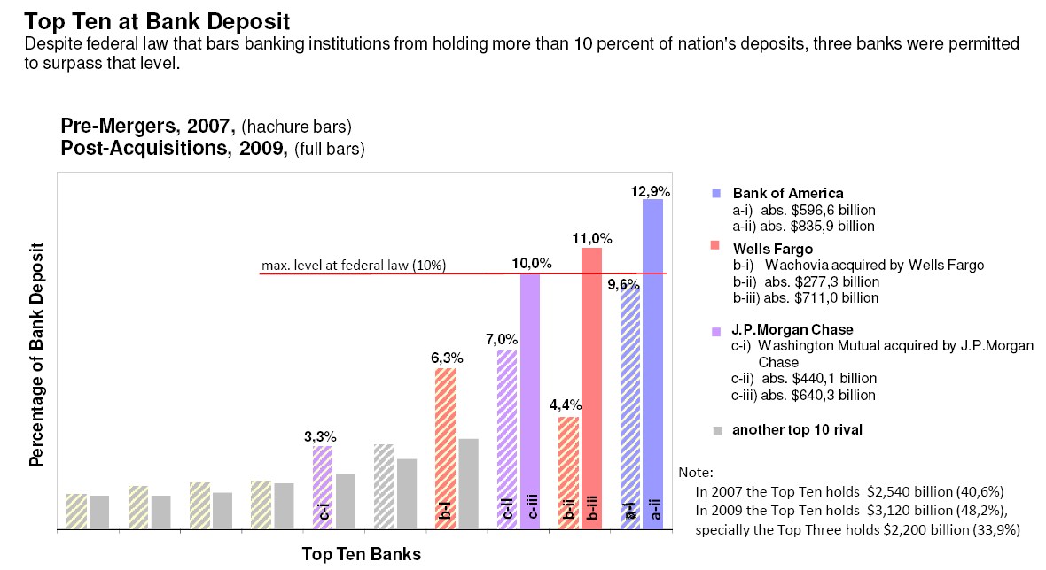
Bank Deposits
- Sense of the graphic is hard to get
- Circles on the right side don't have any relation to the rest of the graphic
- The use of a bar or pie chart for the amount of money that is partitioned over the 3 banks would help understanding the graphic
References
[Few,2004]: Stephen Few, Show Me the Numbers: Designing Tables and Graphs to Enligthen, Analytics Press, 2004, Chapter 7 - Table Design


