Data-Ink Ratio: Difference between revisions
Moved to Glossary |
No edit summary |
||
| Line 12: | Line 12: | ||
== Introduction == | == Introduction == | ||
The Data-Ink Ratio is a concept published by Tufte in [Tufte, 1983]. It arose from | The Data-Ink Ratio is a concept published by Tufte in [Tufte, 1983]. It arose from Tufte's goal: | ||
{{Quotation|Above all else show the data| Tufte, 1983}} | {{Quotation|Above all else show the data| Tufte, 1983}} | ||
<br> | <br> | ||
{{quotation|A large share of ink on a graphic should present data-information, the ink changing as the data change. Data-ink is the non-erasable core of a graphic, the non-redundant ink arranged in response to variation in the numbers represented.|Tufte, 1983}} | |||
<br> | <br> | ||
Revision as of 12:42, 5 November 2009
Definitions
Tufte defines two types of ink used to construct a graph:
- data-ink - the essential non-erasable ink used to present the data
- non-data-ink - the redundant ink used to elaborate or decorate the graph
The Data-Ink Ratio is defined as the percentage: (100 x Data-ink) / (Total ink used on graphic)
[Hunt, 1997]
Introduction
The Data-Ink Ratio is a concept published by Tufte in [Tufte, 1983]. It arose from Tufte's goal:
The data-ink ratio is the proportion of ink (or pixels, when displaying information on a screen) that's used to present actual data, without redundancy, compared to the total amount of ink (or pixels) used in the entire display, such as in a table or graph. The goal is to design a display that has the highest possible data-ink ratio (that is, as close to the total of 1.0 or 100% as possible), without eliminating something that is necessary for effective communication.[Few, 2004]
Example
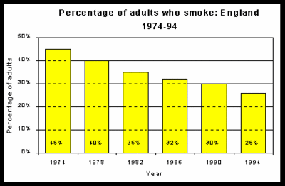
First an example of a graph with a low Data-Ink Ratio

How much of the ink on this chart could be removed without loss of information?
- The word "Year" is superflous
- Only the first year needs to include the digits 19
- Either the data labels or the vertical scale could be removed
- The y-axis label is duplicated in the title
- The bars need not be coloured
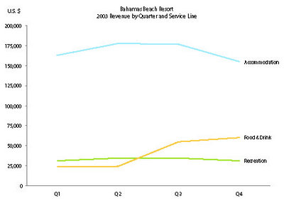
Now an example of a graph with a high Data-Ink Ratio

This graph shows the revenue of three equally important service lines as it moves through the four quarters, but also the comparative performance of the three service lines in any one quarter. The three prominently displayed lines, without anything else to distract from them in the plot area of the graph, makes the key features of the data stand out clearly from the text data that surrounds them.
Bibliography
[Hunt, 1997] Neville Hunt, Data Ink. Created at: 1997. Retrieved at: October 25, 2005. http://home.ched.coventry.ac.uk/Volume/vol0/dataink.htm.
[Few, 2004] Stephen Few, Elegance Through Simplicity. Created at: October 16, 2004. Retrieved at: October 25, 2005. http://www.intelligententerprise.com/showArticle.jhtml?articleID=49400920.
[Tufte, 1983] Tufte, Edward. The Visual Display of Quantitative Information. Graphics Press, Cheshire, 1983.