Teaching:TUW - UE InfoVis WS 2008/09 - Gruppe 10 - Aufgabe 1 - Pareto Chart: Difference between revisions
mNo edit summary |
(Dutter reference added and stat and math expl) |
||
| Line 4: | Line 4: | ||
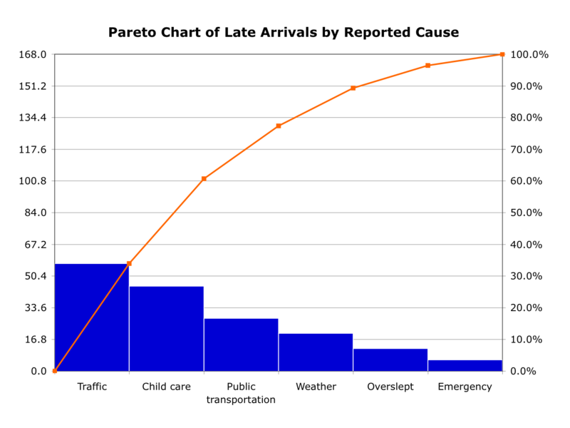
[[Image:Pareto.png|thumb|''This chart is created with MS Excel and the data is hypotetical'']] | [[Image:Pareto.png|thumb|''This chart is created with MS Excel and the data is hypotetical'']] | ||
A '''Pareto chart''' is a histogram in which all bars are sorted in a descendant order. The | A '''Pareto chart''' is a histogram in which all bars are sorted in a descendant order. The diagram is often accompanied by a line or curve graph which shows the cumulative value of the particular categories shown in it. | ||
=== Pareto Principal === | === Pareto Principal === | ||
The Pareto principle (also known as the 80-20 rule, the law of the vital few and the principle of factor sparsity) states that, for many events, 80% of the effects come from 20% of the causes. Business management thinker Joseph M. Juran suggested the principle and named it after Italian economist Vilfredo Pareto, who observed that 80% of income in Italy went to 20% of the population. It is a common rule of thumb in business; e.g., "80% of your sales comes from 20% of your clients." | The Pareto principle (also known as the 80-20 rule, the law of the vital few and the principle of factor sparsity) states that, for many events, 80% of the effects come from 20% of the causes. Business management thinker Joseph M. Juran suggested the principle and named it after Italian economist Vilfredo Pareto, who observed that 80% of income in Italy went to 20% of the population. It is a common rule of thumb in business; e.g., "80% of your sales comes from 20% of your clients." | ||
=== Statistical and Mathematical Explanation === | |||
A histogram is a graphical representation of the frequency distribution of the data. In pareto context the data has to be ordered in a descendant way in order to match the pareto principal. | |||
The curved graph in the Pareto Chart is actually а total frequency polygon, which is widely used in statistics. It is build by connecting the percentage total frequencies on the right edge of the bars in the histogram to each other '''[Dutter, 2008]'''. | |||
=== Fields of use === | |||
The Pareto Chart could be used in many fields and aspects since it is a blueprint of a general principal. However it is mostly referenced in the following context: | |||
* QC/QM - Quality Control/Quality Management | |||
* Microeconomics | |||
* Statistics | |||
=== History === | === History === | ||
| Line 14: | Line 25: | ||
=== Bibliography === | === Bibliography === | ||
[Koch et al., 2004] Richard Koch. Living the 80/20 Way: Work Less, Worry Less, Succeed More, Enjoy More. Nicholas Brealey Publishing, London 2004. ISBN 1857883314. | [Koch et al., 2004] Richard Koch. Living the 80/20 Way: Work Less, Worry Less, Succeed More, Enjoy More. Nicholas Brealey Publishing, London 2004. ISBN 1857883314. | ||
[Dutter, 2008] Rudolf Dutter. Statistik und Wahrscheinlichkeitsrechnung für InformatikerInnen, Scriptum, Vienna University of Technology, 2008, p. 18, p. 25. | |||
Revision as of 22:36, 6 November 2008
Pareto Chart
Definition

A Pareto chart is a histogram in which all bars are sorted in a descendant order. The diagram is often accompanied by a line or curve graph which shows the cumulative value of the particular categories shown in it.
Pareto Principal
The Pareto principle (also known as the 80-20 rule, the law of the vital few and the principle of factor sparsity) states that, for many events, 80% of the effects come from 20% of the causes. Business management thinker Joseph M. Juran suggested the principle and named it after Italian economist Vilfredo Pareto, who observed that 80% of income in Italy went to 20% of the population. It is a common rule of thumb in business; e.g., "80% of your sales comes from 20% of your clients."
Statistical and Mathematical Explanation
A histogram is a graphical representation of the frequency distribution of the data. In pareto context the data has to be ordered in a descendant way in order to match the pareto principal.
The curved graph in the Pareto Chart is actually а total frequency polygon, which is widely used in statistics. It is build by connecting the percentage total frequencies on the right edge of the bars in the histogram to each other [Dutter, 2008].
Fields of use
The Pareto Chart could be used in many fields and aspects since it is a blueprint of a general principal. However it is mostly referenced in the following context:
- QC/QM - Quality Control/Quality Management
- Microeconomics
- Statistics
History
Vilfredo Federico Damaso Pareto(July 15, 1848 – August 19, 1923), or Fritz Wilfried Pareto, was an Italian sociologist, economist, and philosopher. He made several important contributions, particularly in the study of income distribution and in the analysis of individuals' choices. He introduced the concept of Pareto efficiency and helped develop the field of microeconomics. In 1906, he made the famous observation that twenty percent of the population owned eighty percent of the property in Italy, later generalised by Joseph M. Juran and others into the so-called Pareto principle (also termed the 80-20 rule) and generalised further to the concept of a Pareto distribution.
Bibliography
[Koch et al., 2004] Richard Koch. Living the 80/20 Way: Work Less, Worry Less, Succeed More, Enjoy More. Nicholas Brealey Publishing, London 2004. ISBN 1857883314.
[Dutter, 2008] Rudolf Dutter. Statistik und Wahrscheinlichkeitsrechnung für InformatikerInnen, Scriptum, Vienna University of Technology, 2008, p. 18, p. 25.