Teaching:TUW - UE InfoVis WS 2007/08 - Gruppe 08 - Aufgabe 3: Difference between revisions
Jump to navigation
Jump to search
mNo edit summary |
No edit summary |
||
| Line 3: | Line 3: | ||
[[Image:Rentner_Erwerbstaetige.jpg]] | [[Image:Rentner_Erwerbstaetige.jpg]] | ||
Vergleich: Personen im Rentenalter & | Vergleich: Personen im Rentenalter & Erwerbsfähige | ||
== Links == | == Links == | ||
Revision as of 18:31, 19 December 2007
Poor Graphic
 Vergleich: Personen im Rentenalter & Erwerbsfähige
Links
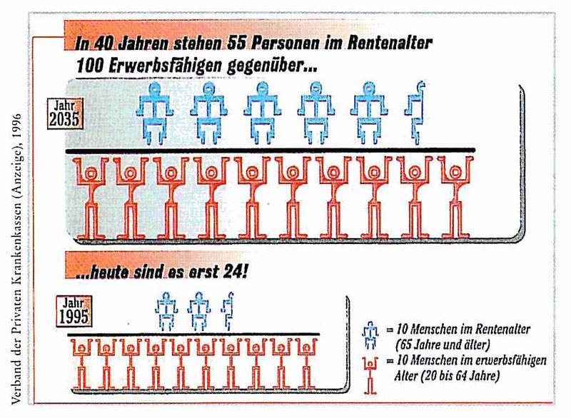
Problems with the Existing Graphic
The following problems where found when taking into account visualization prinicples (Data-Ink-Ratio, Visual Clutter, ...).
- The exact numbers are difficult to determine, especially when trying to count the human figures.
- Unimportant head lines are highlighted while important ones (such as the one on the left) are not.
- Only part of the head line has a background color.
- The head line is long and therefore difficult to read.
- The title is on the left side and is in vertical writing.
- In one glance the picture looks like two mathematical divisions.
- The human figures don't look like what they represent, they arn't symbolic for their respective representations.
- Compareable data within the years should be next to one another, in this case the blue figures are above the red figures.
- The blue and red figures dont have the same size.
- The two graphics 1995 and 2035 represent similar data but have different sizes.
- Different background colors are used for the graphics
- The graphics are not within cronological order, 1995 comes before 2035.
- The Legend is difficult to read, it could for example be framed.
- One could think the legend belongs to the small graphic at the bottom instead of the whole diagram
-> Due to this the diagram is very difficult to understand
Improved Graphic
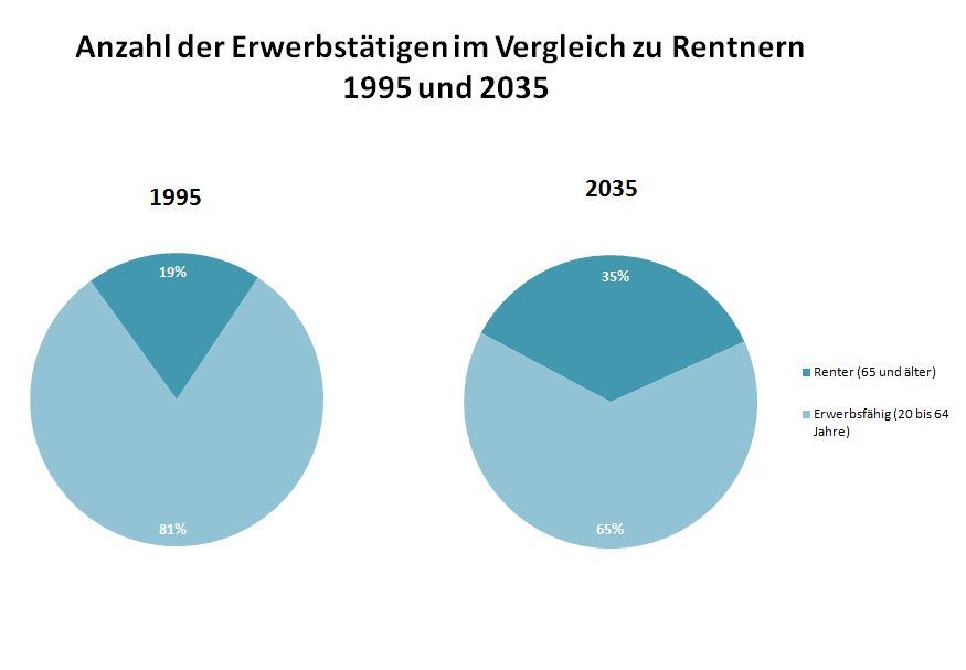
Description of Changes as well as Reasoning
The following changes were made to improve the problems initially found the first diagram.
- Unneccessary data such as the 35 and 100 was removed.
- Percentage numbers were added, these have more meaning than the numbers used in the initial diagram.
- The charts have the same size, this allows you to compare the charts easily.
- The background coloring was removed as this had no purpose and increased visual clutter.
- Colors were chosen that have a different brightness to allow color blind viewing and black and white printing.
- Coherent data is now grouped by the pie charts.
- sequence the data - the data is now sequenced chronologically from left to right to meet the expectations of Austrians.
- rank the data - The data was ranked, the important "rentner" are at the top, while the "erwerbsfaehige" are at the bottom.
