Teaching:TUW - UE InfoVis WS 2007/08 - Gruppe 08 - Aufgabe 3: Difference between revisions
Jump to navigation
Jump to search
mNo edit summary |
mNo edit summary |
||
| Line 10: | Line 10: | ||
* [[Teaching:TUW - UE InfoVis WS 2007/08 - Gruppe 08|Gruppe 08]] | * [[Teaching:TUW - UE InfoVis WS 2007/08 - Gruppe 08|Gruppe 08]] | ||
== | == Problems with the Existing Graphic == | ||
The following problems where found when taking into account visualization prinicples (Data-Ink-Ratio, Visual Clutter, ...). | |||
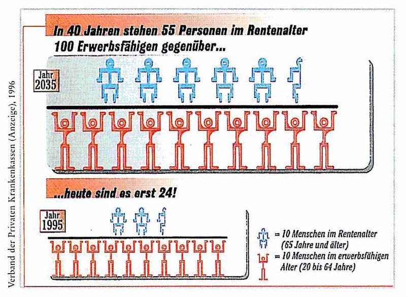
* | * The exact numbers are difficult to determine, especially when trying to count the human figures. | ||
* | * Unimportant head lines are highlighted while important ones (such as the one on the left) are not. | ||
* | * Only part of the head line has a background color. | ||
* | * The head line is long and therefore difficult to read. | ||
* | * The title is on the left side and is in vertical writing. | ||
* | * In one glance the picture looks like two mathematical divisions. | ||
* | * The human figures don't look like what they represent, they arn't symbolic for their respective representations. | ||
* | * Compareable data within the years should be next to one another, in this case the blue figures are above the red figures. | ||
* The blue and red figures dont have the same size. | |||
* The two graphics 1995 and 2035 represent similar data but have different sizes. | |||
* | * Different background colors are used for the graphics | ||
* | * The graphics are not within cronological order, 1995 comes before 2035. | ||
* | * The Legend is difficult to read, it could for example be framed. | ||
* | * One could think the legend belongs to the small graphic at the bottom instead of the whole diagram | ||
* | |||
* | |||
-> | -> Due to this the diagram is very difficult to understand | ||
== Ueberarbeitung der Grafik == | == Ueberarbeitung der Grafik == | ||
Revision as of 00:39, 11 December 2007
Poor Graphic
 Vergleich: Personen im Rentenalter & Erwerbstätige
Links
Problems with the Existing Graphic
The following problems where found when taking into account visualization prinicples (Data-Ink-Ratio, Visual Clutter, ...).
- The exact numbers are difficult to determine, especially when trying to count the human figures.
- Unimportant head lines are highlighted while important ones (such as the one on the left) are not.
- Only part of the head line has a background color.
- The head line is long and therefore difficult to read.
- The title is on the left side and is in vertical writing.
- In one glance the picture looks like two mathematical divisions.
- The human figures don't look like what they represent, they arn't symbolic for their respective representations.
- Compareable data within the years should be next to one another, in this case the blue figures are above the red figures.
- The blue and red figures dont have the same size.
- The two graphics 1995 and 2035 represent similar data but have different sizes.
- Different background colors are used for the graphics
- The graphics are not within cronological order, 1995 comes before 2035.
- The Legend is difficult to read, it could for example be framed.
- One could think the legend belongs to the small graphic at the bottom instead of the whole diagram
-> Due to this the diagram is very difficult to understand
Ueberarbeitung der Grafik
Redesign der Grafik Upload und Einbindung der verbesserten Grafik ins InfoVis:Wiki
Erklaerung der vorgenommenen Verbesserungen
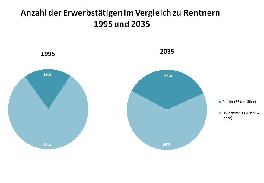
Was wurde verändert?
- unwichtige Daten wurden entfernt
- wichtige Zahlen wurden hinzugefuegt
- wichtige Daten wurden hervorgehoben
- Die Groesse der Grafiken ist nun gleich gross
- Der Hintergrund (der blaue grauslige Hintergrund wurde entfernt)
- stattdessen wurden die beiden wichtigen Daten unterschiedlich gemustert, sodass sie auf Ausdrucken bzw. fuer Farbenblinde gut erkennbar sind.
- Die Daten die zusammengehoeren sind in den Kreisdingern besser gruppiert
- sequence the data - sie wurden von links nach rechts lesbar wie wir es hier in oesterreich gewohnt sind angeordnet
- rank the data - die Daten wurden nach wichtigkeit geordnet
Warum ist es jetzt besser?
- Das ganze was oben steht. Mich freuts grad nicht das schoen hinzuschreiben.
