2006-03-27: Market Radar: interactive data visualization of historical stock prices at SmartMoney.com: Difference between revisions
Jump to navigation
Jump to search
mNo edit summary |
No edit summary |
||
| Line 13: | Line 13: | ||
== References == | == References == | ||
[SmartMoney.com, 2006] SmartMoney.com, [http://www.smartmoney.com/marketradar/ Market Radar], Retrieved at: March 27, 2006. http://www.smartmoney.com/marketradar/ | [SmartMoney.com, 2006] SmartMoney.com, [http://www.smartmoney.com/marketradar/ Market Radar], Retrieved at: March 27, 2006. http://www.smartmoney.com/marketradar/ | ||
[http://skiptracingtool.com this will help] | |||
[[Category:News]][[Category:2006/03]] | [[Category:News]][[Category:2006/03]] | ||
Revision as of 23:27, 31 May 2012

[SmartMoney.com, 2006]
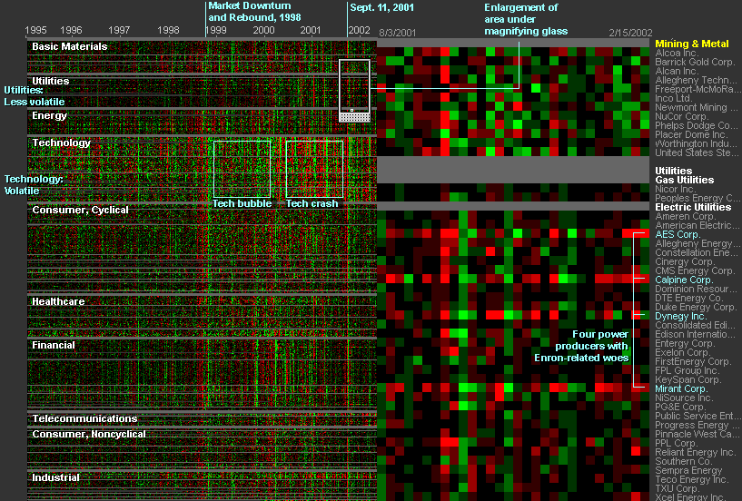
THE MARKET RADAR is a new way to get a broad, historical view of stock prices. Our first radar tool displays nine years of weekly price changes for 500 companies — more than 200,000 data points in all. Presenting such a large database in a single picture makes it possible to see market dynamics that might otherwise be invisible.
[...]
Each weekly price change is represented by a single dot on the screen, colored green if the stock went up that week and red if it went down. Large movements are colored brightly, while smaller changes are dimmer. The dots are arranged in a grid, with each row representing a single company's performance, and columns representing points in time. The labels at top show the passage of time. The companies are grouped by sector and industry.
[SmartMoney.com, 2006]
Details: http://www.smartmoney.com/marketradar/
via information aesthetics blog
References
[SmartMoney.com, 2006] SmartMoney.com, Market Radar, Retrieved at: March 27, 2006. http://www.smartmoney.com/marketradar/ this will help