Chart Junk: Difference between revisions
No edit summary |
No edit summary |
||
| Line 31: | Line 31: | ||
There is no information in the use of the 3rd dimension which heavily influences the pictures and very much drives the attention towards the depth of the bars and the underlying grid. But this is not at all the information which schould be transported. | There is no information in the use of the 3rd dimension which heavily influences the pictures and very much drives the attention towards the depth of the bars and the underlying grid. But this is not at all the information which schould be transported. | ||
As a very important fact, the proportions of the areas represented by 3D bars are not in a relation to the actual data value represented. This is because the bar is more or less represented with the front part, the | As a very important fact, the proportions of the areas represented by 3D bars are not in a relation to the actual data value represented. This is because the bar is more or less represented with the front part, the rectangle, and in addition to this with the two parts giving the impression of the 3rd dimension (which are chart junk per definition). The mistake in the proportion is called [[Teaching:TUW_-_UE_InfoVis_WS_2005/06_-_Gruppe_G4_-_Aufgabe_1_-_Lie_Factor|lie factor]]. | ||
Revision as of 15:34, 31 October 2005
Definition(s)
Chartjunk is a term for unnecessary or confusing visual elements in charts and graphs. Markings and visual elements can be called chartjunk if they are not part of the minimum set of visuals necessary to communicate the information understandably. Examples of unnecessary elements which might be called chartjunk include heavy or dark grid lines, ornamented chart axes and display frames, pictures or icons within data graphs, and ornamental shading. [wikipedia.org, 2005]
"The interior decoration of graphics generates a lot of ink which does not tell the viewer anything new. The purpose of the decoration varies - to make the graphic appear more scientific, to enliven the display, to give the designer an opportunity to exercise artistic skill. Regardless of the cause, it is all non-data-ink or redundant data-ink, and it is often chartjunk." [Tufte, 1983]
Key Words
Chart Junk, Bar Chart, Pie Chart
Abstract
With modern technologies in the field of office work, reporting and presenting got a major boost in the last few years. The everywhere available color beamer for presentations and easily accessible software has forced a tremendous rise in colorful and media enriched presentations throughout branches. Does more color and media always help to get the point of a message? Or is it mostly distracting the viewer from the spot of interest? This article wants to focus on what is called "Chart Junk" and defines the parts of charts that are not carrying essentail information, that are not even neutral, but which do disturb the visualization of the data.
Examples
3D Bar Chart
The Icon of the Microsoft® Office Excel "Diagramm-Assistent" shows exactly what it mostly produces, namely Chart Junk. This can be easily seen when we enlarge the picture and mark the points which do not carry information.
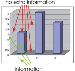
The following picture of a 3D Barplot in Excel shows which parts do not carry information and are thus just distracting the viewer away from the real point of interest. This is the height of the bars, which represents some numerical value.
There is no information in the use of the 3rd dimension which heavily influences the pictures and very much drives the attention towards the depth of the bars and the underlying grid. But this is not at all the information which schould be transported.
As a very important fact, the proportions of the areas represented by 3D bars are not in a relation to the actual data value represented. This is because the bar is more or less represented with the front part, the rectangle, and in addition to this with the two parts giving the impression of the 3rd dimension (which are chart junk per definition). The mistake in the proportion is called lie factor.
Presentation
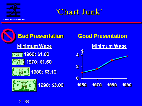
The image below also gives a good idea what is meant by "Chart Junk". The Dollar signs are not at all helpful for the point of interest. This is the way the amount of money develops over the years. As the example shows, this is best presented by a simple line [Maggie Elgin, 2005].
Confusing graphic
The following graphic also contains chart junk. The logos giving a hint what the lines are dealing with are far more than the minimum needed to present the desired information. This goes along with the definition of chart junk as found on wikipedia.org.
Conclusion
To sum up it is to say that Chart Junk is something completely unnecessary. Someone should always stick to the essential part of what he or she wants to deliver to the audience.
Additionally most Chart Junk is produced because of vanity, and maybe even more because of bad software. It takes some time and experience to find out what is essential, without making boring and sleepy presentations and charts. This time is to be respected, and to be taken serious. Deliver data and information in a efficient and clear way is a major task, even a science.
Maybe when you are working on your next chart or presentation, and your software suggests some fancy but distracting methods, you just consider the statement below!
"Kill the frills and get to the point!" [Tufte, 1997]
Bibliography
[wikipedia.org, 2004] Wikipedia, the free encyclopedia, Created at: June 22, 2004, Retrieved at: October 22, 2005
http://en.wikipedia.org/wiki/Chartjunk
[Tufte, 1983] Edward R. Tufte, The Visual Display of Quantitative Information. 2nd Edition, Graphics Press, Cheshire, Connecticut, 1983.
[Tufte, 1997] Edward R. Tufte, Visual Explanations, Graphics Press, Cheshire, Connecticut, 1997.
[AHK]
AHK, Die deutschen Auslandshandelskammern in Mercosur. Retrieved at: October 22, 2005
http://www.mercosur-info.com/al/handelsstatistiken.shtml
<< G8
<<< overview

