Teaching:TUW - UE InfoVis WS 2009/10 - Gruppe 15 - Aufgabe 3: Difference between revisions
Jump to navigation
Jump to search
No edit summary |
No edit summary |
||
| Line 4: | Line 4: | ||
------------------------------- <br> <br> | ------------------------------- <br> <br> | ||
[[Image:spend.png]] | [[Image:spend.png]] | ||
===Critics=== | |||
Again, the main point of failure is the bad readability of the graph. The eye of the reader gets distracted by the load of information viewed in circles, which are more confusing than being informal. The vertical distance between the rows of data intensify this effect.<br> | |||
The graph should be consistent, so the x2 section confuses the viewer.<br> | |||
Because of all these critics, we decided to change the graph completly. | |||
===Redesigned Graph=== | ===Redesigned Graph=== | ||
[[Image:grafik.jpg|500px]] | [[Image:grafik.jpg|500px]] | ||
===Changes=== | |||
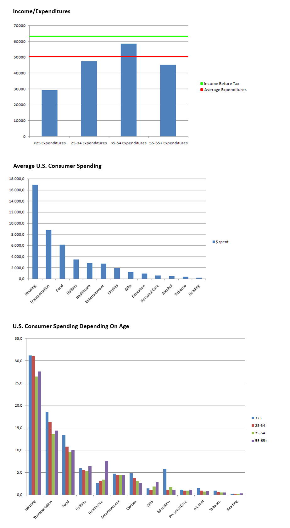
* Devided the graph into 3 smaller graphs with increased readability. | |||
Revision as of 14:12, 8 December 2009
Aufgabenstellung
Zu verbessernde Grafik
Critics
Again, the main point of failure is the bad readability of the graph. The eye of the reader gets distracted by the load of information viewed in circles, which are more confusing than being informal. The vertical distance between the rows of data intensify this effect.
The graph should be consistent, so the x2 section confuses the viewer.
Because of all these critics, we decided to change the graph completly.
Redesigned Graph
Changes
- Devided the graph into 3 smaller graphs with increased readability.

